I love this box out of all of the ones i've made so far!
Credit goes to...
Template- KoopaDasher
Super Mario Galaxy logo - forgot who's it was
Every thing else - Bing and Google
Credit to Nintendo for Super Mario Galaxy(:
If the no esrb logo on the back is buggin anybody just say so
otherwise I won't put one.
Also, for those who wanted a different font, the sites I try won't download right so sorry but i'll upload when it does.
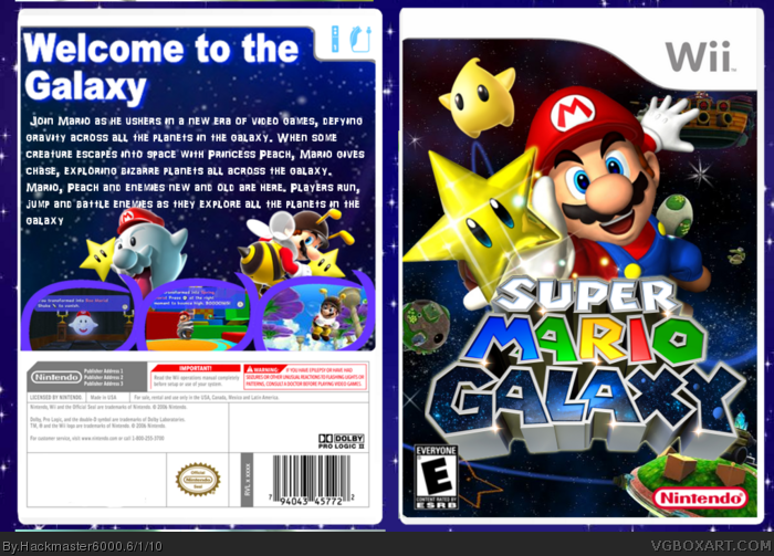
This is pretty good. I think the biggest flaw that's sticking out to me is how sharp and elongated the star is. Mario's stars have always had more of a "chubby" vibe to them, since Mario 64.
I actually really do like that front. Its simple and the gleam on the star is quite nice. The back isn't on par though. Text doesnt look professional and then it looks like a mess on the bottom. I think the screen borders may be too thick.
Overall ill give you a fav for the front, and can't wait to see your next.
The screenshot borders are pretty neat, and I think the back would look better if everything was just re-oganised to fit (like have the screen shots running down vertically or something), but the front is very good.
 Super Mario Galaxy Box Cover Comments
I love this box out of all of the ones i've made so far!
Credit goes to...
Template- KoopaDasher
Super Mario Galaxy logo - forgot who's it was
Every thing else - Bing and Google
Credit to Nintendo for Super Mario Galaxy(:
If the no esrb logo on the back is buggin anybody just say so
otherwise I won't put one.
Also, for those who wanted a different font, the sites I try won't download right so sorry but i'll upload when it does.
Edited at 1 decade ago
[ Reply ]
Add an ESRB logo and info to the back and I'll fav :) it looks great though
[ Reply ]
what do you mean by info?
[ Reply ]
The front looks great, but the back needs work.
1. The tagline font could have been much better. It just doesnt fit the box at all
2. Boo Mario and Bee mario look strange with the screenshots covering them
3. I really dislike those screenshot borders.
4. The template shouldn't overlap the screenshots
Like I said, the front is good, but that back just looks bad.
[ Reply ]
like I said theres not much I can do about the tagline text because of site problems on my computer, but at least you like the box itself, right?
[ Reply ]
Let me be the first to fav. I like the front despite the oodles of SMG boxes on this site.
[ Reply ]
Theres no way I posted twice! Halp! Delete second post
Edited at 1 decade ago
[ Reply ]
thanks for the first fav, and cherish the moment
[ Reply ]
See how I put the ESRB logo and ESRB info box on the back? link Thats what you need to do. I'm gonna fav this box because the front is amazing
[ Reply ]
okay, I thought you meant something else
I hope this is worth more than 3 favs
Edited at 1 decade ago
[ Reply ]
Bump! What,Me?,No way
[ Reply ]
The front is great, but the back could use a lot of work.
Still, the front itself is worth a fav. You've improved since that crappy Sonic Adventure box of a while ago.
[ Reply ]
Thanks Nessie and i guess i've improved a little
[ Reply ]
This is pretty good. I think the biggest flaw that's sticking out to me is how sharp and elongated the star is. Mario's stars have always had more of a "chubby" vibe to them, since Mario 64.
link
Other than that it's looking pretty good. I might consider putting characters behind screenshots less in the future, if I were you, good job.
[ Reply ]
I hope there will be more favs so i can get to rank 4
[ Reply ]
I actually really do like that front. Its simple and the gleam on the star is quite nice. The back isn't on par though. Text doesnt look professional and then it looks like a mess on the bottom. I think the screen borders may be too thick.
Overall ill give you a fav for the front, and can't wait to see your next.
[ Reply ]
I guess nobody likes the back, *sigh* i've got to get that text
[ Reply ]
BUMP! *smacks hand* bad hand!
[ Reply ]
I still think the tagline font should be changed to continuum with a strong outer glow. Oh, well you deserve it. +fav
Edited at 1 decade ago
[ Reply ]
Thanks for the fav and thanks for your help really needed it
[ Reply ]
What #4 said, he took the words outta my mouth.
[ Reply ]
come on is the back really that bad you guys
[ Reply ]
The screenshot borders are pretty neat, and I think the back would look better if everything was just re-oganised to fit (like have the screen shots running down vertically or something), but the front is very good.
[ Reply ]
This your best so far. Everything is great,except I think you could have come up with as better layout of the back.
[ Reply ]
Yah most people don't like the back so i have to get some ideas first
[ Reply ]