This is my first box-art and I feel that for the first time i did very well, but if you have any comments they would be very much appreciated so I can make my new ones a lot better.
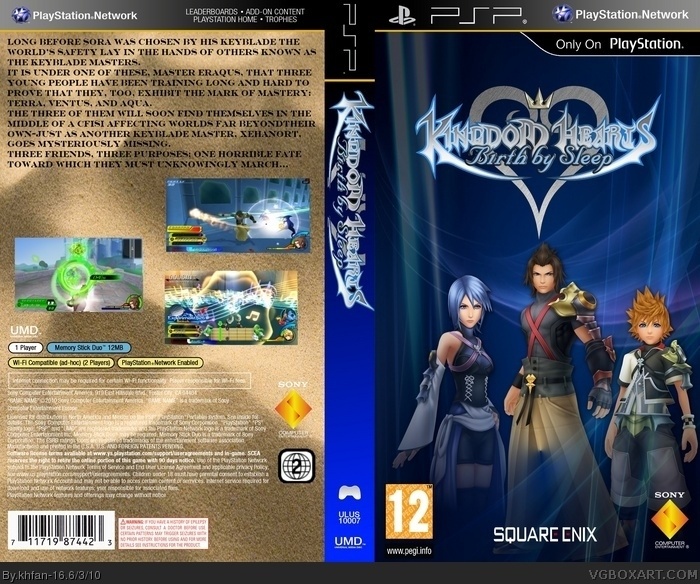
This is a stunning first. Only problems are as follows:
1. Logo on spine is stretched and just looks weird.
2. Square-enix logo is waaaaaay too big.
3. T on front is a just a tiny bit too big.
4. T on back is way too stretched, besides, it's not the correct way for a back ESRB to be.
5. Screenshot borders are kind of too big.
6. Text on back is bland and boring.
 Kingdom Hearts: Birth by Sleep Box Cover Comments
This is my first box-art and I feel that for the first time i did very well, but if you have any comments they would be very much appreciated so I can make my new ones a lot better.
[ Reply ]
This is a stunning first. Only problems are as follows:
1. Logo on spine is stretched and just looks weird.
2. Square-enix logo is waaaaaay too big.
3. T on front is a just a tiny bit too big.
4. T on back is way too stretched, besides, it's not the correct way for a back ESRB to be.
5. Screenshot borders are kind of too big.
6. Text on back is bland and boring.
Keep up the good work!
[ Reply ]
#2, Thanks for the comments and i will take everything you have said on board for the next box i will be doing
[ Reply ]
OH MY GOD!!!!!My friend and i love Kingdom Hearts games!!!!!!!!!!!!!!
Although there are a lot of screw ups. Try to fix them.
Edited at 1 decade ago
[ Reply ]
#4, you really shouldn't tell someone else their box has "screwups" when you make an account just to comment.
[ Reply ]
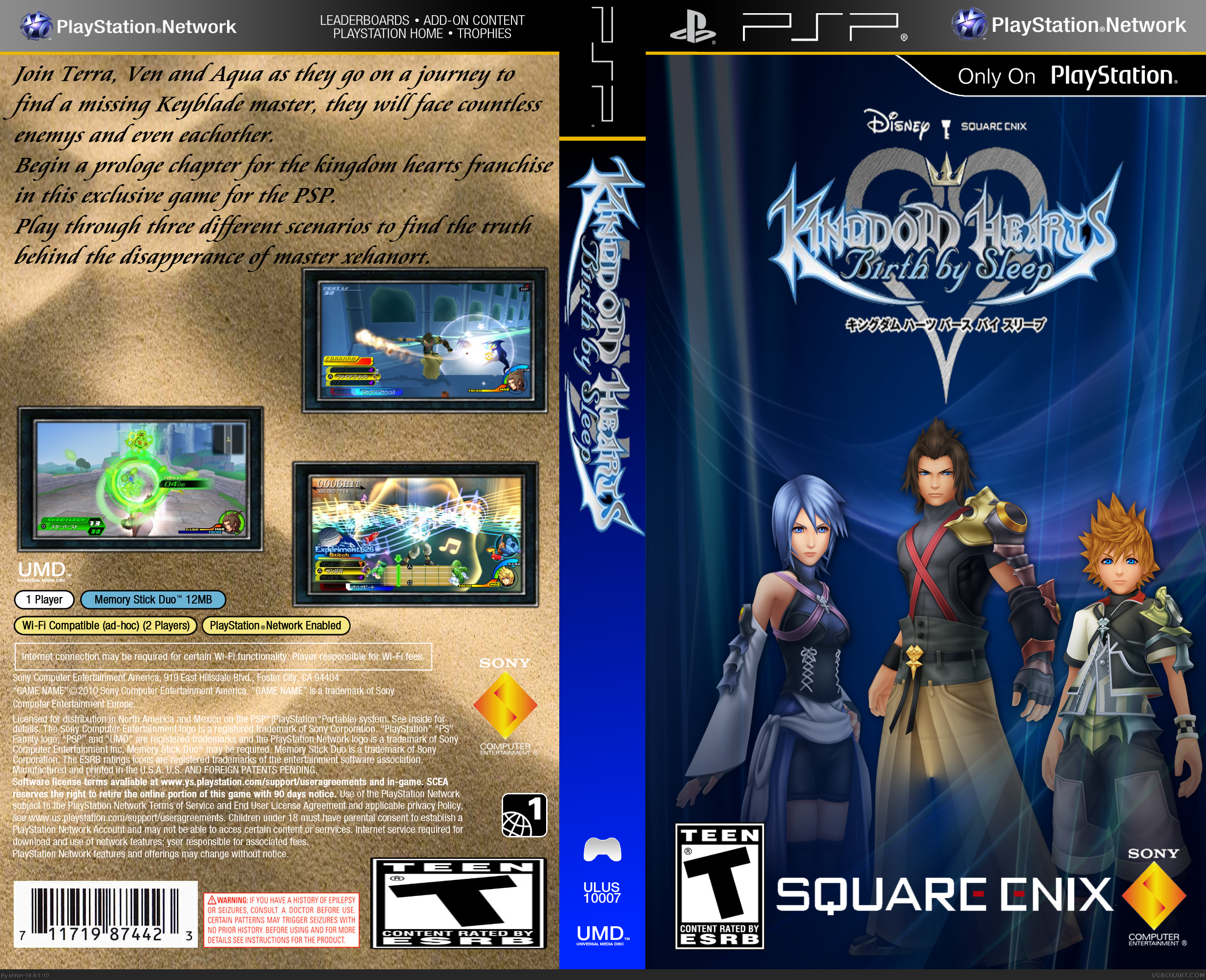
An updated version fixing most of the problems
[ Reply ]