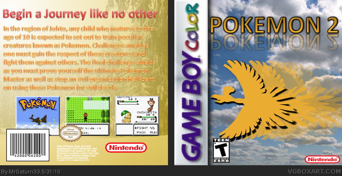
Here's my big comeback, this time I'm doing a box called Pokemon 2. That's right, Pokemon 2. What if Pokemon Gold/Silver was just one game, and it was called Pokemon 2? What if it was much darker/cooler then the previous games in the series? That was the inspiration of this box. Speaking of inspiration, the front is actually inspired by StarMario22's HeartGold box for DS, and the template is by Roza, though I changed it slightly. Anyway, please feel free to comment and tell me what you think.
I know where your going with the idea and all but if you want to convince people that its much darker/cooler make it look that way don't just say what if.
#12, Being inspired by someone's box and copying someone's box are two different things. I see no creativity in this at all. *waits for mrsaturn to call me a meanie*
Looking at the two boxes now, I'd honestly say, it doesn't look like there are sufficient enough changes between both fronts. they're identical apart from the logo and the duplicate Ho-oh's with lowered opacity.
 Pokemon 2 Box Cover Comments
Rated T for Teen?
[ Reply ]
Here's my big comeback, this time I'm doing a box called Pokemon 2. That's right, Pokemon 2. What if Pokemon Gold/Silver was just one game, and it was called Pokemon 2? What if it was much darker/cooler then the previous games in the series? That was the inspiration of this box. Speaking of inspiration, the front is actually inspired by StarMario22's HeartGold box for DS, and the template is by Roza, though I changed it slightly. Anyway, please feel free to comment and tell me what you think.
[ Reply ]
#1, please wait until the box artist posts. You literally posted while I was just finishing typing. I explained things there.
Edited at 1 decade ago
[ Reply ]
You didn't explain anything about the ESRB.
[ Reply ]
I know where your going with the idea and all but if you want to convince people that its much darker/cooler make it look that way don't just say what if.
[ Reply ]
Comeback? Hmm, anyways it really needs a lot of work, like a better logo, frames for the back, a choppyless front, and a lot of other things.
[ Reply ]
That teen logo is bothering me but it's a nice improvement from your previous work.
[ Reply ]
#5, I guess you're right but everyone's freaking out about the ESRB and hardly commenting on the box...
#6, there are screenshots on the back (If that's what you by mean frames...?) and I don't see much choppiness on the front.
#7, Thank you...
[ Reply ]
#8 by frames I mean like the borders around the screenshots. Simply having screenshots is just kinda plain if you know what I mean.
[ Reply ]
#4, he said what if it was "darker/cooler" meaning, as I would imagine, more violent and adult.
[ Reply ]
The front looks very similar too: link
[ Reply ]
#11, what do you think I said in the description. Read that before commenting.
[ Reply ]
#12, Being inspired by someone's box and copying someone's box are two different things. I see no creativity in this at all. *waits for mrsaturn to call me a meanie*
[ Reply ]
#13, *doesn't wait for mrsaturn* You're a meanie! lol Nah, this is pretty similar but don't just go raggin on him.
[ Reply ]
#14, lol I said that because of him flipping out in the WIP xD
[ Reply ]
I don't know why, but I just love that logo.
[ Reply ]
Looking at the two boxes now, I'd honestly say, it doesn't look like there are sufficient enough changes between both fronts. they're identical apart from the logo and the duplicate Ho-oh's with lowered opacity.
[ Reply ]
#13, YOU A BIG FAT MEANIE!!! WAAAAAH! I GO CWY TO MY MOMMY NOW!
Is that what you ****ing wanted? Happy now?
[ Reply ]
...Not to be a resurrecting noob, but I think it's funny that you consider your box dark just because it says hell-bent on the back
[ Reply ]