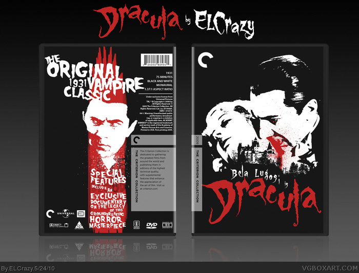
As YS (or YS' neighbour/cousin/brother/pet rabbit) said, the splatter looks a bit odd. However, the back is just plain sexy, your type choice is awesome as usual.
I like the choice of type and the images used, but it's something about how you organzied it that seems off. Using the same typeface for the subtitle text "Bela Lugosi is" like the main title is a big no-no. I thought you'd know better, El. :(
The back would've worked better if you'd given ample negative around that vertical block of text and image. The empty space on the left bothers me.
All in all, a very good concept but I feel the composition is lacking in execution.
 Dracula Box Cover Comments
Hey guys. I'm hoping at least one or two of you missed me doing boxes. :P
Anyway, the front is actually part of a poster I did for a contest. First prize is an iPhone. Fingers crossed.
One day I realized I haven't done a box in a long time, due to school commitments (sigh), so I thought, why the hell not.
Template by Indexenos. Enjoy!
[ Reply ]
The criterion-feeling is great, and I love the colours, red on dark gray always looks awesome.
[ Reply ]
very nice.
[ Reply ]
It's fantastic, but the original vampire film is F.W. Murnau's 'Nosferatu.' Still definitely worth a fave.
[ Reply ]
#4 is correct, but this is ground zero awesome Dan. The red makes the piece in my opinion.
[ Reply ]
Really nice! A splatter where he's biting her neck looks a bit weird though. Blood oozing down would be better IMO
[ Reply ]
As YS (or YS' neighbour/cousin/brother/pet rabbit) said, the splatter looks a bit odd. However, the back is just plain sexy, your type choice is awesome as usual.
[ Reply ]
MasterWorks, NOW!!!
[ Reply ]
This is what essence boxes are about. This just oozes with Dracula essence, and everything is spot on and truly captures "Dracula". Fantastic.
[ Reply ]
It may be oozing with Dracula essence, but not with the style of Lugosi... At least I feel that way.
[ Reply ]
Thanks guys!
#6, 7: Yeah, I tried the blood oozing down method, it didn't work out. =/
[ Reply ]
I like the choice of type and the images used, but it's something about how you organzied it that seems off. Using the same typeface for the subtitle text "Bela Lugosi is" like the main title is a big no-no. I thought you'd know better, El. :(
The back would've worked better if you'd given ample negative around that vertical block of text and image. The empty space on the left bothers me.
All in all, a very good concept but I feel the composition is lacking in execution.
Edited at 1 decade ago
[ Reply ]