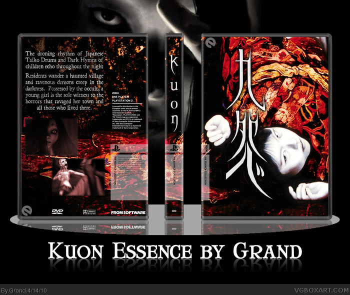
Pretty obscure survival horror game for the PS2 that came out in 2004. Not the scariest or best in terms of design, but worth making a box for. Just because Japanese girls with long black hair are really goddamn scary.
Not as good as some of my other Essence boxes, but there really aren't many resources for this game. Not much fan art either.
Essence temp by Master General, plastic by Jevangod.
Love the Japanese flavor you have going on with the whole design collectively, and the front is REALLY nice looking. I was actually playing this game not so long ago. It's unusual...even for a game based around Japanese demons.
#8, I never said it's just a background, but almost just a simple official artwork. I don't know how hard it is to find that image now, but when the game came out it was a piece of cake. even now I do find it on the first page via google-image search link
than again, why should I appreciate "skill to track resources", when people almost never do it? not to mention it is recommended to put some efford in searching for your resources, making it kinda "not so special".
as for the japanese characters: you have made them into a vector (or however you made em) but they are still traced from the original ones ;) I know, "traced" sounds very negative.
sure, it is fine to use a single artwork, however it is not that creative and the amount of work is not that high as well. nope, this doesn't have to be negative, since you don't have to make uber-covers with 50+ layers all the time, but it's a fact... somehow.
#7, it's always the same. he does take it pretty good. it is his right to argue about critique and clarify some points. why do people always start the "you don't take it very well" drama?
#9, I take criticism but if I feel the need to discuss things to clarify. It improves the criticism. Criticism can't be a one-sided thing; to fully understand, there has to be a discussion.
Anywho, I take your points, wasa-bi. I usually don't just take artwork but it seems that it never makes that much of a difference if I go the extra mile and create something truly original. Hell, my first HoF just had some official artwork on the front while boxes that I spent hours on slip by unnoticed.
I like this one alot, especially the front. The text on the back could be smaller (and in a different font), and I think it should have a tagline.
But good job!
#13, I think that people seem to perceive responding to criticism as "not taking it well." But I find it useful, if only for the purposes of clarification. And if I have to argue and explain what's good about a box I made, I usually end up seeing what's bad about it, as well.
 Kuon Box Cover Comments
Pretty obscure survival horror game for the PS2 that came out in 2004. Not the scariest or best in terms of design, but worth making a box for. Just because Japanese girls with long black hair are really goddamn scary.
Not as good as some of my other Essence boxes, but there really aren't many resources for this game. Not much fan art either.
Essence temp by Master General, plastic by Jevangod.
Edited at 1 decade ago
[ Reply ]
Love the Japanese flavor you have going on with the whole design collectively, and the front is REALLY nice looking. I was actually playing this game not so long ago. It's unusual...even for a game based around Japanese demons.
[ Reply ]
Awesome, love seeing obscure horror games pop up. I heard about this game but never got my hands on a copy.
The box is good, but the back could look a lot better, both the text and screenshots could use some improvement.
[ Reply ]
Epic. Box is too epic. You did a great job with this one, Grand. I love the Japanese characters on the front as well as the image you chose. Nice.
[ Reply ]
#4, just official artwork, so nothing special if you know the title already, but it is very well done
[ Reply ]
#5, Not quite. Do you know how hard it was to track down the full image? Japanese characters are made from scratch by me as well.
[ Reply ]
Grand. You don't take criticism very well. You need to learn to.
[ Reply ]
#7, I just wanted to point out that it's not just a background and that it takes knowledge, time, and skill to track down the right resources.
Besides, I think that using a single piece of official art is just fine & dandy.
[ Reply ]
#8, I never said it's just a background, but almost just a simple official artwork. I don't know how hard it is to find that image now, but when the game came out it was a piece of cake. even now I do find it on the first page via google-image search link
than again, why should I appreciate "skill to track resources", when people almost never do it? not to mention it is recommended to put some efford in searching for your resources, making it kinda "not so special".
as for the japanese characters: you have made them into a vector (or however you made em) but they are still traced from the original ones ;) I know, "traced" sounds very negative.
sure, it is fine to use a single artwork, however it is not that creative and the amount of work is not that high as well. nope, this doesn't have to be negative, since you don't have to make uber-covers with 50+ layers all the time, but it's a fact... somehow.
#7, it's always the same. he does take it pretty good. it is his right to argue about critique and clarify some points. why do people always start the "you don't take it very well" drama?
[ Reply ]
Official artwork or not, I don't see why the hell this isn't getting more love than it is. :( I'd fav it some more if I could.
[ Reply ]
#9, I take criticism but if I feel the need to discuss things to clarify. It improves the criticism. Criticism can't be a one-sided thing; to fully understand, there has to be a discussion.
Anywho, I take your points, wasa-bi. I usually don't just take artwork but it seems that it never makes that much of a difference if I go the extra mile and create something truly original. Hell, my first HoF just had some official artwork on the front while boxes that I spent hours on slip by unnoticed.
[ Reply ]
Sorry for not leaving a comment before.
I like this one alot, especially the front. The text on the back could be smaller (and in a different font), and I think it should have a tagline.
But good job!
[ Reply ]
#11, now that's something new, since discussing critism on package is called drama on this page.
[ Reply ]
#13, I think that people seem to perceive responding to criticism as "not taking it well." But I find it useful, if only for the purposes of clarification. And if I have to argue and explain what's good about a box I made, I usually end up seeing what's bad about it, as well.
[ Reply ]