[ Box updated on March 30th, 2010 ] [ original ]
 Kingdome Hearts: The Keyblade War Box Cover Comments
Comment on nephilim83's Kingdome Hearts: The Keyblade War Box Art / Cover.
[ Box updated on March 30th, 2010 ] [ original ]
Comment on nephilim83's Kingdome Hearts: The Keyblade War Box Art / Cover.
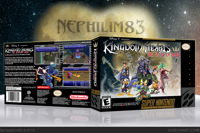
I've been working at this one for weeks. I just couln't decide on what to use for the background. I finally just settled for the generic heart-shaped moon and painted in some swirly clouds for a little extra flair.
I put the FF renders with their respective Keyblades and made the screenshots with different FF and Disney sprites I found across the web. I don't really know who to credit for the Mickey Mouse sprites or Keyblade renders, but I thank them very much whoever they are.
Also, I figured since the Keyblade War was something that happened forever ago in the KH universe I thought it would be cool to make it as an SNES title with SNES FF characters.
I hope you guys like it!
[ Reply ]
Excellent dude, very good. This blows my mind, and I hate to say this, but the only thing bothering me about this is the text on the back, you could have easily used a plain white colored text without the outer glow, it's hard to read.
[ Reply ]
Excellent work here, but I agree with Throavium, the text doesn't look too good.
[ Reply ]
Yeah, I was feeling pretty iffy about the text the whole time. I thought it'd be better white, but I thought it'd look too plain at the same time. I'll fix it in a bit.
[ Reply ]
#2, Man, I'm actually having a difficult time fixing it. I've been trying a bunch of different fonts, but nothing fits there as well as the one I used and its actually easier to read the way it already is. I think the real mistake I made was putting too much text in such a small spot. I think I'll just end up writing a more brief synopsis and then using a clearer text. I'll update it a bit later.
Edited at 1 decade ago
[ Reply ]
This is insanely, epically amazing! Great work, dude!
[ Reply ]
Nice job!
[ Reply ]
Oh no, it's now a Final Fantasy game!
[ Reply ]
Hahaha you posted it! It looks amazing!
Edited at 1 decade ago
[ Reply ]
Yeah this looks great. I agree about the text, I would suggest a simple white font like most SNES boxes.
[ Reply ]
Wow. Thanks guys for the wonderful comments!
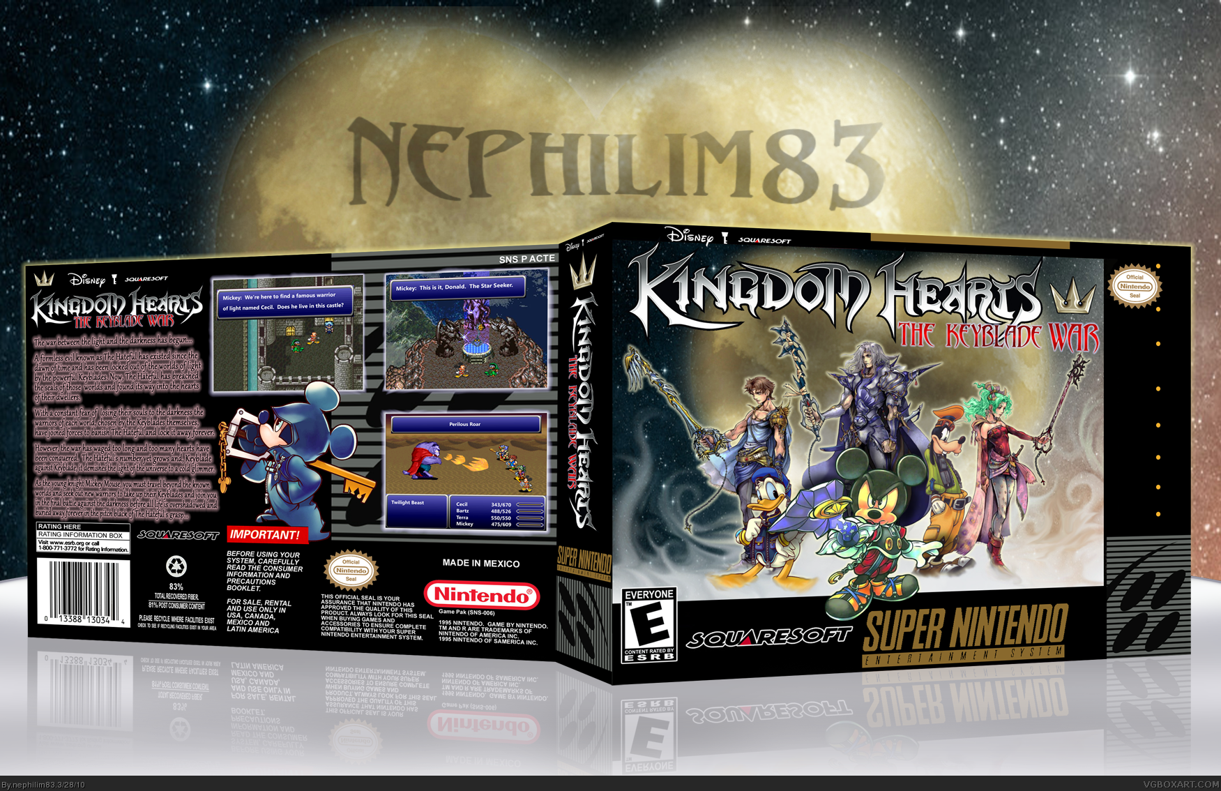
I updated to version 2 with a more legible text. It doesn't really fit in there like I wanted it to, but it was the most easy to read font that still fit there at all. The good thing is I didn't have to cut out any of the synopsis.
Anyway, here it is!
Thanks again for your feedback!
[ Reply ]
I saw that you updated this, it looks much better.
[ Reply ]
#12, Thanks. I just hate that it took me so long to find a decent font....
[ Reply ]
Really liking this one. :) Love the smoke effects on the front.
[ Reply ]
#14, Thanks, man. Means a lot coming from you. The smoke effects are just a little fun I had with the trusty ol' smudge tool. Is there anything that you can do with that thing??
[ Reply ]
#14, I agree, the smoke effects are awesome, great job!
[ Reply ]
this should be the HOF :D
[ Reply ]
#17, Thanks! Maybe it'll make it one day.....
[ Reply ]
I didn't point this out before, but maybe you could edit Mickey on the front, he has the green tint to him, possibly because that render is from a scan. Good still.
[ Reply ]
strange...
[ Reply ]
Not a fan of kingdom hearts, but a hardcore fan of SNES and this kind of BoxArt. FAVORITE!
[ Reply ]