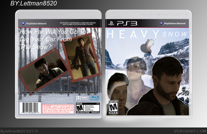
My 2nd box : Heavy Snow! ^^
I'm still practicing my PhotoShop skills, and I will update this box with more logos and text on the back!
But tell me what you think.
Credits:
PS3 Template: deiviuxs
Borders: LEGOslayer
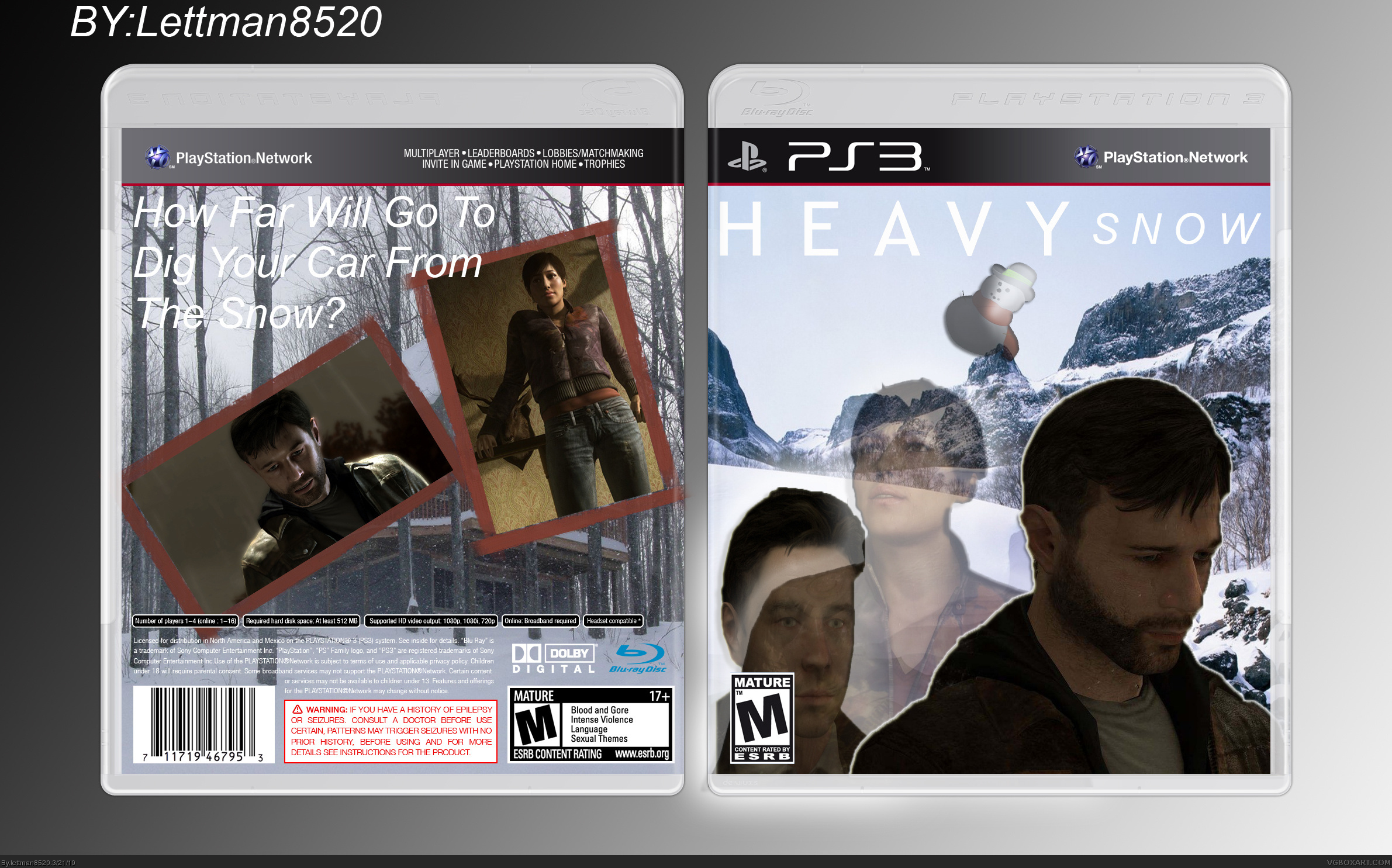
Its funny, but it looks pretty low quality. Since you're still working on your photoshop skills I'd like to throw you a few tips:
1. Never squish or stretch your renders. To makesure that you maintain the exact ratio when resizing use the boxes at the top to manually type in the percentage you want. If they have the same numbers then its still the perfect proportion. Basically, do one direction or the other manually first to get it to about the size you're looking for, then whatever number is in that box type it in the other.
2. Don't put white letters on light colored backgrounds. We can't read them or have a hard time reading them. You can still use white, but it's a good idea to put a darker colored border or shadow or something of the like to give it a bit of contrast from the scenery.
3. On the tool bar: Image/adjustments/Brightness&Contrast... This is your friend! When a render is too dark or murky looking you can easily living it up by turning up the brightness and adjusting the contrast to make it really pop! That render of Ethan Mars could really use some of that.
I love the idea, and there's definitely potential to it! Keep practising, and it will be great!
And I'd like to add something to nephilim93's tips:
When resizing pictures, use the lasso tool (it works with others too, I suppose), right click, press "free transform" and also press the small icon in the top menu that looks a bit like a chain. The picture will now keep it's proportions!
 Heavy Snow Box Cover Comments
My 2nd box : Heavy Snow! ^^
I'm still practicing my PhotoShop skills, and I will update this box with more logos and text on the back!
But tell me what you think.
Credits:
PS3 Template: deiviuxs
Borders: LEGOslayer
Edited at 1 decade ago
[ Reply ]
Its funny, but it looks pretty low quality. Since you're still working on your photoshop skills I'd like to throw you a few tips:
1. Never squish or stretch your renders. To makesure that you maintain the exact ratio when resizing use the boxes at the top to manually type in the percentage you want. If they have the same numbers then its still the perfect proportion. Basically, do one direction or the other manually first to get it to about the size you're looking for, then whatever number is in that box type it in the other.
2. Don't put white letters on light colored backgrounds. We can't read them or have a hard time reading them. You can still use white, but it's a good idea to put a darker colored border or shadow or something of the like to give it a bit of contrast from the scenery.
3. On the tool bar: Image/adjustments/Brightness&Contrast... This is your friend! When a render is too dark or murky looking you can easily living it up by turning up the brightness and adjusting the contrast to make it really pop! That render of Ethan Mars could really use some of that.
4. Don't give up and practice often!
Hope to see some more of your work soon! ;)
[ Reply ]
I love the idea, and there's definitely potential to it! Keep practising, and it will be great!
And I'd like to add something to nephilim93's tips:
When resizing pictures, use the lasso tool (it works with others too, I suppose), right click, press "free transform" and also press the small icon in the top menu that looks a bit like a chain. The picture will now keep it's proportions!
Edited at 1 decade ago
[ Reply ]
#3, well, now... Thanks. You just taught me something, too!
[ Reply ]
I have to say, I really like that tagline, haha.
[ Reply ]
#2, Thanks man, I'll definitely follow your tips!
[ Reply ]
#3, Thanks for the tip ^^
[ Reply ]
#5, Lol took me a while to come up with it, even though it's so simple.
[ Reply ]