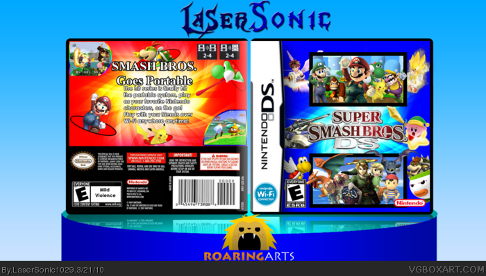
Not only is it not very good design-wise (floating charrys, strange placement etc, I dont see how the box is anything like the one you are supposed to make it like. I mean, the logos in the same spot, but there is no reference to a comic book, the characters are VERY differently placed and the back has NO resemblence whatsoever. Therefore, I dont consider this going by the rules of the comp.
The back is too bad. The front is epically amazing, but the back is just kind of sad compared. I would recommend completely scrapping the back and starting over.
It looks like two different boxes. The front is relatively good, though I don't like the characters in the edges. The back however seemes extremely mal-placed. The red sticks out from the blue theme of the rest of the picture too much.
 Super Smash Bros. DS Box Cover Comments
my entry for the Roaring Arts Competition
I'm supose to remake this box:http://vgboxart.com/view/15246/super.smash.bros.ds/?replies=7
Enjoy
[ Reply ]
eh its ok, not your best
[ Reply ]
I have to agree with MK91.
Edited at 1 decade ago
[ Reply ]
Not only is it not very good design-wise (floating charrys, strange placement etc, I dont see how the box is anything like the one you are supposed to make it like. I mean, the logos in the same spot, but there is no reference to a comic book, the characters are VERY differently placed and the back has NO resemblence whatsoever. Therefore, I dont consider this going by the rules of the comp.
[ Reply ]
Seems quite messy.
[ Reply ]
#2, I disagree. It's not perfect, but it's actually pretty good.
[ Reply ]
The back is too bad. The front is epically amazing, but the back is just kind of sad compared. I would recommend completely scrapping the back and starting over.
[ Reply ]
It looks like two different boxes. The front is relatively good, though I don't like the characters in the edges. The back however seemes extremely mal-placed. The red sticks out from the blue theme of the rest of the picture too much.
[ Reply ]
The black borders on the front ruin it. Use something more creative.
[ Reply ]
maybe some more text on the back, nthe wi-fi logo goes above the Nintendo DS logo, and maybe some more information from the ESRB
[ Reply ]