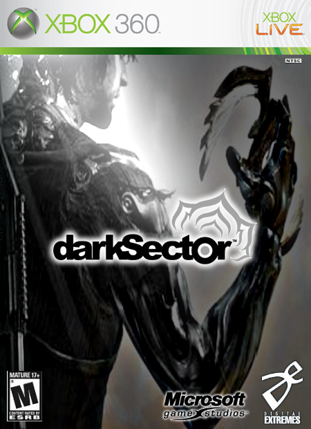
I wanted this one to have amost a comic book feel to it, but still look like a real person at the same time. So the slight bluriness is there for that reason. Other than that, i wanted the title to stand out the most. So other than that, please comment and rate :)

 Dark Sector Box Cover Comments
I wanted this one to have amost a comic book feel to it, but still look like a real person at the same time. So the slight bluriness is there for that reason. Other than that, i wanted the title to stand out the most. So other than that, please comment and rate :)
[ Reply ]
omg man that is wicked 5/5 and if i could rate higher i would personally i like bluriness on some boxes
[ Reply ]
#2, thanx john43. i'm glad youlike the blurriness. i thought i would get flamed.
[ Reply ]
everyone got on me bout that on my too human box but i thougt it was pretty cool
[ Reply ]
#4 that is a neat box art. I think blurring helps bring attention to the title. but it shouldn't be done too much.
[ Reply ]
I mad ethe dvs and stuff smaller, and gave the DE logo a drop-shadow...
[ Reply ]