use this font on the back link
and instead of a gradient, use a stroke, also, add pipes and such along the bottom. then ill fav
and you spelt series wrong
The front is nice but the back is OK, it's a bit random with artwork of random objects. I also don't really like the space background. But the front is nice and I love that logo so I'll fav!
The front is beautiful, however the back is just all wrong. I'm sorry man but it just ruins the main basic layout of your box. I do however like the font, but the random layout and the space look really doesn't go for this game. Overall nice work, I would again fix the back. 3/5
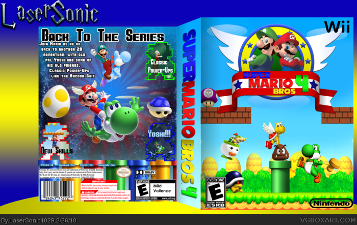
 Super Mario Bros. 4 Box Cover Comments
I've finally Post it
This was a BIG project(For me)
Tell me What you think
[ Reply ]
this is really good. 5/5 fav
[ Reply ]
The front is great but the back I'm not so crazy about. 8/10
[ Reply ]
#2, Thanks
#3, It took a lot of custom work
[ Reply ]
Th back really ruins it for me. The BG is boring, I don't like the screenborders and I really don't like the fonts you used.
The front is ok I guess, but it keeps bugging me that mario and luigi are on a sonic logo.
It's good but you need to fix the back 3/5
[ Reply ]
#5, I'll try
[ Reply ]
use this font on the back
link
and instead of a gradient, use a stroke, also, add pipes and such along the bottom. then ill fav
and you spelt series wrong
Edited at 1 decade ago
[ Reply ]
#7, Working on it
[ Reply ]
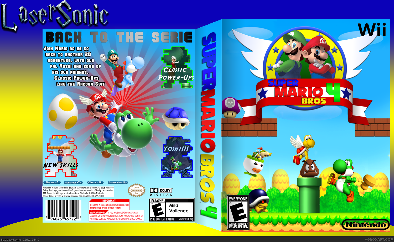
Updated!!!!!
[ Reply ]
The back and front don't match well.
[ Reply ]
The front looks pretty good, the back looks more like a Super Mario Galaxy box.
[ Reply ]
Is this galaxy or a original super Mario bros type game?
[ Reply ]
I got a question. Why does everyone think that Mario and Sonic were in two games together that their game art works together on one anothers games?
[ Reply ]
wow, way better :)
[ Reply ]
The front is nice but the back is OK, it's a bit random with artwork of random objects. I also don't really like the space background. But the front is nice and I love that logo so I'll fav!
[ Reply ]
The back reminds me of SMG :p
The front is Ok. +fav
[ Reply ]
I don't like the logo... to Sonic-ish.
[ Reply ]
The front is beautiful, however the back is just all wrong. I'm sorry man but it just ruins the main basic layout of your box. I do however like the font, but the random layout and the space look really doesn't go for this game. Overall nice work, I would again fix the back. 3/5
[ Reply ]
This box is a bit FAIL
[ Reply ]
Wuzz up with people using the same temp style as mine. I mean I have no problem with it, but just a few people are starting to do it all of a sudden.
[ Reply ]
The front and back don't match at all.
[ Reply ]
amazing laser sonic this needs to be in hall of fame ill fav, though i fav so much of your boxes it probably docent matter anymore.
[ Reply ]
#21, I know....
#22, EVERY fav matters to me
PS: Almost Rank 6!!
Edited at 1 decade ago
[ Reply ]
alsome but take the hammer from yoshi and tell me the story
[ Reply ]
#24, tell you the What?
[ Reply ]
Why would you put the Sonic ring and wings on a Mario box?
Also, there is no point in Super Mario Bros. 4 when they have NSMB!
[ Reply ]