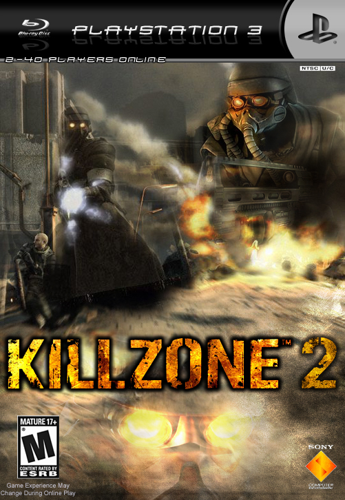
Well, for one thing, the new template looks better, but I think the box for the '2-40 Players Online' should be bigger, or atleast the right size for the words to fit in it. Again, I like the '2', it's nothing but perfection. I actually preferred your first Killzone 2 box, it was simple and easier to look at it. This is good, but there's just too much blending and it's a bit confusing.

 Killzone 2 Box Cover Comments
Here's my new and (i think) refined Killzone 2 box. complete with my new temp and online play!
comments would be absolutely fabulous =D
[ Reply ]
Well, for one thing, the new template looks better, but I think the box for the '2-40 Players Online' should be bigger, or atleast the right size for the words to fit in it. Again, I like the '2', it's nothing but perfection. I actually preferred your first Killzone 2 box, it was simple and easier to look at it. This is good, but there's just too much blending and it's a bit confusing.
[ Reply ]
i realy like your work but i think that the playstation logo and blu-ray disk logo should be switched
[ Reply ]
ok, i'll update it soon. thanks for the feedback! =D
[ Reply ]
NO MOZINAA.09 the playstation logo is always on the right side. the box art is OK 3.5/5
[ Reply ]
thats not what he meant. He's talking about the text "Playstation 3" and the blu-ray logo.
which i did.
i love my new template :)
[ Reply ]
Hey, I'm making an Assassins Creed box. Can I use that template?
[ Reply ]
EB Games jacked this boxart .
[ Reply ]