[ Box updated on January 27th, 2010 ] [ original ]
 Glee: Season One, Special Edition Box Cover Comments
Comment on tmrd's Glee: Season One, Special Edition Box Art / Cover.
[ Box updated on January 27th, 2010 ] [ original ]
Comment on tmrd's Glee: Season One, Special Edition Box Art / Cover.
You guys had better like this version cuz I lost the xcf file by accident :(
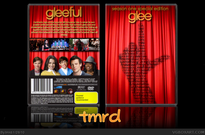
This was a big project for me. I am obsessed with glee, and have all 52 songs on my iTunes. I wanted to make a box very different from my style, without making a gun game, so I came up with this. I originally had curtains with a person sticking that out through the curtains. I saw roarshark's old brawl WiP, and that inspired the front. BTW, the hand on the front is actually my hand, lol. The words gleeful are an edited version of the font Century Gothic. Errr... I also rendered everything.
This is for the VGBA group cup comp thingo, held by GrahamZ.
Credit goes to jevangod for the amazing template provided in his template kingdom thread.
I must also credit Ayron for the amount of help he has goven me with this.
Edited at 1 decade ago
[ Reply ]
i fucking love it yes fav autor + fav
i love glee too (listening right now) awesome
[ Reply ]
I'm indifferent to this.
Edited at 1 decade ago
[ Reply ]
I can't really say anything for this because I have not watched the series before. My only complaint would be on the back you just end the image where if you faded the bottom of the image to black it would look a lot better.
Do that and I'll fav.
[ Reply ]
I couldnt wait for you too post it. Its nice to see something different from you, very nice job here.
[ Reply ]
#2, Thanks :D
#3, please explain why you don't like it. If it is simply because you dont like glee, that is a pathetic reason not to at least give me feedback.
#4, Updated :D
#5, Thankyou, I wanted to do somethin different. Never will I ditch my mario style though, don't you worry, :P
[ Reply ]
im sorry, but to me, its pretty generic :(
[ Reply ]
#6, Nah I didn't feel like giving you feedback because you posted 'will edit with first comment.'
[ Reply ]
#7, Kinda like the show.
[ Reply ]
#7, I dont see how this is generic, but meh, you dont have to like it.
#8, that was so I could get first comment, I do it for almost all my boxes.
[ Reply ]
I like it.
[ Reply ]
#11, lol, thanks.
I think its a bit odd that not many people like it but I think its like, my best box, haha
[ Reply ]
#12, I dont think its your BEST box bit i still think its good :) Like I sadi maybe it wouldve been better as critereon? (or however you spell it lol.)
#8, Constructive criticism is the rule, remember not to just say something like it sucks... come on man the rules are below the comments.
Edited at 1 decade ago
[ Reply ]
It looks like you really put alot of thought into it,and that's what i like about it.
[ Reply ]
Dear lord, you like this show?
God, after watching the first 10 minutes of the pilot, I wanted to shoot myself.
Anyway, as for the box, its just... average. Its missing the 'wow' factor, I believe.
[ Reply ]
Never seen the show but the box looks good.
[ Reply ]
#13, I dont think it can be criterion, its not a movie, haha.
#14, Thanks, I did.
#15, You caught me. I'm a tad obsessed, I'm a gleek. :P
#16, Thanks :D
[ Reply ]
#13, I didn't leave any type of criticism of the box. I didn't say it sucked. I just object to him trying to solicit comments.
But if you want me to comment about the box, I will--I think it's boring and generic. Same red curtain graphic on both the back and front.
Show sucks, too.
[ Reply ]
Never saw the show I don't think I want too
The doesn't really appeal to me sorry but that just me. also the background for the general info goes off the template.
[ Reply ]
I really like the idea of the words on the hand.
But as S_O said there something missing..I don't know what mabye try adding a "rising sun" brush on the front to just make it stand out more :)
[ Reply ]
I really like the front. ;)
[ Reply ]
This is a great box, for a great show.
[ Reply ]
Looks great buddy, keep up the good work.
[ Reply ]
It sucks. No one likes it. IT SUCKS. IT FUCKING SUCKS. GET OFF THIS FUCKING SITE NOW.
[ Reply ]
It sucks. No one likes it. IT SUCKS. IT FUCKING SUCKS. GET OFF THIS FUCKING SITE NOW.
[ Reply ]
#24, #25, Ohhh sibling jealousy...
Edited at 1 decade ago
[ Reply ]
#18, Whatever.
#19, thanks, I hadnt noticed the legal info :)
#20, lol, I have no idea how to do that...
#21, Thanks, thats my fave bit too :)
#22, Agreed... On the show bit anyway lol.
#23, thanks :)
#24, #25, thanks for the wonderful critique. This should help me to improve this box to an ultimate standard.
[ Reply ]