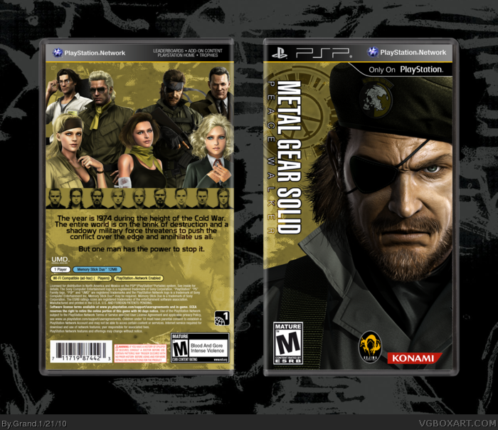
Don't like the lack of the logo on the front, or rather that no where on the box is the title. Bottom of the back looks rushed. Overall it looks good though. I'd say add a logo to the front and try something different with the bottom of the back. I get the simplistic look, but it I'd like to see the title somewhere.
 Metal Gear Solid: Peace Walker Box Cover Comments
Spent a few hours on this one, mostly fiddling around with dozens of layers and trying to get the colors right. In the end I just got fed up with it.
Template by Scorpion Soldier, and I modified Jevangod's case template to fit a PSP game.
[ Reply ]
Don't like the lack of the logo on the front, or rather that no where on the box is the title. Bottom of the back looks rushed. Overall it looks good though. I'd say add a logo to the front and try something different with the bottom of the back. I get the simplistic look, but it I'd like to see the title somewhere.
[ Reply ]
#2 I agree
Overall this is a very nice box. Fave
[ Reply ]
#2, It's late so I didn't try to do anything else with the back, but I added the title to the front.
I might just get rid of all the renders I put on the back and try to replace them with some screenshots instead.
Edited at 1 decade ago
[ Reply ]
I think the title of the game is too close to the left edge.
And the back text should probably be white. As black, it barely stands out.
[ Reply ]