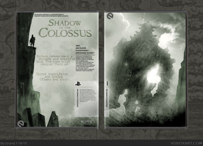
Spent a few hours on this one, starting by creating the background with multiple pieces of fan art, concept art, and screenshots for reference. Wanted to keep text minimal and overall I'm happy with the outcome.
#2, not very constructive. I realize it's a bit subdued but that's what I feel is the essence of the game. The game is almost entirely empty but there's always something looming on the horizon.
Another note: I was listening to the soundtrack when I made this.
And Essence temp by master_general, box temp by Jevangod
I really like this one. I still have never played Shadow of the Colossus but from an artistic stand point this looks awesome. From what I have heard of the game and from some of the art and music I have seen/heard I think that you captured the game perfectly. +Fav.
I don't understand why there are 1,579 (could be a glitch) views but yet only 4 comments, (not including yours). I like how the colossus is shrouded in clouds, the back seems a bit empty but it seems fine that way.
Not that bad, but the back...? Let me say it this way: The text on the back is not very well balanced. There is no real alignment of it and it seems like you just put it into the free areas you had left. This makes the text squeezed between the mountain image and the games specifications; the text about those "essence-packages" as well as the logo seem to be broken, becaue they don't have a clear line where they are arranged with the other text. link
#11, I know, but I am talking about the text you DID add. Or do you wanna tell me you did not add the whole copy-text (sixteen colossi...) as well as the title on the back. Don't know about the "essence"-text on top, but I've seen that one on yours for the first time.
However, it does not change the fact certain parts of YOUR text look kinda cramped or just like they have to fill some gaps.
 Shadow of the Colossus Box Cover Comments
Spent a few hours on this one, starting by creating the background with multiple pieces of fan art, concept art, and screenshots for reference. Wanted to keep text minimal and overall I'm happy with the outcome.
[ Reply ]
Yawn
[ Reply ]
#2, not very constructive. I realize it's a bit subdued but that's what I feel is the essence of the game. The game is almost entirely empty but there's always something looming on the horizon.
Another note: I was listening to the soundtrack when I made this.
And Essence temp by master_general, box temp by Jevangod
[ Reply ]
I really like this one. I still have never played Shadow of the Colossus but from an artistic stand point this looks awesome. From what I have heard of the game and from some of the art and music I have seen/heard I think that you captured the game perfectly. +Fav.
[ Reply ]
I too really like the mood of this box, probably deserves more attention.
+Fav
[ Reply ]
Your ability with the Essence idea and template is definitely beyond many on this site. This captures the feel of the game excellently.
[ Reply ]
I don't understand why there are 1,579 (could be a glitch) views but yet only 4 comments, (not including yours). I like how the colossus is shrouded in clouds, the back seems a bit empty but it seems fine that way.
Edited at 1 decade ago
[ Reply ]
#6, Thanks for the great compliment.
#7, It seems to be a trend. My boxes get shitloads of views but very few comments. My Darksiders box has almost 5,000 views and only 13 comments.
[ Reply ]
Printable requested, so I added it.
[ Reply ]
Not that bad, but the back...? Let me say it this way: The text on the back is not very well balanced. There is no real alignment of it and it seems like you just put it into the free areas you had left. This makes the text squeezed between the mountain image and the games specifications; the text about those "essence-packages" as well as the logo seem to be broken, becaue they don't have a clear line where they are arranged with the other text. link
Edited at 1 decade ago
[ Reply ]
#10, I didn't make the template--I leave all of the temp text untouched.
[ Reply ]
#11, I know, but I am talking about the text you DID add. Or do you wanna tell me you did not add the whole copy-text (sixteen colossi...) as well as the title on the back. Don't know about the "essence"-text on top, but I've seen that one on yours for the first time.
However, it does not change the fact certain parts of YOUR text look kinda cramped or just like they have to fill some gaps.
[ Reply ]
COVER IS VERY COOL. NICE JOB.
[ Reply ]
Wow, exactly what I was looking for. Splendid job!
[ Reply ]
Great
[ Reply ]