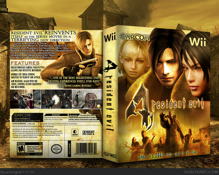
Yea so you know its been a while since i've done a Resident Evil box. So I actually did my research here. I looked at all the other boxes on the site and made it look different from all of them. I was actually inspired by the movie Joy Ride poster link
Plus I used an old render of Leon that they were gonna use but then scrapped it. It was in the Resident Evil 3.5 gameplay you can see on youtube.
You should stop putting your text that much on the edges... Even if it is a fake-box mind that the text could be cut off during printing when you do this. The "glow" on the text on the front is not my thing either.
#14, You are right. I don't post my boxes in 3-d views and use the same templates over and over, while you seem to create a new template every time. Kudos on the box. +fave.
#14, technical stuff got nothing to do with "own style". you still can have your own style but you should mind certain things, when doing boxes (etc).
BTW: there is a typo on the copy on the back. Just before the word "knive" is a blank. But maybe that's no typo and your own style? However, it does not make much sense to allign everything on the right side apart from two things (the "knive" and the "Leon .. is now"). The latter would work with a diffrent makeup a lot better, like without the break after "now" (resulting in such a big open space compared to the rest of the text), or even as a simple headline.
THAT'S A PRINTABLE? Sorry, but it just got 8 x 5 cm with 300 dpi... very LOW quality. A printable should have the original size at 300 dpi for the best results.
Besides: for what package should people print this one? I mean... the spine doesn't fit the real Wii-covers.
#20, Errrr... Aren't "printables" supposed to be printable? Like "real" printable stuff? Just uploading it because you wanna have a 2D-Version seems... oh well.
#22, Sure... You don't care about technical issues as long as they are on your works too. Even though you are doing this stuff just for fun you should at least try to "get to the next level" in starting to matter about certain stuff.
Anyways, there are rules about posting and if I do remember right THIS here is a bit off from adding a printable. I have to admit I am not that firm with the rules for it.
True true. I dont know why but I just like it this way. Its a bit different from everyone elses. Like your PS3 ones. When you didnt have the big plastic temp on them.
I would love to print this and wedge it into the box sleeve, but there are issues that I share with a lot of the other commenters:
1 - The GOTY tag at the bottom of the front doesn't work; things like that have been the downfall for many other boxarts in the past, like BioShock or Okami (Wii). 100% artwork with logo always works perfectly.
2 - The spine works for a PC box, and, unlike you, I despise thick PC boxes; too much shelf space taken up for something that can fit in something half - or a fourth - of that size.
I understand your reasons for it, and I can't persuade you otherwise, but I would love to be able to put this in a standard DVD box.
 Resident Evil 4 Box Cover Comments
Yea so you know its been a while since i've done a Resident Evil box. So I actually did my research here. I looked at all the other boxes on the site and made it look different from all of them. I was actually inspired by the movie Joy Ride poster link
Plus I used an old render of Leon that they were gonna use but then scrapped it. It was in the Resident Evil 3.5 gameplay you can see on youtube.
[ Reply ]
I like it, I like it a lot! Fav.
[ Reply ]
Holy Hell that's good.
Fav.
[ Reply ]
good lord that is awesome!
[ Reply ]
Ooooooh sexy.
[ Reply ]
This is great! Really well done!
[ Reply ]
Oh shit, I'm toast.
[ Reply ]
Front would be amazing without that text on the bottom.
Back is nothing special...
[ Reply ]
Thanks people.
[ Reply ]
Wow this is awesome, the only thing I don't really like is the white glow on the bottom text on the front, but that's very minor. Great job!
[ Reply ]
Awesome, I like the way you do your templates...
[ Reply ]
Love the color comp on this. Great work!
[ Reply ]
You should stop putting your text that much on the edges... Even if it is a fake-box mind that the text could be cut off during printing when you do this. The "glow" on the text on the front is not my thing either.
Edited at 1 decade ago
[ Reply ]
#13, Yea. Well we all have our own style.
[ Reply ]
#14, You are right. I don't post my boxes in 3-d views and use the same templates over and over, while you seem to create a new template every time. Kudos on the box. +fave.
[ Reply ]
#14, technical stuff got nothing to do with "own style". you still can have your own style but you should mind certain things, when doing boxes (etc).
BTW: there is a typo on the copy on the back. Just before the word "knive" is a blank. But maybe that's no typo and your own style? However, it does not make much sense to allign everything on the right side apart from two things (the "knive" and the "Leon .. is now"). The latter would work with a diffrent makeup a lot better, like without the break after "now" (resulting in such a big open space compared to the rest of the text), or even as a simple headline.
Edited at 1 decade ago
[ Reply ]
#16, Yea your right.
[ Reply ]
PRINTABLE ADDED.
[ Reply ]
THAT'S A PRINTABLE? Sorry, but it just got 8 x 5 cm with 300 dpi... very LOW quality. A printable should have the original size at 300 dpi for the best results.
Besides: for what package should people print this one? I mean... the spine doesn't fit the real Wii-covers.
Edited at 1 decade ago
[ Reply ]
#19, I know it doesnt. I just like having a 2d version of it.
[ Reply ]
#20, Errrr... Aren't "printables" supposed to be printable? Like "real" printable stuff? Just uploading it because you wanna have a 2D-Version seems... oh well.
[ Reply ]
#21, Doesnt matter to me.
[ Reply ]
#22, Sure... You don't care about technical issues as long as they are on your works too. Even though you are doing this stuff just for fun you should at least try to "get to the next level" in starting to matter about certain stuff.
Anyways, there are rules about posting and if I do remember right THIS here is a bit off from adding a printable. I have to admit I am not that firm with the rules for it.
Edited at 1 decade ago
[ Reply ]
#23, Yea. I read that once.
[ Reply ]
Pretty damn nice. Forgive me if you've addressed this already, I haven't read through all the comments, but why'd you choose to make it so thick?
[ Reply ]
#25, I dont know. I just like when the boxes are thick. It gives you more to work with.
[ Reply ]
#26, but the "skill" behind package-design is to do something fitting for the template - not to make the template fit what you wanna do ;)
[ Reply ]
#27,
True true. I dont know why but I just like it this way. Its a bit different from everyone elses. Like your PS3 ones. When you didnt have the big plastic temp on them.
[ Reply ]
#28, as mentioned, I got the temp from some japanese pages, since the first images of ps3 games hat such a these on some photos ;)
[ Reply ]
#29, Ohhh I see. Well... its something different that stands out from other boxes. So thats all I really wanted.
[ Reply ]
Great colours.
[ Reply ]
W00T This is amazing!
[ Reply ]
Not perfect with the text too close to the edges and floating heads are not to everyone's taste but great layout and colour palette.
[ Reply ]
I would love to print this and wedge it into the box sleeve, but there are issues that I share with a lot of the other commenters:
1 - The GOTY tag at the bottom of the front doesn't work; things like that have been the downfall for many other boxarts in the past, like BioShock or Okami (Wii). 100% artwork with logo always works perfectly.
2 - The spine works for a PC box, and, unlike you, I despise thick PC boxes; too much shelf space taken up for something that can fit in something half - or a fourth - of that size.
I understand your reasons for it, and I can't persuade you otherwise, but I would love to be able to put this in a standard DVD box.
[ Reply ]
Very very very nice.
[ Reply ]