I really want to like this box.... but I just cant!
The front is 'okay' but I really dont like Sonic's pose.
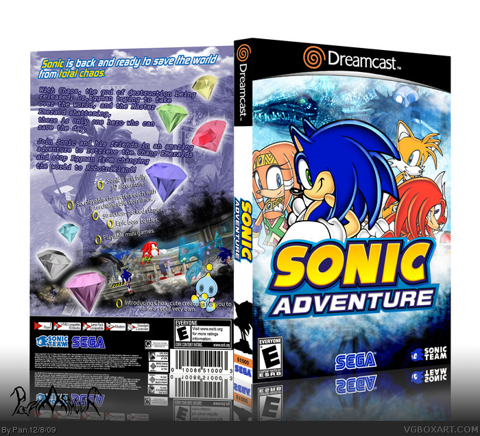
It makes little sense why the unplayable character Tikal is on the front rather than Amy or even Big.
And not trying to be too harsh or anything, but the back is a mess and holds very little structure.
Overall, decent attempt but could of been so much better 2.5/5
I don't see what's wrong with the back really. As for the front, Big and E-102 are very lame characters and don't add much to the story, I did have Amy on there but she didn't fit in very well. I consider Tikal a more important character to the story than those 3 so I used her.
#11, Fair enough, the others didn't really tell me why they didn't like the back, but I don't see being crowded as a problem since I was able to make everything still readable.
Also not that it matters, the back of the official is really crowded as well: link
Hey! Overally a nice job, especially on the front.
I think what's wrong with the back is it just seems a little big too "fiddly" and "messy". It looks like you're trying to throw too much at the viewer with too little space to do it in.
Part of it is the descriptive text which I think would be better in a slightly smaller font and also in white - with a slightly less thick border.
Regarding the smaller, bullet-pointed text, it isn't quite as easy to read because the small drop shadow that it's got doesn't quite define it enough. I might suggest a black outer glow?
 Sonic Adventure Box Cover Comments
Just another Sonic box to add to the site, nothing special.
I recently acquired a Dreamcast so me and my friend are going to be converting games to DVD cases.
Edited at 1 decade ago
[ Reply ]
Ah... My fav. Sonic game.
One problem, the screens are from the GC version, the graphics isn't that good on the DC ^^
[ Reply ]
Awesome!
#2, It doesn'y matter, they look better anywho.
[ Reply ]
Good grief. So awesome.
If it wasn't for that awful back, this would have been Hall of Fame!
[ Reply ]
I agree with #4, though I think "awful" is a bit harsh.
[ Reply ]
The front is sweet. The back, well...
[ Reply ]
The front is good, as for the back it's not bad just really fit doesn't the game or this box.
[ Reply ]
I really want to like this box.... but I just cant!
The front is 'okay' but I really dont like Sonic's pose.
It makes little sense why the unplayable character Tikal is on the front rather than Amy or even Big.
And not trying to be too harsh or anything, but the back is a mess and holds very little structure.
Overall, decent attempt but could of been so much better 2.5/5
[ Reply ]
I don't see what's wrong with the back really. As for the front, Big and E-102 are very lame characters and don't add much to the story, I did have Amy on there but she didn't fit in very well. I consider Tikal a more important character to the story than those 3 so I used her.
[ Reply ]
I likez it.
Even the back.
insta fav for Sonic
[ Reply ]
#9
The problem is the back seems a little too crowded.
[ Reply ]
#11, Fair enough, the others didn't really tell me why they didn't like the back, but I don't see being crowded as a problem since I was able to make everything still readable.
Also not that it matters, the back of the official is really crowded as well:
link
[ Reply ]
You need update.
Rule 1: Change the screenshots into DC version.
That's all and FAV.
Edited at 1 decade ago
[ Reply ]
#13, I have to reprint this anyway so I'll try and change the screenshots before then.
[ Reply ]
Hey! Overally a nice job, especially on the front.
I think what's wrong with the back is it just seems a little big too "fiddly" and "messy". It looks like you're trying to throw too much at the viewer with too little space to do it in.
Part of it is the descriptive text which I think would be better in a slightly smaller font and also in white - with a slightly less thick border.
Regarding the smaller, bullet-pointed text, it isn't quite as easy to read because the small drop shadow that it's got doesn't quite define it enough. I might suggest a black outer glow?
-TCM
[ Reply ]
Nicely done.
[ Reply ]
...
I quite like the back...
[ Reply ]