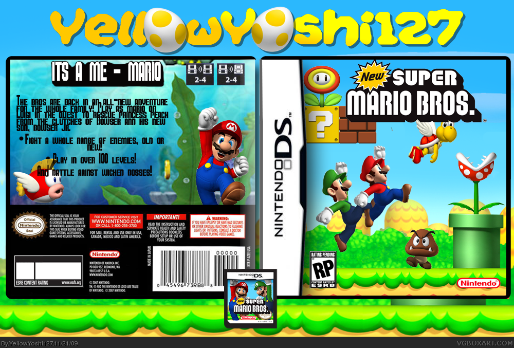
Put the paratroopa at the front of the logo, make the logo bigger, and take off the template outer shadow (or at least make it less strong); by the way that's not Javan's temp, IMO.
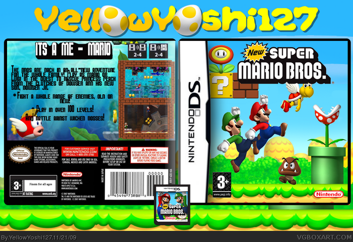
The back seems to be empty, the synopsis font is hard to read, and the tagline font is kinda boring, also the screenshot borders needs some work... by the way, the back water scheme doesn't fit with the front.
Put ESRB ratings instead the PEGI ones.
#8, Woooaah I have got a lot to work on!! I think it is hevans as it was off his template kindom, I just edited it a bit and added a card. I don't reall think it's my BEST but I think it's alright. My favourite was yoshi's tropical island really.. But thanx for the comment, I'll try and work on it!
As for the box, the front is good but VERY generic. I would have liked to see you try something a little bit different. The screenshot borders look messy and the positioning of the text looks weird.
 NEW Super Mario Bros. Box Cover Comments
My latest, what do you think?
Woops forgot screenshots, update in a mo. Template by Jevan and userlogo by tmrd.
Edited at 1 decade ago
[ Reply ]
You should really change from RP to E
and there's a tiny piece of pixels under the logo
And Mario and Luigi's too small
[ Reply ]
#2, I was just updating those things as you wrote!!! Is it better now?
[ Reply ]
#3, Yep
+FAV
[ Reply ]
#4 Cool thanx mate!
[ Reply ]
*looks at front*
Nice, good work!
*looks at back*
o.O
[ Reply ]
#6, Is it THAT bad??? :(
Edited at 1 decade ago
[ Reply ]
Put the paratroopa at the front of the logo, make the logo bigger, and take off the template outer shadow (or at least make it less strong); by the way that's not Javan's temp, IMO.
The back seems to be empty, the synopsis font is hard to read, and the tagline font is kinda boring, also the screenshot borders needs some work... by the way, the back water scheme doesn't fit with the front.
Put ESRB ratings instead the PEGI ones.
But, also, this is your best work yet.
+Fav
Edited at 1 decade ago
[ Reply ]
#8, Woooaah I have got a lot to work on!! I think it is hevans as it was off his template kindom, I just edited it a bit and added a card. I don't reall think it's my BEST but I think it's alright. My favourite was yoshi's tropical island really.. But thanx for the comment, I'll try and work on it!
[ Reply ]
make the text white with a black outline on the back, and replace the cheep cheep with a coin & put it in fornt of the text.
[ Reply ]
#10, OK thanx, how do you do outlines exactly?
[ Reply ]
Looks good. I love the idea of an underwater theme for the back, very unique. You should bring the DS Card up onto the ground.
Faved.
[ Reply ]
#12 Thanx a lot :), i was trying for a different back as i was a bit bored of the same background on the front and on the back.
[ Reply ]
#9, I think its spypilot's.
As for the box, the front is good but VERY generic. I would have liked to see you try something a little bit different. The screenshot borders look messy and the positioning of the text looks weird.
[ Reply ]