[ Box updated on October 28th, 2009 ] [ original ]
 Prototype Collector's Edition Box Cover Comments
Comment on miamiflash's Prototype Collector's Edition Box Art / Cover.
[ Box updated on October 28th, 2009 ] [ original ]
Comment on miamiflash's Prototype Collector's Edition Box Art / Cover.
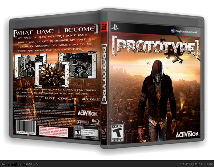
My latest work, tell me what you think, is it a step up or down.
[ Reply ]
It's one of your better backs, Although the front seems like somewhat of a step down. Kind of looks like he's stretched on the front, maybe it's just my eyes I dunno. I don't really feel the renders on the front go well together.
[ Reply ]
#2, that's what updates are for, just tell me what the front needs, i am thinking maybe, the same front as back.
i will update it.
[ Reply ]
You should use only one Alex render, also change the front BG and use the official logo.
[ Reply ]
#4, official logo makes it boring, it just looks bad, i am putting one update now and then if it doesn't look good i will then update it to v3.
i have used one render and the background looks alot better.
[ Reply ]
Edited at 1 decade ago
[ Reply ]
It looks better now but you used the same BG in the front and back, you should center Alex and add some editing to him.
Also, you used the PEGI seal in the front but ESRB in the back, fix that.
Edited at 1 decade ago
[ Reply ]
i like it il´l fav it
[ Reply ]
#7, i was actually thinking about putting mercer in the center, i will see if i can half the BG's from the front and back and try to wrap it around the case.
i will also fix the esrb thing, i will use a T for Teen logo.
[ Reply ]
my fourth update, credit to super-mega-hyper-sonic for the assist on making it 3D.
it actually looks alot better in 3D then 2D.
[ Reply ]
The logo is very stretched and some things are blurry but other than that pretty good. Love the back design.
[ Reply ]
#11, i will try and use a larger logo, i have a small one for the spine, a middle one which i used here and i have another which is 2000 by 1500 so i will use the third one.
plus i will sharpen it, say 75% sharpen after moving into place.
thanks for your comment.
[ Reply ]
i like it
[ Reply ]