I'm honored. I love the color scheme, and I like the change to the logo itself. It kind of says "Limited Edition". Only thing is the back isn't as grungy as the front. I think it could use some of the same effect you had on the bottom of the front, in and around the back, maybe in blotches.
#7, Its the same presentation as always. But I don't know if this is the background or something you did, but what ever is behind Link looks awesome, but Like I said if its just part of the background its not good anymore.
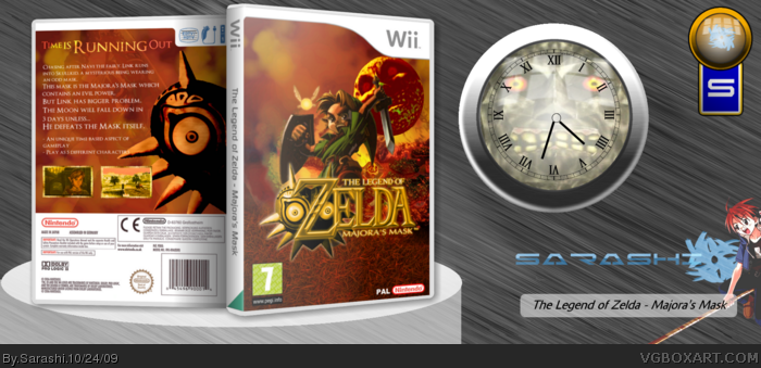
Nicely done, the color scheme is very well selected, it all really flows nicely together, the back is a little simple, but a lot of official backs are simple like yours, good simple though, not plain simple. The presentation is a bit unnecesarry with the clock as big as 1/2 of the box, maybe just a disc or something half under the box or just a presentation more compact, or maybe something that fits with the box, to make the box more appealing, just a tip ;)
 The Legend of Zelda: Majora's Mask Box Cover Comments
Credit to Ray Blade for the logo.
I think I added a lot of text, but hey!
[ Reply ]
love the colour scheme ;)
[ Reply ]
I'm honored. I love the color scheme, and I like the change to the logo itself. It kind of says "Limited Edition". Only thing is the back isn't as grungy as the front. I think it could use some of the same effect you had on the bottom of the front, in and around the back, maybe in blotches.
Overall it's really good though.
[ Reply ]
#4, It's meant to be grass XP
Anyway, I'm honoured that your honored that I honoured you!
Thanks a lot!
I'm also happy that Star98er fav'd the box.
[ Reply ]
Another good job, and nice choice in colors.
[ Reply ]
#2, Double posts don't come 6 minutes late :P.
Anyway, the box is....ok but nothing special. Nothing particurly wrong with it apart from the unnecessary presentation.
[ Reply ]
#7, Its the same presentation as always. But I don't know if this is the background or something you did, but what ever is behind Link looks awesome, but Like I said if its just part of the background its not good anymore.
[ Reply ]
Nice job. Although the clock and stuff is unnecessary and distracting.
[ Reply ]
Nicely done, the color scheme is very well selected, it all really flows nicely together, the back is a little simple, but a lot of official backs are simple like yours, good simple though, not plain simple. The presentation is a bit unnecesarry with the clock as big as 1/2 of the box, maybe just a disc or something half under the box or just a presentation more compact, or maybe something that fits with the box, to make the box more appealing, just a tip ;)
+fav
[ Reply ]
#7, My internet failed.
I had to unplug it and replug it. It lags. =P
K, thanks for all your crit. And favs. They help 8D
[ Reply ]
Has anyone noticed the Fierce Deity Link in the back's background?
[ Reply ]
...Damn. Triple post.
But it's worth it. First box to 30 favs.
Edited at 1 decade ago
[ Reply ]
woot woot
[ Reply ]