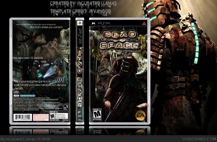
Edit: Just to help you I will give my thoughts. I think the front image shouldn't spread all the way to the back image, usually with officials the front and sometimes the spine is one design and the back is another that matches. Also you might want a border around your screens shots along with a couple more screen shots. Most officials use a basic font so it's easy to read and doesn't throw off the design too. Your font is the middle is different than the rest of the box.
Your copyright area has a black line across which I think is unnecessary a little. Your logo should be faded out and your might want to use one size with your text unless your going for a specific theme that would have unbalanced text.
Don't use 'Birth of a Hero.' In addition to it being an incredibly overused font, it doesn't quite fit the horror nature of Dead Space. 'Birth of a Hero' is something that you might see donning the cover of an indie rock CD. I'd recommend something more grung-y for survival horror titles.
 Dead Space Box Cover Comments
Here's my first box, Dead Space. I'm using Paint.NET, so bear with me. Template credit to Jevangod. View in full screen! Post your thoughts!
Edited at 1 decade ago
[ Reply ]
Good first man. welcome to the site =]
Edit: Just to help you I will give my thoughts. I think the front image shouldn't spread all the way to the back image, usually with officials the front and sometimes the spine is one design and the back is another that matches. Also you might want a border around your screens shots along with a couple more screen shots. Most officials use a basic font so it's easy to read and doesn't throw off the design too. Your font is the middle is different than the rest of the box.
Your copyright area has a black line across which I think is unnecessary a little. Your logo should be faded out and your might want to use one size with your text unless your going for a specific theme that would have unbalanced text.
Edited at 1 decade ago
[ Reply ]
good for a first the logo could be better cut out but well done for a first
heres your first fav :)
[ Reply ]
#2, thanks a lot. I appreciate your advice.
#3, yeah, I couldn't really find a good logo and I sorta rushed it when I cut it out. Thanks for the fav!
[ Reply ]
Don't use 'Birth of a Hero.' In addition to it being an incredibly overused font, it doesn't quite fit the horror nature of Dead Space. 'Birth of a Hero' is something that you might see donning the cover of an indie rock CD. I'd recommend something more grung-y for survival horror titles.
Also, IGN sucks.
[ Reply ]
#5, just because I put a quote from IGN on the box doesn't mean I like them, they're terrible.
[ Reply ]
#6, Wasn't implying that you liked them. I just saw another opportunity to say IGN sucks--and I took it. Because IGN Sucks.
...
IGN sucks.
[ Reply ]