horror_classic [ Buy The Wolfman ... at Amazon ] By super-mega-hyper-sonic 41 on October 18th, 2009 No Printable Available The Wolfman (2010) Box Cover Comments Comment on super-mega-hyper-sonic's The Wolfman (2010) Box Art / Cover. Cancel Reply super-mega-hyper-sonic 41 [ 1 decade ago ] Dunno why it is so small... Anyway cred to jeven and MG. [ Reply ] Oddmania 40 [ 1 decade ago ] Nice ! :] Looks cool, good job ! [ Reply ] super-mega-hyper-sonic 41 [ 1 decade ago ] #2, Thanks Odd! [ Reply ] MoneY 5 [ 1 decade ago ] Yes, realy great Job! I like the Wolfman...and I think, He love your Box to ;) [ Reply ] StarMario22 34 [ 1 decade ago ] Very well done! :) [ Reply ] jevangod 50 [ 1 decade ago ] Saw the trailer for this during Zombieland. Looks kinda of like Sonic Unleashed. Edited at 1 decade ago [ Reply ] super-mega-hyper-sonic 41 [ 1 decade ago ] #6, Do you like the box? [ Reply ] slimd1995 27 [ 1 decade ago ] Lower the opacity of the reflection. [ Reply ] super-mega-hyper-sonic 41 [ 1 decade ago ] #8, Does the reflection matter that much? [ Reply ] coolguy753 27 [ 1 decade ago ] #9, Yes. Everything matters. Also, the logo doesn't really fit in, the blue 15 logo is blurry. The back is OK but the stroke on the text really doesn't work well. [ Reply ] super-mega-hyper-sonic 41 [ 1 decade ago ] #10, Well it is very hard to find a good blue 15 so it is from a scan which isn't very high quality. sorry about logo. [ Reply ] dpmm07 15 [ 1 decade ago ] Nice box. [ Reply ]
 The Wolfman (2010) Box Cover Comments
Dunno why it is so small...
Anyway cred to jeven and MG.
[ Reply ]
Nice ! :] Looks cool, good job !
[ Reply ]
#2, Thanks Odd!
[ Reply ]
Yes, realy great Job! I like the Wolfman...and I think, He love your Box to ;)
[ Reply ]
Very well done! :)
[ Reply ]
Saw the trailer for this during Zombieland. Looks kinda of like Sonic Unleashed.
Edited at 1 decade ago
[ Reply ]
#6, Do you like the box?
[ Reply ]
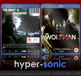
Lower the opacity of the reflection.
[ Reply ]
#8, Does the reflection matter that much?
[ Reply ]
#9, Yes. Everything matters.
Also, the logo doesn't really fit in, the blue 15 logo is blurry. The back is OK but the stroke on the text really doesn't work well.
[ Reply ]
#10, Well it is very hard to find a good blue 15 so it is from a scan which isn't very high quality. sorry about logo.
[ Reply ]
Nice box.
[ Reply ]