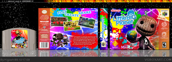
Originally, I was trying to do a Little Big Planet PSP version, except that I was trying to make a template N64, so I ended up creating a box of Little Big Planet for N64
I thought it could be better in "Unoficial" instead in "Humor", because I thought the final work of it became pretty decent.
The template was made by myself (I will upload in Resources later)
The N64 Cartridge template was not made by me.
Anyway, enjoy.
#1
I don't know how to make the pics more N64ish...
The colours, wow, there's so many!! This is great, such a vibrant, happy box as Ayron said, really fitting for the N64. I would have perhaps opted to keep Sony's logo off it, and maybe change the PSN logo to a RANDnet one (Nintendo's Japanese N64 gaming network, Japanese but still Nintendo.) I like the CGI looking screen there too, reminds me of how Capcom kept the CGI scenes for RE2 on N64.
That aside, perhaps the SCE and PSN logos would have looked quite at place there if Nintendo weren't such snakes to Sony all those years ago. Oh well!!
I like the color splashes and how they clash - it wouldn't work for the PS3 box art but this looks like how they'd do an N64 box, I don't know why :P 4/5 fav :DDD
 Little Big Planet Box Cover Comments
I love it but the screenshots, maybe add an effect to make them N64ish. + Fav
[ Reply ]
Hello there
Originally, I was trying to do a Little Big Planet PSP version, except that I was trying to make a template N64, so I ended up creating a box of Little Big Planet for N64
I thought it could be better in "Unoficial" instead in "Humor", because I thought the final work of it became pretty decent.
The template was made by myself (I will upload in Resources later)
The N64 Cartridge template was not made by me.
Anyway, enjoy.
#1
I don't know how to make the pics more N64ish...
Edited at 1 decade ago
[ Reply ]
Whoa, very colorful!
[ Reply ]
#2, It looks lovely anyway so just leave it then. :)
[ Reply ]
Brilliant! It looks like something even I would be proud of :)
Congratulations on your first Hall of Fame boxart (probably)
[ Reply ]
The box looks nice, but you probably should've used Nerdysimmer's cartridge temp (link) over my dirty scan :p.
[ Reply ]
oooo, nice. Very colourful indeed. +fav
[ Reply ]
LOL supported for playstation network. Like that would ever happen. Nintendo and Playstation getting along.
[ Reply ]
^ haha, you should edit it to Nintendo Network or something. :)
[ Reply ]
You should have used screenshots from the PSP game.
[ Reply ]
This is awesome, I love the colors.
[ Reply ]
Wow!!
I never though it could have 20 fav's!!
Thanks, guys!
[ Reply ]
contrast is way too high on the cover. The sackboy on the front just looks weird.
you should have played around with the screens to make them look like it's on the N64.
decent overall
[ Reply ]
colorful,cheerful and overall well designed.
+Fav/author.
[ Reply ]
The colours, wow, there's so many!! This is great, such a vibrant, happy box as Ayron said, really fitting for the N64. I would have perhaps opted to keep Sony's logo off it, and maybe change the PSN logo to a RANDnet one (Nintendo's Japanese N64 gaming network, Japanese but still Nintendo.) I like the CGI looking screen there too, reminds me of how Capcom kept the CGI scenes for RE2 on N64.
That aside, perhaps the SCE and PSN logos would have looked quite at place there if Nintendo weren't such snakes to Sony all those years ago. Oh well!!
+fav
Edited at 1 decade ago
[ Reply ]
this box at should totally be added into the hall of fame
[ Reply ]
#16, Yeah, it should (imagining waking on next morning and see this box on "the new entry for Hall of Fame")
...ohhhh yeah @_@
[ Reply ]
#17, aKSOPAKoskoaKSPAkps xD
OMG! I can't believe it!
[ Reply ]
I think it's waaaaay too bright and colorful. And the back is just kind of boring.
Also, I think you should have used screenshots from the PSP version.
[ Reply ]
I like the color splashes and how they clash - it wouldn't work for the PS3 box art but this looks like how they'd do an N64 box, I don't know why :P 4/5 fav :DDD
[ Reply ]
Awesome box art man! Looks real. I wish it was.
[ Reply ]