I like the split image lightning on the front,but it just seems... well somewhat awkward. Not too bad though. I like the fact that you were creative when making this. Therefore, I'll fav.
#23, I think the spelling errors are because I'm from England and we spell some things differently, not all reflections have to be right up against the box, it depends where the creator wants to put it. And I may 3D it, but last time I 3D'd a box it didnt turn out too good lol.
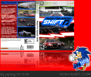
 Need for Speed: Shift Box Cover Comments
#View full size#
Well i have to say this is my best box.. ever :) i hope you all like it. Im saying view full size because it has actually gone tiny :/ lol.
Credit:
Google
Temp - Lenny819
[ Reply ]
Good job, I like it, especially the front ! :]
[ Reply ]
#2, thanks i had a bit of trouble with the front at first but thats sorted :) and thanks for the fav :) i think this is my favorite box that ive made
Edited at 1 decade ago
[ Reply ]
I like it the font on the back really fit in fav
[ Reply ]
#4, Thanks!
[ Reply ]
Nice! Best box yet! +fav!
[ Reply ]
#6, wow thanks that means a lot, especially now that 2 rank 6 people have fav'd :D
[ Reply ]
I love the front. The back seems a little lacking in comparison. still, +fav
[ Reply ]
#8, Thanks, any ideas to improve the back? i knew it wasnt as good as the front but i dunno what to do to change it.
[ Reply ]
I don't like the white part on the back and side the rest is ok 4/5
[ Reply ]
#10, The white part is meant to be where all the legal info is, and i couldnt think of much more to do with the spine :/
[ Reply ]
Nice.
[ Reply ]
This is amazing.
[ Reply ]
#12, #13, Thanks!
[ Reply ]
nice job
[ Reply ]
for the back I think that the tagline needs a bit of work, as do the screenshot borders. hope it helps.
[ Reply ]
#16, OK thanks, i think my problem is i dunno what to do with them.
[ Reply ]
Good job.
[ Reply ]
#17, I think that you maybe should incorporate the theme of lightning into the back, as well as the front.
[ Reply ]
I like the split image lightning on the front,but it just seems... well somewhat awkward. Not too bad though. I like the fact that you were creative when making this. Therefore, I'll fav.
Edited at 1 decade ago
[ Reply ]
#20, Thanks, like i said i had trouble with the front for where to put the logo.
[ Reply ]
I like it, particulary the front.
[ Reply ]
couple problems:
spelling on back
reflection is too low, should be up against box
like it though - fix those and i'll fave
[ Reply ]
also, 3D it?
[ Reply ]
#23, I think the spelling errors are because I'm from England and we spell some things differently, not all reflections have to be right up against the box, it depends where the creator wants to put it. And I may 3D it, but last time I 3D'd a box it didnt turn out too good lol.
[ Reply ]