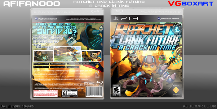
I love it. Nice use of the color scheme. Also logo could be a bit smaller. Nice temp too. Great font on the back. Except for that question mark :D Nice work.
Looks really nice. The renders on the front are a bit choppy, but the overall design comes together very nicely, and it looks much better than the official. Good job!
I actually really don't think it's that great. For starters, the logo is unnecessarily big. It takes up literally half the front. The concept of the front is pretty decent, but I'm not feeling anything from it. Ratchet looks kind of out of place there. It seems kinda like you couldn't find a good way of placing him on the ground, so you just put him in front of it. I think it's the lighting. He just doesn't look like he fits there.
As for the back, well, it just looks kinda messy. It feels really claustrophobic. The text hurts my eyes to look at. That light turquoise against black and white doesn't look very nice, in my opinion. The screenshots look kinda placed on top, and not really part of the the actual box. The whole thing just looks really cluttered. Lastly, that shine is getting on my nerves. I want to get a good look at the back, but it feels like the shine gets in the way more than it enhances it.
 Ratchet & Clank Future: A Crack in Time Box Cover Comments
This was a verah fun box to make!
[ Reply ]
This is my favorite box from you by far, amazing job!
[ Reply ]
Could you make the logo bigger?
[ Reply ]
#3, WOW lol
[ Reply ]
Haha That front is action packed!
[ Reply ]
LOL he used my words on the back from my game box.
[ Reply ]
#6, Oh yes, credit to Jevan for the tagline!
#3, It adds to atmosphere :P
Thanks everyone!
[ Reply ]
The front looks totally awesome, though the logo could've been a bit smaller in my opnion, but still awesome.
[ Reply ]
very cool but i agree the logo should be smaller :)
[ Reply ]
The front's very generic, but I like the back =P
[ Reply ]
I like this, it's one of you're better boxes.
[ Reply ]
I love that back!
Also, is that your template? Could you please send it to me? I will credit. :)
Edit: Ah, i saw it in the resources..
Edited at 1 decade ago
[ Reply ]
Ohhh yea Clank shouldnt be the same size as the other guy.
[ Reply ]
I love it. Nice use of the color scheme. Also logo could be a bit smaller. Nice temp too. Great font on the back. Except for that question mark :D Nice work.
[ Reply ]
Whoa O_o
So... awesome...
[ Reply ]
Woah, very nice man :)
[ Reply ]
This is a really crappy box. :P
[ Reply ]
YES!
[ Reply ]
Loving it. Logo maybe a little too big on the front but it certainly gives character. This certainly puts my R+C box into place (:
[ Reply ]
Great ! Quite different of what I've already seen, the box should be like this ! :]
[ Reply ]
I don't really like the font used for the tagline but the box is still great!
[ Reply ]
Well made box you have here!
[ Reply ]
Do want HoF!
[ Reply ]
Looks really nice. The renders on the front are a bit choppy, but the overall design comes together very nicely, and it looks much better than the official. Good job!
[ Reply ]
Congrats on the Hall of Fame, afifan000
The box is really nice
[ Reply ]
congrats on the hall!
[ Reply ]
Well done man!
[ Reply ]
very nice afifan000
Edited at 1 decade ago
[ Reply ]
Epic as usual!
[ Reply ]
By far, your best.
[ Reply ]
Edited at 1 decade ago
[ Reply ]
O...M...G... THAT'S AWESOME!
[ Reply ]
Really sharp, clean, and professional. A super job man, and congrats on the hall of fame!
[ Reply ]
Thats just Epic, dude. I love the style. 9.5/10 +fav
[ Reply ]
amazing!
[ Reply ]
I actually really don't think it's that great. For starters, the logo is unnecessarily big. It takes up literally half the front. The concept of the front is pretty decent, but I'm not feeling anything from it. Ratchet looks kind of out of place there. It seems kinda like you couldn't find a good way of placing him on the ground, so you just put him in front of it. I think it's the lighting. He just doesn't look like he fits there.
As for the back, well, it just looks kinda messy. It feels really claustrophobic. The text hurts my eyes to look at. That light turquoise against black and white doesn't look very nice, in my opinion. The screenshots look kinda placed on top, and not really part of the the actual box. The whole thing just looks really cluttered. Lastly, that shine is getting on my nerves. I want to get a good look at the back, but it feels like the shine gets in the way more than it enhances it.
[ Reply ]