While I think it looks really good, ultimately I feel that the idea is too similar to MarioLee's Paper Mario box (It's listed under the essence tag, if you haven't seen it.)
Yours is similar to MarioLee's, but different enough to hold its own. This is your best box to date, but both the front and back seem a bit empty. I really like the tag line on the back.
@#16, I guess it's just the text, sure it's taking up space, but there is less pretty pictures because of it.
It's not so much that there's too much of a paper effect, it's that the shadow on the crumpled paper is far too dark. Lighten it up a tad bit and see where that takes you.
#24, I know it's not Luigi, It's actually Mario that I edited. I didn't like any of the Paper Luigi's that I found, because None of them would work on the cover. So I just edited it.
And I know it's a bit empty, especially the cover, but I;m not quite sure what to add. Any ideas? And for the centering thing, I like it that way, it makes it seem like someone threw all these crumpled paper cutouts onto another peice of paper. Know what I mean?
It looks pretty nice. The only thing I dislike is that very heavy paper texture. Maybe tone it down a little? Overall its a great box, hope it makes HoF!
 Paper Luigi Box Cover Comments
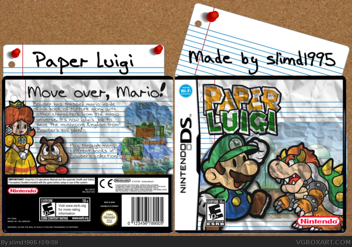
This one took alot of work. I added the paper texture to everything, rendered everything, and made the kick ass presentation.
Credit
Logo: Google, but it was made by someone from here.
Screenshots: Google
Template: I'm not sure.
[ Reply ]
Luigi is not tall enough and Daisy should be there instead of Peach, fix these.
[ Reply ]
Why does the Daisy/Peach thing matter? And I think Luigi is tall enough.
[ Reply ]
I think Luigi's good anyway it seems a little too dark I'm preet sure that's because of the paper effect but it should still be lighten.
[ Reply ]
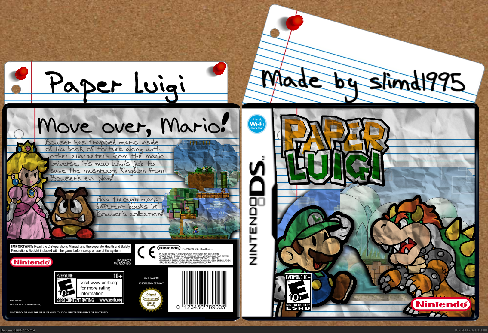
Fix'd.
I'll try lightening it up.
[ Reply ]
Fix'd Fix'd. It does look better when brightened.
[ Reply ]
It works fav.
[ Reply ]
you should add something more to the title like:
Paper Luigi: And the Book of Torture
it feels empty with "Paper Luigi" only
[ Reply ]
I wanted it to be simple. And it's a bit too late for that, because you can't change the title.
I think Paper Luigi works fine, though.
[ Reply ]
You got a little crazy with the paper effect.
[ Reply ]
#10, thats the theme of the box =P
[ Reply ]
While I think it looks really good, ultimately I feel that the idea is too similar to MarioLee's Paper Mario box (It's listed under the essence tag, if you haven't seen it.)
[ Reply ]
#12, I'll look for it real quick.
[ Reply ]
Okay, I saw it. And I'll admit the boxes have similiar style.
Yet, he has alot of marker type writing and drawing on his.
Mine is just pencil.
[ Reply ]
Yours is similar to MarioLee's, but different enough to hold its own. This is your best box to date, but both the front and back seem a bit empty. I really like the tag line on the back.
@#16, I guess it's just the text, sure it's taking up space, but there is less pretty pictures because of it.
Edited at 1 decade ago
[ Reply ]
#15, thank you.
But, th back is empty? I see how the front might be, but there isn;t any open space on the back.
[ Reply ]
What's with the Wi-fi symbol and E10+?
[ Reply ]
its so great!
[ Reply ]
Agreed with Slyder. Not bad.
[ Reply ]
It's a cool design but ultimately a little empty/bland. 3.5/5
[ Reply ]
Tone down the paper effect a bit, its too strong.
[ Reply ]
It's cool! :D + Fav
[ Reply ]
It's not so much that there's too much of a paper effect, it's that the shadow on the crumpled paper is far too dark. Lighten it up a tad bit and see where that takes you.
[ Reply ]
A few things bother me.
1. I'm glad the whole paper texture thing is catching on, but it just seems adding it too everything makes it harder on the eyes.
2. That's not Luigi.
3. A bit empty and there's no real center on the front.
[ Reply ]
#24, I know it's not Luigi, It's actually Mario that I edited. I didn't like any of the Paper Luigi's that I found, because None of them would work on the cover. So I just edited it.
And I know it's a bit empty, especially the cover, but I;m not quite sure what to add. Any ideas? And for the centering thing, I like it that way, it makes it seem like someone threw all these crumpled paper cutouts onto another peice of paper. Know what I mean?
[ Reply ]
Looks great, but maybe change the green Mario to an official Luigi render?
I'll fave though. ;)
[ Reply ]
Thanks for the addition section to the link >XD *evil laugh*
[ Reply ]
I really like the texture!! Its great!!
[ Reply ]
Nice, I like what you did with the screenshots.
[ Reply ]
Not bad but it seems a little too simple for my taste
[ Reply ]
This looks great. I love it.
[ Reply ]
Neat Idea, fairly well executed.
[ Reply ]
I like this box, really well done
Fav
[ Reply ]
It isn't the most original idea, but it still looks good. Although, I would have toned the paper texture down a bit.
[ Reply ]
Not bad!
[ Reply ]
It looks pretty nice. The only thing I dislike is that very heavy paper texture. Maybe tone it down a little? Overall its a great box, hope it makes HoF!
[ Reply ]
I wish I still had the .pdn so I could make some changes to this, but it's been a year since I uploaded this.
[ Reply ]
It's a real shame you've lost the pdn file so you can't change it, as the paper texture could be toned down some, but apart from that this is great.
[ Reply ]
Congrats.
[ Reply ]
Thanks to everyone who fav'd!
[ Reply ]
I think King Boo needs to be here instead of Bowser XD
[ Reply ]
Uhhhh Luigi is actually Mario with Luigi's clothes from Paper Mario: TTYD.
[ Reply ]