guitar_hero [ Buy Guitar Hero 5 at Amazon ] By Joeseye 47 on September 7th, 2009 No Printable Available Guitar Hero 5 Box Cover Comments Comment on Joeseye's Guitar Hero 5 Box Art / Cover. Cancel Reply spypilot 43 [ 1 decade ago ] not the official logo, but still nice. [ Reply ] crazyjp 33 [ 1 decade ago ] Haha I love the logo. [ Reply ] paper sonic 37 [ 1 decade ago ] #3, Ha yeah me too, Very clever Joeseye! [ Reply ] jevangod 50 [ 1 decade ago ] creative but not liking the guitar upside down thing. [ Reply ] Nerdysimmer 41 [ 1 decade ago ] Interesting concept of the logo, though it's not something I'd stick with. You get points for trying it out though. Edited at 1 decade ago [ Reply ] billyman31 40 [ 1 decade ago ] i love the colours :) [ Reply ] Spiderpig24 48 [ 1 decade ago ] I actually really like the logo, very creative. The colors are great too. [ Reply ] Js2Kings 34 [ 1 decade ago ] Awesome box man. [ Reply ] Eggboy'13 48 [ 1 decade ago ] #1, Are you serious? That's a HUGE plus if you ask me! [ Reply ] sd1833 48 [ 1 decade ago ] Oh man, I love that logo! Great box and great game. :D [ Reply ] afifan000 44 [ 1 decade ago ] Real nice logo! Good work on the box! [ Reply ] firebert626 29 [ 1 decade ago ] The logo is sweet, and the colors pop very well. Great box +fav. [ Reply ] SimplyVimal 1 [ 1 decade ago ] you're really making goofd boxes seriously a VGBOXART PRO [ Reply ] a-beast-of-art 39 [ 1 decade ago ] really nice, and I love the temp and logo. Looks alot better than the bland official cover. BTW, the game is great too! [ Reply ] Pan 48 [ 1 decade ago ] The logo was a really good idea, and this defiantly looks a lot more appealing than the official box does. [ Reply ] firebert626 29 [ 1 decade ago ] bumped because this deserves HoF [ Reply ] tmrd 43 [ 1 decade ago ] I really, really, really, really, really, really, really, really, really, really, really, really, really, really, really, really, really, really, really, really, really, really, really, really, really, really, really, really, really, really, really, really, really, really, really, really, really, really, really, love it! +fav! [ Reply ] Etrain 1 [ 1 decade ago ] where's the 5? [ Reply ]
 Guitar Hero 5 Box Cover Comments
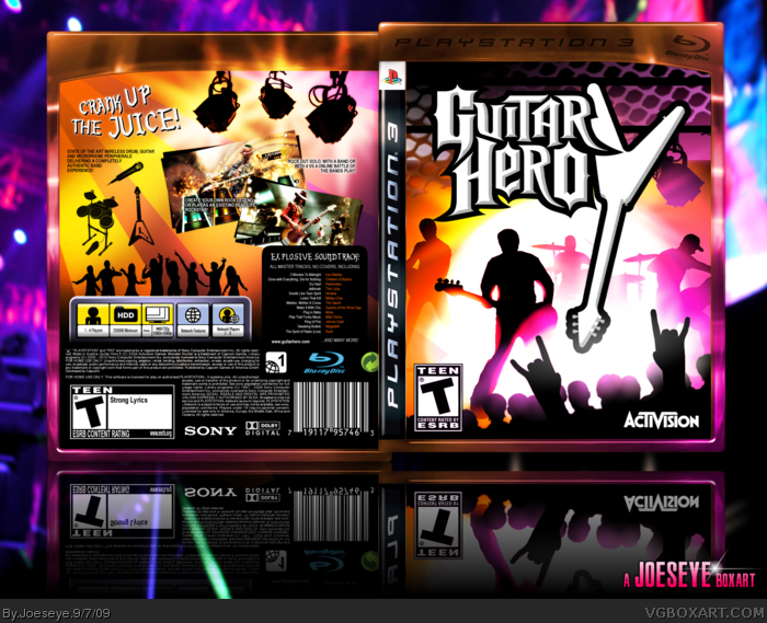
not the official logo, but still nice.
[ Reply ]
Haha I love the logo.
[ Reply ]
#3, Ha yeah me too, Very clever Joeseye!
[ Reply ]
creative but not liking the guitar upside down thing.
[ Reply ]
Interesting concept of the logo, though it's not something I'd stick with. You get points for trying it out though.
Edited at 1 decade ago
[ Reply ]
i love the colours :)
[ Reply ]
I actually really like the logo, very creative. The colors are great too.
[ Reply ]
Awesome box man.
[ Reply ]
#1, Are you serious? That's a HUGE plus if you ask me!
[ Reply ]
Oh man, I love that logo! Great box and great game. :D
[ Reply ]
Real nice logo! Good work on the box!
[ Reply ]
The logo is sweet, and the colors pop very well. Great box +fav.
[ Reply ]
you're really making goofd boxes seriously a VGBOXART PRO
[ Reply ]
really nice, and I love the temp and logo. Looks alot better than the bland official cover. BTW, the game is great too!
[ Reply ]
The logo was a really good idea, and this defiantly looks a lot more appealing than the official box does.
[ Reply ]
bumped because this deserves HoF
[ Reply ]
I really, really, really, really, really, really, really, really, really, really, really, really, really, really, really, really, really, really, really, really, really, really, really, really, really, really, really, really, really, really, really, really, really, really, really, really, really, really, really, love it! +fav!
[ Reply ]
where's the 5?
[ Reply ]