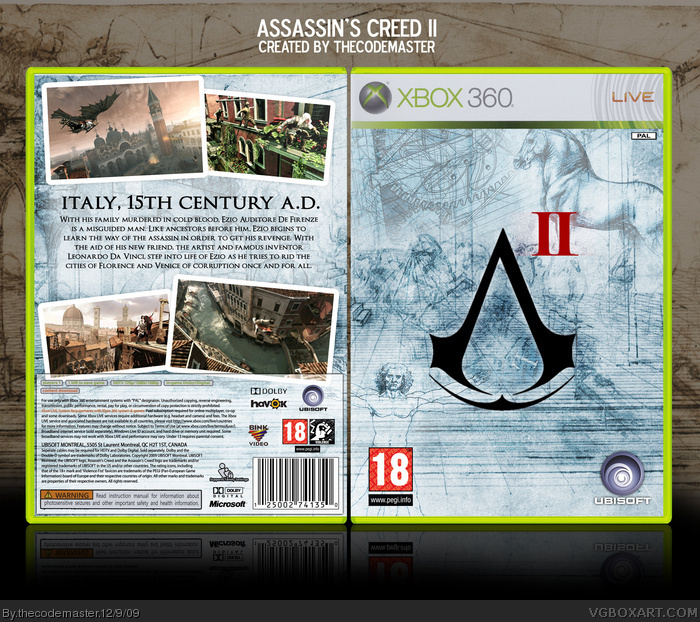
This actually hasn't turned out as well as I hoped. Guess I had other images in my mind when I was making it. Oh well.
1) It looks awful in full view. Gotta start 3D-izing myself, this program is so crummy.
2) I had no idea what to do with the back cover.
3) Couldn't find a hi-res version of the new PEGI logos.
...oh, and I honestly DID NOT mean to put the 18 rating over the Virturvian Man's... parts.
#5, the main reason I didn't put it on was the idea of Symbols. The "A", the crest of the Assassin's within the game is well known now, much because of the first game. I decided that I'd play on gamer's awareness of the symbol to have a more simple logo that people will recognise immediately. Take a look at the Half-Life 2 logo :)
 Assassin's Creed II Box Cover Comments
This actually hasn't turned out as well as I hoped. Guess I had other images in my mind when I was making it. Oh well.
1) It looks awful in full view. Gotta start 3D-izing myself, this program is so crummy.
2) I had no idea what to do with the back cover.
3) Couldn't find a hi-res version of the new PEGI logos.
...oh, and I honestly DID NOT mean to put the 18 rating over the Virturvian Man's... parts.
[ Reply ]
#1, Well it is a good job you did XD!
Good Job!
[ Reply ]
Nice blending. And I like the main colour being blue, it makes the logo stand out.
[ Reply ]
This is a really solid design, plus it stands stands out from the other ACII boxes. Nice job.
[ Reply ]
I think it's pretty nice actually.
But i think that you should have the "Assassin's Creed" text on the front.
[ Reply ]
#5, the main reason I didn't put it on was the idea of Symbols. The "A", the crest of the Assassin's within the game is well known now, much because of the first game. I decided that I'd play on gamer's awareness of the symbol to have a more simple logo that people will recognise immediately. Take a look at the Half-Life 2 logo :)
[ Reply ]
Different, Attractive, Awesome, Faved.
[ Reply ]
Only thing I dont like is the placement of the II.
[ Reply ]
The II might look good in the middle of the logo. I like how the 18+ is covering up the dude lol.
[ Reply ]
#9, I tried the II in the middle of the logo at first, but it didn't really work. At least, not for me.
[ Reply ]
PRINTABLE VERSION ADDED....!
[ Reply ]
Wow this is very good, great job.
[ Reply ]
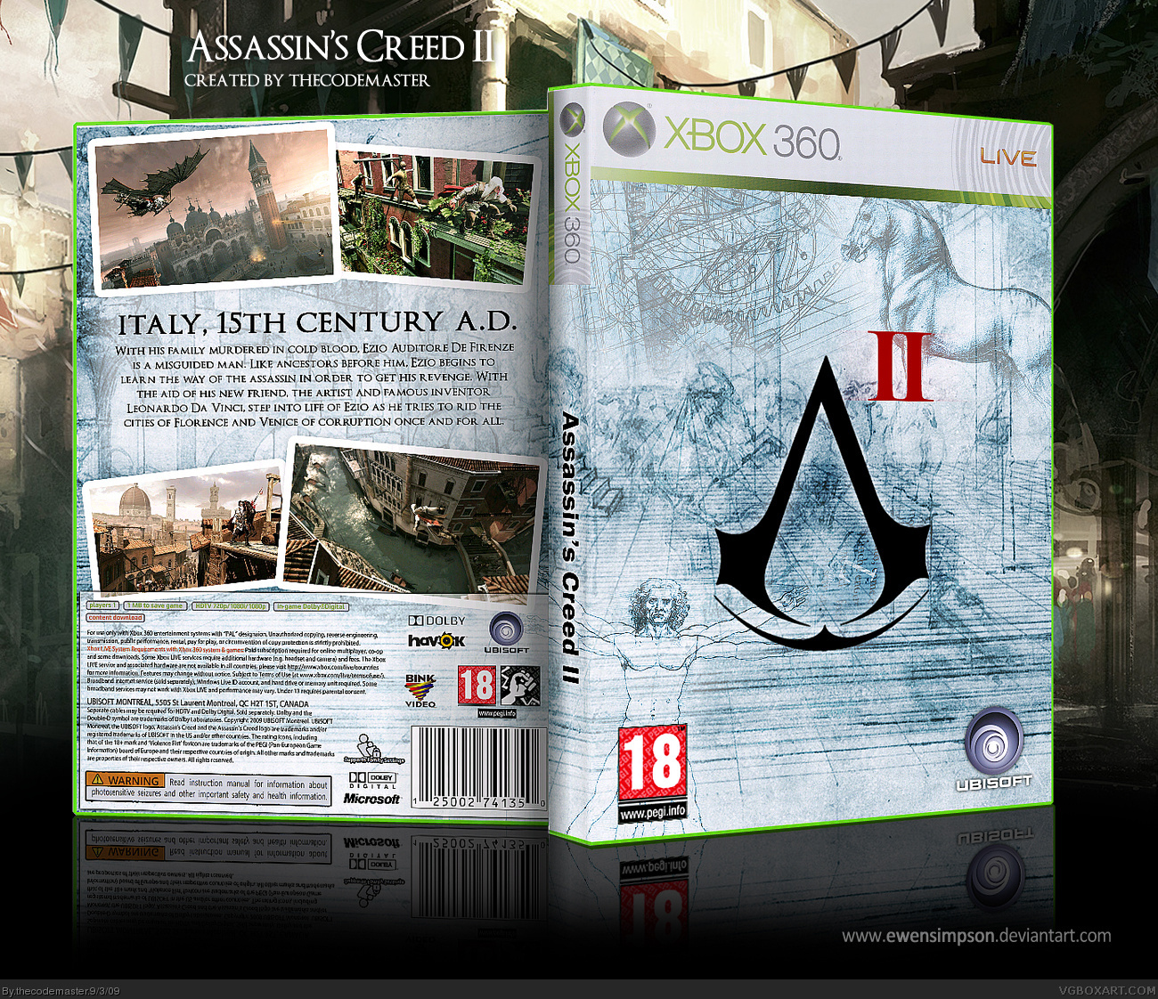
Update to version 2.
NEW LAYOUT!
(I'm kinda doing this to my most recent boxes so bear with me)
[ Reply ]