[ Box updated on August 19th, 2009 ] [ original ]
 Heroes May Cry: Final Fantasy D Box Cover Comments
Comment on spypilot's Heroes May Cry: Final Fantasy D Box Art / Cover.
[ Box updated on August 19th, 2009 ] [ original ]
Comment on spypilot's Heroes May Cry: Final Fantasy D Box Art / Cover.
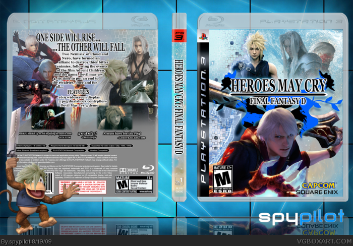
My new box, it took me forever, and honestly, i couldnt think of a plot, so i just wrote other stuff, lol.
anyway, this took me a while, and i think it's my best yet. comment and critique as always!
credit:
Technee: template
Avenger: username logo (i always forget to credit you, but now i remebered)
i made the logo and controllers myself too.
[ Reply ]
Hi! I find that TRANSPARENT template annoying, but the boxart itself is good, so I'll fav!
[ Reply ]
You should fix the controllers.
Buttons and analogs shouldnt be coloured too, then it looks weird.
Then I'll fav.
Edited at 1 decade ago
[ Reply ]
Remove the Controllers. They are un-necessary.
[ Reply ]
thanks for totally listening to my advice about how you should get rid of the identical cloud renders on both covers...
[ Reply ]
#2, the ps3 temp is transparent though...
#5, you never said that!
Edited at 1 decade ago
[ Reply ]
#6, Um...yes he did. In the WIP Forums, these were his exact words.
LEGOslayer:
"My only complaint is that you use the same Cloud render on the front and back..."
And I have to agree with him, it wasn't the best approach.
[ Reply ]
I'll be honest I'm not loving it. Scrap the controllers, get actual renders - not cosplayers. I also don't care for the grey on the back.
[ Reply ]
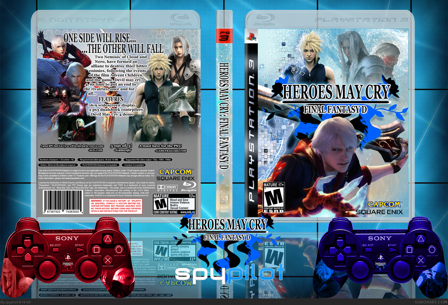
UPDATED!
-controllers removed
-diddy kong added (isnt he just AWESOME!)
-resolution enlarged
-different cloud on the back (recoulored from a pure green cloud, now THAT was hard to do.)
#8, cosplays, what? those are all from planetrenders.net!
[ Reply ]
I still don;t like that front. It just seems cluttered.
[ Reply ]
#10, i knew you wouldnt fav this, but i like it.
[ Reply ]
i like it now
[ Reply ]
I would say delete the two pictures on the front top right put cloud in the middle and nero under him and put the words on the back more towards the middle good stuff though
[ Reply ]
Sephiroth on the front is not a render, that is a person dressed up as him. Aka a cosplayer, new presentation is much better.
Edited at 1 decade ago
[ Reply ]
#14, EDIT: i just realised it is!
Edited at 1 decade ago
[ Reply ]