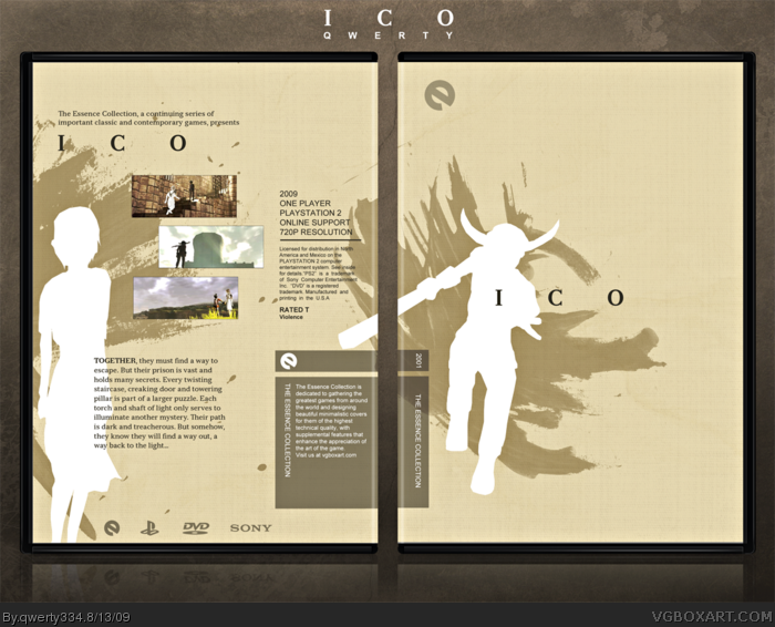
My second Ico box, as well as my first essence box.
I went for a minimalistic, yet artistic approach with interesting placement and restrained brush strokes. This is definitely a departure from my usual style, as well as my first Ico box which was dramatic/epic. I feel this fits the game better, so...
LOL I like the play on the Criterion template. As a purist, I should be offended and scold you, but it's just so creative I can't help but give you a thumbs up!
I think what would've sealed the deal for me was that if yorda's silhouette was behind Ico on the front cover; giving the composition the look that Ico is protecting Yorda. Both silhouettes on one side would've also conveyed the togetherness between the characters - an essential aspect of the game.
Otherwise the box is technically well made and elegant, as I'd expect from you.
Yet another essence box with nothing but silhouettes. Sorry if this offends you qwerty, but your great idea of essence kind of went... bad once people started using all these silhouettes. So no fav from me :(
 ICO Box Cover Comments
My second Ico box, as well as my first essence box.
I went for a minimalistic, yet artistic approach with interesting placement and restrained brush strokes. This is definitely a departure from my usual style, as well as my first Ico box which was dramatic/epic. I feel this fits the game better, so...
Enjoy!
-Qwerty
[ Reply ]
Just amazing work here, everything just looks flawless.
Best ICO box I have ever seen, and one of my favourite overall boxes.
[ Reply ]
I never noticed, was ICO really in 720p? Anyways, fantastic box. I'm loving this comp right now.
[ Reply ]
Marry me.
[ Reply ]
Thanks guys.
#3, No, but like Criterion, Essence would re-release classic games in better quality.
[ Reply ]
Sexy.
Edited at 1 decade ago
[ Reply ]
Great Job Qwerty.
[ Reply ]
LOL I like the play on the Criterion template. As a purist, I should be offended and scold you, but it's just so creative I can't help but give you a thumbs up!
[ Reply ]
BTW, where the heck is my invite to the group? :(
[ Reply ]
#9, same here :(.
[ Reply ]
Thanks peeps.
#9, #10, Sorry, it's hard to remember everyone. XD
You're both invited to the party nao!
Edited at 1 decade ago
[ Reply ]
Amazing, 'nuff said.
[ Reply ]
I really like the ideae of this Essence Collection, the box is great, and it captures the feel of the game perfectly.
[ Reply ]
If only Sony would re-release Ico, Shadow of the Colossus, and Okami in 16:9 and HD. I'd buy those games in a SECOND.
[ Reply ]
#4, Fuck you, I asked first.
[ Reply ]
Haha thanks everyone.
#4, #15, Now now, don't fight. We can work something out. XD
[ Reply ]
#16, Bigamous much?
[ Reply ]
flawless and elegant.
i. absolutely. love. this.
[ Reply ]
Awesome, that is all that is needed to be said
[ Reply ]
I think what would've sealed the deal for me was that if yorda's silhouette was behind Ico on the front cover; giving the composition the look that Ico is protecting Yorda. Both silhouettes on one side would've also conveyed the togetherness between the characters - an essential aspect of the game.
Otherwise the box is technically well made and elegant, as I'd expect from you.
[ Reply ]
Hey hey, congrats for the HoF, you've deserved it ! =D
[ Reply ]
yes.
[ Reply ]
Yet another essence box with nothing but silhouettes. Sorry if this offends you qwerty, but your great idea of essence kind of went... bad once people started using all these silhouettes. So no fav from me :(
[ Reply ]
Combining the Essense art direction concept with ICO, one of my favorite things is just...it's magical.
How can I NOT favorite this? It just looks wonderful.
[ Reply ]