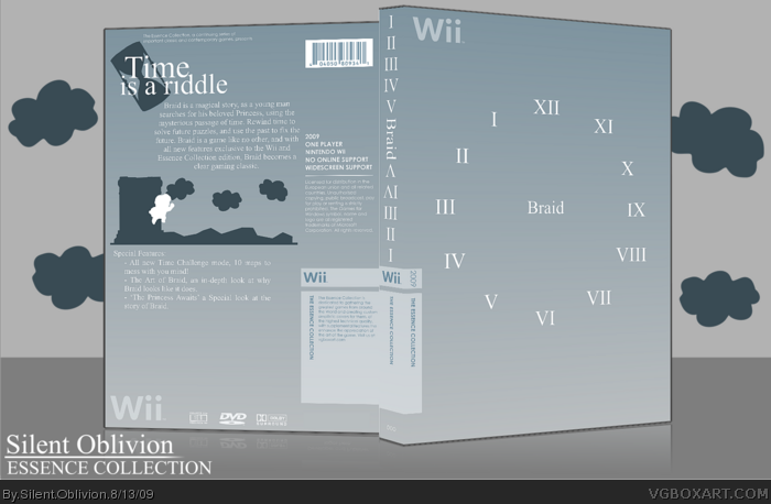
Well, I present what I think is my best box, and alot of work went into this =P
A lot is my own, as well, the back silhouette shot is my art, mimicking what the game enviroment looks like. The front, is kinda a symbol showing what the game is all about, if you haven't noticed, the clock is reversed, to show the idea about rewinding time etc.
Hope you like it guys, I have some other interesting ideas for a few games for this Essence collection, so keep an eye out =)
Oh, and also, why Wii? Well, Braid is the perfect little game for the system, and its simply because of that.
It's a really nice box, very clean, but it doesn't appeal to me...at all I'm afraid.
It just seems too bland, I don't get what the game is about by looking at this, sorry.
I love Braid, LOVE IT. I think the cover explains the game pretty well without touching the story. For someone who isn't familiar with the game, just figuring out why the clock is in reverse is a puzzle in itself. Then you realize time manipulation is a mechanic. Intentional or not, me likey.
 Braid Box Cover Comments
Braid isn't...on wii, is it?
[ Reply ]
Oh hai.
Well, I present what I think is my best box, and alot of work went into this =P
A lot is my own, as well, the back silhouette shot is my art, mimicking what the game enviroment looks like. The front, is kinda a symbol showing what the game is all about, if you haven't noticed, the clock is reversed, to show the idea about rewinding time etc.
Hope you like it guys, I have some other interesting ideas for a few games for this Essence collection, so keep an eye out =)
Oh, and also, why Wii? Well, Braid is the perfect little game for the system, and its simply because of that.
Edited at 1 decade ago
[ Reply ]
Its so simple...yet it works to beyond perfection...
[ Reply ]
Love it.
So bold and unique, and it captures the essence of Braid.
Great job, S_O. ;)
Edited at 1 decade ago
[ Reply ]
Wait, I've never played the game so I don't know, but is the front supposed to go 12-9-11-10-8?
[ Reply ]
#5, it's 12-11-10-9-8[etc];)
Very,very nice mate.
[ Reply ]
It's a really nice box, very clean, but it doesn't appeal to me...at all I'm afraid.
It just seems too bland, I don't get what the game is about by looking at this, sorry.
[ Reply ]
Looks fantastic. So Simplistic.
[ Reply ]
Thanks, guys =D
#7 - Criteron type covers unfortunatly don't appeal to everyone, sorry =)
Printable added, as usual, just incase this does get released =P
[ Reply ]
#6, look at V1
[ Reply ]
This looks incredible, I love the simplicity.
[ Reply ]
This one is the most minimalistic of the designs I've seen so far, and easily the most effective. Great job man.
[ Reply ]
It is a nice box, but I have seen a familiar box on NeoGAF.
Edited at 1 decade ago
[ Reply ]
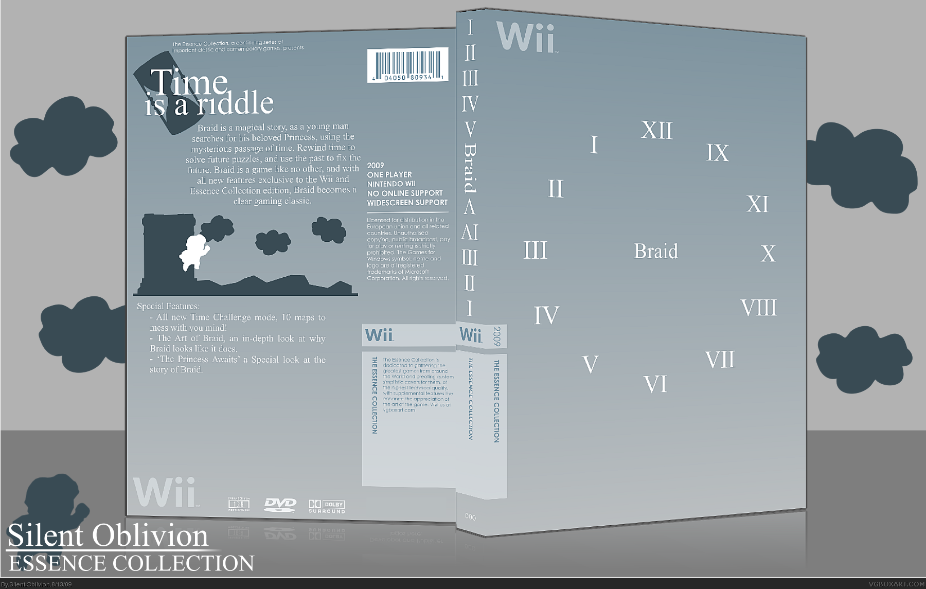
I love Braid, LOVE IT. I think the cover explains the game pretty well without touching the story. For someone who isn't familiar with the game, just figuring out why the clock is in reverse is a puzzle in itself. Then you realize time manipulation is a mechanic. Intentional or not, me likey.
[ Reply ]