im really sorry if this offends you, i mean no offence but to give my opinion...i think this cover is a bit to simple...barely anything on the front and nothing except for colours and screens... on the back! i know your trying to create a certain concept however i dont really think this box is the best on VG! Im sorry if this offends you.
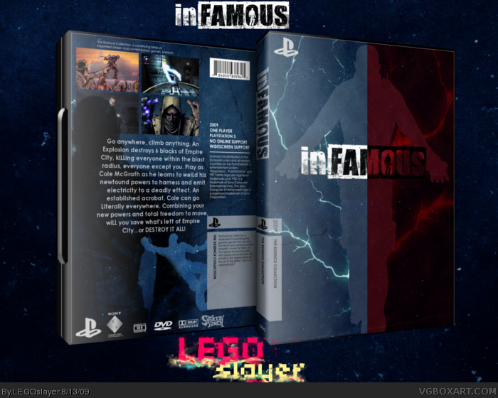
#7, I understand what you're saying, but I don't think you understand the point of this project. The point is to capture the essence of the game without making an elaborate and overzealous compilation. The front shows off both the good/bad personalities the players can take as well as the electrical powers he possesses. If you actually look at the back for more than a few seconds, you'd realize those "colors" were actually outlines of Cole. One outline, the pitch black one, once again represents the evil Cole, and how much bigger and more powerful he is compared to the smaller "good" Cole. The smaller Cole not only represents the climbing abilities in the game(by hanging onto the template)but also the fact that he is smaller than the big Cole shows that in order to maintain a good status, you have to work and fight harder than the Evil Cole, who more or less dominates everything.
#7, oh really sorry i didnt see your perspective and now its like im viewing the box from different eyes...i start to see what your meaning. and if that was truly your aim then this box is worth +++A. sorry about before...i hope their are no hard feelings between us! +fav
 inFAMOUS Box Cover Comments
My first submission the the essence project. inFAMOUS is an amazing game that somehow passed under the radar of a lot of people.
Credits: planetrenders.net
Silent_Oblivion for the temp
gamespot for screens
[ Reply ]
Amazing.
This has the perfect balance of not being too simplistic nor too complex. I love the concept of the front.
The best inFAMOUS box at VGBA IMO.
Edited at 1 decade ago
[ Reply ]
Qwerty just pretty much described my feelings.
Stunning work, Slayer, you best box yet.
[ Reply ]
This is it. I must post my essence box now.
[ Reply ]
#2, This. Expect mine soon.
Edited at 1 decade ago
[ Reply ]
Stunning.
[ Reply ]
im really sorry if this offends you, i mean no offence but to give my opinion...i think this cover is a bit to simple...barely anything on the front and nothing except for colours and screens... on the back! i know your trying to create a certain concept however i dont really think this box is the best on VG! Im sorry if this offends you.
[ Reply ]
#7, I understand what you're saying, but I don't think you understand the point of this project. The point is to capture the essence of the game without making an elaborate and overzealous compilation. The front shows off both the good/bad personalities the players can take as well as the electrical powers he possesses. If you actually look at the back for more than a few seconds, you'd realize those "colors" were actually outlines of Cole. One outline, the pitch black one, once again represents the evil Cole, and how much bigger and more powerful he is compared to the smaller "good" Cole. The smaller Cole not only represents the climbing abilities in the game(by hanging onto the template)but also the fact that he is smaller than the big Cole shows that in order to maintain a good status, you have to work and fight harder than the Evil Cole, who more or less dominates everything.
To everyone else, thanks for the love.
Edited at 1 decade ago
[ Reply ]
Awesome!
[ Reply ]
Its good and |I really Like this!!!!|
Edited at 1 decade ago
[ Reply ]
#7, oh really sorry i didnt see your perspective and now its like im viewing the box from different eyes...i start to see what your meaning. and if that was truly your aim then this box is worth +++A. sorry about before...i hope their are no hard feelings between us! +fav
[ Reply ]
really good!
[ Reply ]
Not bad. I dont like how dark it is on front, but very creative. The back is a bit empty.
[ Reply ]
I think you've definately pulled it off, but maybe consider getting rid of the texture for that ultra simplistic effect?
[ Reply ]
Bumped because it deserves more attention.
[ Reply ]
*enter site*
*sees hall*
:D thanks apollo for helping give this attention...and thanks to everyone who fav'd/responded/critiqued
Edited at 1 decade ago
[ Reply ]
YAY! Hall! Congrats!
[ Reply ]
Congrats.
[ Reply ]
congrats on your second hall!
[ Reply ]
Awesome stuff man. You nailed the idea behind the games very effectively.
[ Reply ]
congrats
[ Reply ]
one world: WOW!
[ Reply ]