2vgba09 [ Buy Final Fantas... at Amazon ] By RoarShark 40 on August 4th, 2009 No Printable Available Final Fantasy XIII Box Cover Comments Comment on RoarShark's Final Fantasy XIII Box Art / Cover. Cancel Reply RoarShark 40 [ 1 decade ago ] Here is my entry for the VGBA Cup Round Two ------------------------------------------- Not much to say, uh this is part two of my Final Fantasy Series, I used the same color stuff from my last, and thats about it. Enjoy! [ Reply ] Mariolee 43 [ 1 decade ago ] I think I lost. :( [ Reply ] RoarShark 40 [ 1 decade ago ] #2, Who knows. [ Reply ] LEGOslayer 42 [ 1 decade ago ] this seriously needs more attention [ Reply ] Mariolee 43 [ 1 decade ago ] #3 Dude, this box is the epics! I think this deserves HoF in my opinion. My box is apparently too dark...:) #4 AGREED. Edited at 1 decade ago [ Reply ] sd1833 48 [ 1 decade ago ] #4, I agree. This is one of your best. Though I think you should cut down on some of the presentation. Edited at 1 decade ago [ Reply ] RoarShark 40 [ 1 decade ago ] #5, It ain't that good, but at least I got away from grunge for a few boxes. But #6, your right it is one of my best, It is my favorite! Edited at 1 decade ago [ Reply ] E_G 39 [ 1 decade ago ] #7, Actually, it is that good. It's your best work and you're really improving. I do suggest you make the background much smaller so the outside presentation is more focused. [ Reply ] paper sonic 37 [ 1 decade ago ] Epic [ Reply ] RoarShark 40 [ 1 decade ago ] #8, Thank You, #7, Thank You as Well. any way I can improve on the box? [ Reply ] Sven 32 [ 1 decade ago ] This is quite nice, but the gigantic presentation is very unnecessary. [ Reply ] Oddmania 40 [ 1 decade ago ] So colorful, great job ! =D [ Reply ] jevangod 50 [ 1 decade ago ] Black dude on back looks like Mike Epps. But nice box. [ Reply ]
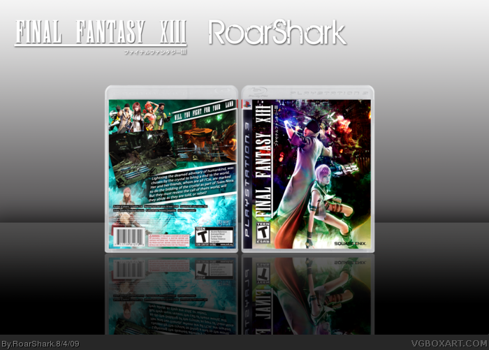
 Final Fantasy XIII Box Cover Comments
Here is my entry for the VGBA Cup Round Two
-------------------------------------------
Not much to say, uh this is part two of my Final Fantasy Series,
I used the same color stuff from my last, and thats about it.
Enjoy!
[ Reply ]
I think I lost. :(
[ Reply ]
#2, Who knows.
[ Reply ]
this seriously needs more attention
[ Reply ]
#3 Dude, this box is the epics! I think this deserves HoF in my opinion. My box is apparently too dark...:)
#4 AGREED.
Edited at 1 decade ago
[ Reply ]
#4, I agree. This is one of your best.
Though I think you should cut down on some of the presentation.
Edited at 1 decade ago
[ Reply ]
#5, It ain't that good, but at least I got away from grunge for a few boxes. But #6, your right it is one of my best, It is my favorite!
Edited at 1 decade ago
[ Reply ]
#7, Actually, it is that good. It's your best work and you're really improving. I do suggest you make the background much smaller so the outside presentation is more focused.
[ Reply ]
Epic
[ Reply ]
#8, Thank You, #7, Thank You as Well. any way I can improve on the box?
[ Reply ]
This is quite nice, but the gigantic presentation is very unnecessary.
[ Reply ]
So colorful, great job ! =D
[ Reply ]
Black dude on back looks like Mike Epps. But nice box.
[ Reply ]