[ Buy Devil May Cry 4 at Amazon ] By Radioactive Bob 38 on July 12th, 2006 No Printable Available [ Box updated on July 12th, 2006 ] [ original ] Devil May Cry 4 Box Cover Comments Comment on Radioactive Bob's Devil May Cry 4 Box Art / Cover. Cancel Reply Radioactive Bob 38 [ 1 decade ago ] Hope everybody likes this, had to make logo and template myself... [ Reply ] treesquirrel12 5 [ 1 decade ago ] good box art mikey im just about to release a new one i dont see any problems except the ps3 log it looks odd but dont change it 7/10 [ Reply ] Radioactive Bob 38 [ 1 decade ago ] thanx, i was just about to make the Blu-ray logo look better, i think it looks too...messy... [ Reply ] Radioactive Bob 38 [ 1 decade ago ] there, an updated PS3 template, and yes, the blue box is around the Blu-ray becuase i wanted it there :P [ Reply ] Radioactive Bob 38 [ 1 decade ago ] uh... comments? [ Reply ] Radioactive Bob 38 [ 1 decade ago ] i fixed the Capcom logo, and did a litle work on the template, it's barely noticable though... [ Reply ] treesquirrel12 5 [ 1 decade ago ] wow mikey people ask for it and they dont look at it thats kinda sad. [ Reply ] TwilightMystics 42 [ 1 decade ago ] Its good 8/10 exept the PS3 temp, The temp has to be modern and futuristic. If you fix that it's awsome ( P.S, if you want you can use mine temp if you want, but please give me credit when you are gonna to use it). [ Reply ] Radioactive Bob 38 [ 1 decade ago ] thanx Icarus, i'll see what i can do about my temp, thanx for the offer though! [ Reply ] TwilightMystics 42 [ 1 decade ago ] no problem [ Reply ] JballX 1 [ 1 decade ago ] this is pretty awesome. you're really good at box arts! what program do u use? [ Reply ] Radioactive Bob 38 [ 1 decade ago ] #11 thanx! i use GIMP btw [ Reply ] Radioactive Bob 38 [ 1 decade ago ] 4th version, using my new PS3 template... hope you like it [ Reply ] JballX 1 [ 1 decade ago ] NICE logo. i like it alot better than the other one. [ Reply ] Radioactive Bob 38 [ 1 decade ago ] #14 thanx JballX [ Reply ] treesquirrel12 5 [ 1 decade ago ] Awsome template i upgrade your art to a 10/10. [ Reply ] Ratchetcomand 8 [ 1 decade ago ] It good but i diss the template (it to bule). [ Reply ] Radioactive Bob 38 [ 1 decade ago ] i have given this box art my new template i think it looks a lot cooler now, but that's just, like, my opinion [ Reply ] WickedGamer1 37 [ 1 decade ago ] i dunno if GIMP has an anti-aliasing tool, but if it does you should use it on your text. it looks really choppy. [ Reply ] Radioactive Bob 38 [ 1 decade ago ] Yes, GIMP has that, lemme fix that... [ Reply ] Radioactive Bob 38 [ 1 decade ago ] Fixed [ Reply ] WickedGamer1 37 [ 1 decade ago ] what about on the DMC logo? >.< sorry to sound so picky :s [ Reply ] Radioactive Bob 38 [ 1 decade ago ] I like picky, it helps me in the future [ Reply ] Radioactive Bob 38 [ 1 decade ago ] Alright, i have made all text anit-aliasing, so it looks smoother [ Reply ] WickedGamer1 37 [ 1 decade ago ] much better! now i can give it a proper rating! HORRIBLE! kidding. i'll give it a 5. great work bob :) [ Reply ] Radioactive Bob 38 [ 1 decade ago ] thanx wicked! [ Reply ] Ratchetcomand 8 [ 1 decade ago ] It looks a lot beter but that Devil May Cry 1 Image not a Devil May Cry 4 Image. [ Reply ] Radioactive Bob 38 [ 1 decade ago ] D'oh! [ Reply ]

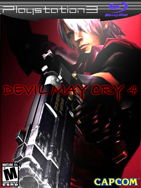
 Devil May Cry 4 Box Cover Comments
Hope everybody likes this, had to make logo and template myself...
[ Reply ]
good box art mikey im just about to release a new one i dont see any problems except the ps3 log it looks odd but dont change it 7/10
[ Reply ]
thanx, i was just about to make the Blu-ray logo look better, i think it looks too...messy...
[ Reply ]
there, an updated PS3 template, and yes, the blue box is around the Blu-ray becuase i wanted it there :P
[ Reply ]
uh... comments?
[ Reply ]
i fixed the Capcom logo, and did a litle work on the template, it's barely noticable though...
[ Reply ]
wow mikey people ask for it and they dont look at it thats kinda sad.
[ Reply ]
Its good 8/10 exept the PS3 temp, The temp has to be modern and futuristic. If you fix that it's awsome ( P.S, if you want you can use mine temp if you want, but please give me credit when you are gonna to use it).
[ Reply ]
thanx Icarus, i'll see what i can do about my temp, thanx for the offer though!
[ Reply ]
no problem
[ Reply ]
this is pretty awesome. you're really good at box arts! what program do u use?
[ Reply ]
#11 thanx! i use GIMP btw
[ Reply ]
4th version, using my new PS3 template... hope you like it
[ Reply ]
NICE logo. i like it alot better than the other one.
[ Reply ]
#14 thanx JballX
[ Reply ]
Awsome template i upgrade your art to a 10/10.
[ Reply ]
It good but i diss the template (it to bule).
[ Reply ]
i have given this box art my new template i think it looks a lot cooler now, but that's just, like, my opinion
[ Reply ]
i dunno if GIMP has an anti-aliasing tool, but if it does you should use it on your text. it looks really choppy.
[ Reply ]
Yes, GIMP has that, lemme fix that...
[ Reply ]
Fixed
[ Reply ]
what about on the DMC logo? >.<
sorry to sound so picky :s
[ Reply ]
I like picky, it helps me in the future
[ Reply ]
Alright, i have made all text anit-aliasing, so it looks smoother
[ Reply ]
much better! now i can give it a proper rating!
HORRIBLE!
kidding. i'll give it a 5.
great work bob :)
[ Reply ]
thanx wicked!
[ Reply ]
It looks a lot beter but that Devil May Cry 1 Image not a Devil May Cry 4 Image.
[ Reply ]
D'oh!
[ Reply ]