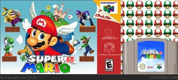
yes, youre gonna get a lot of crituiqe. if people keep on saying, great keep it up, you'll never improve. as for the box, its dece. the art styles are clashing and the logo sucks, sorry.
fix those things and i'll fav.
welcome to VGBA
It's better than your W.I.P. but there's still a lot of wacko things.
1. Welcome to the website!
2. The logo is badly cut.
3. Everything is choppy, especially Waluigi.
4. The renders are all in different styles.
5. What's up with the Nintendo 64 logo in the top right corner?
All in all, it's good for a first, and I can't wait to see more of what you have to offer. 2.5/5 overall!
#10, Wow, he was not violating the rules, more like helping, and now that I have seen it in full view, this needs work, template is choppy, the logo is bad, renders don't go together, and blurry beyond reason.
Its not bad for a first, In fact, I kinda like the design!
What I don't like is that all the renders are different art styles, and the logo's are poorly cut, especially the N64 logo. I would suggest making all the renders N64 styled like Mario.
Good first. 2.5/5
Nice update! may i suggest 2 more things?
1. add a bg, i dont like that whaite space
2. i dont like those bricks either, delete the white space around this one and put 3 together to make a platform, i hope that made sense. link
do those 2 things and sure, ill fav
 Super Mario 65 Box Cover Comments
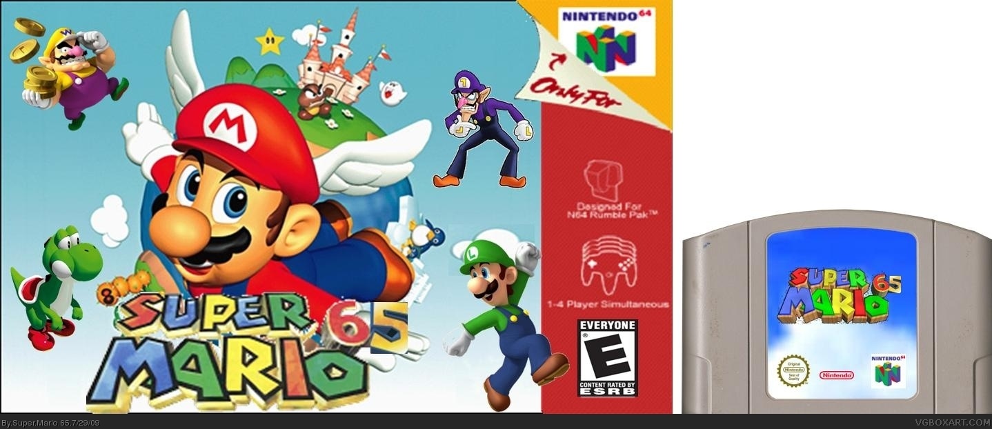
Not bad for a first. A couple of issues, all the characters are floating, and Luigi comes out of the template.
[ Reply ]
There, all fixed! By the way #3, DON'T BE MEAN! This is my FIRST box!
Edited at 1 decade ago
[ Reply ]
Its pretty bad. Everything is choppy, the ESRB is stretched and the logo is horrible.
[ Reply ]
I think its pretty good 4/5
[ Reply ]
Thanks #4. I just updated it, by the way. Credit to Eggboy'13 for the new logo. #3, if you want to see bad, see my beta version at link
Edited at 1 decade ago
[ Reply ]
Edited at 1 decade ago
[ Reply ]
#2, If you thought that was being mean, you are in for a surprise. Many critiques are much harsher.
[ Reply ]
yes, youre gonna get a lot of crituiqe. if people keep on saying, great keep it up, you'll never improve. as for the box, its dece. the art styles are clashing and the logo sucks, sorry.
fix those things and i'll fav.
welcome to VGBA
[ Reply ]
#8, read the second line of the comment rules.
[ Reply ]
#8, read the second line of the comment rules.
[ Reply ]
what a welcomeming
[ Reply ]
It's better than your W.I.P. but there's still a lot of wacko things.
1. Welcome to the website!
2. The logo is badly cut.
3. Everything is choppy, especially Waluigi.
4. The renders are all in different styles.
5. What's up with the Nintendo 64 logo in the top right corner?
All in all, it's good for a first, and I can't wait to see more of what you have to offer. 2.5/5 overall!
Edited at 1 decade ago
[ Reply ]
#10, Double post and he is helping. Your allowed to say its bad, but you have to put what to improve to. So, his post is following the rules.
[ Reply ]
#10, Wow, he was not violating the rules, more like helping, and now that I have seen it in full view, this needs work, template is choppy, the logo is bad, renders don't go together, and blurry beyond reason.
[ Reply ]
#9, i was helping, geez if theres one thing i hate is n00bs who are ignorant and dont take advice.
[ Reply ]
Its not bad for a first, In fact, I kinda like the design!
What I don't like is that all the renders are different art styles, and the logo's are poorly cut, especially the N64 logo. I would suggest making all the renders N64 styled like Mario.
Good first. 2.5/5
[ Reply ]
I'm going to fix the logo and I'm trying to find a better Waluigi picture.
Edited at 1 decade ago
[ Reply ]
#17, and yoshi, honestly, he doesn't fit there.
[ Reply ]
#18, I'll get right on it.
[ Reply ]
Just updated it. By the way Credit to Avenger for my newer logo and Credit to Geno for the Cartridge template.
Edited at 1 decade ago
[ Reply ]
It looks better now. I'll fav.
[ Reply ]
#21, thanks for my 1st fav ever!
[ Reply ]
#22, you're welcome.
[ Reply ]
Good for a first! +Fav
But you should use a better template, and you can improve the artwork of the cassete.
Edited at 1 decade ago
[ Reply ]
Nice update! may i suggest 2 more things?
1. add a bg, i dont like that whaite space
2. i dont like those bricks either, delete the white space around this one and put 3 together to make a platform, i hope that made sense.
link
do those 2 things and sure, ill fav
[ Reply ]
with the exception of Yoshi floating, the box is pretty good. i'll fav+
[ Reply ]
when i scroll down, those shrooms move down too, but wow, you've done it man, great box!
[ Reply ]
Check out my new box!
[ Reply ]
all the characters of 64 DS but whith waluigi. Nice work. I'd Buy it.
[ Reply ]
Its good. Hi guys, i'm new here too.
[ Reply ]
#10, you have to read the first line too: "If you MERELY say "this sucks!"..."
I don't like the placing of the logo (too close on the edge) and the 65-font doesn't fit the font of the logo. but it's okay.
[ Reply ]