![]() »
»
[ Box updated on July 29th, 2009 ] [ original ]
 Psych: The Complete Third Season Box Cover Comments
Comment on gamerking's Psych: The Complete Third Season Box Art / Cover.
![]() »
»
[ Box updated on July 29th, 2009 ] [ original ]
Comment on gamerking's Psych: The Complete Third Season Box Art / Cover.
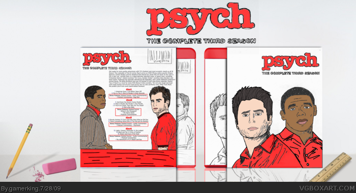
I was originally going to upload my Psych season 2 box that was almost done but since Pan kept saying that I don't deserve the attention I get and that I need to put more effort, I skipped the second season and did the third season hand drawn. Everything on the box is drawn by me except for Jevangod's template and the back text. I tried over and over and over again to write the text out myself but it was too hard. lol
I'll upload the second season later this week though. :)
Edited at 1 decade ago
[ Reply ]
Gimmick for gimmick's sake is hardly ever a good idea. The handdrawn, while still amazing art, just doesn't work in this case. Your 1st Season case was much better.
[ Reply ]
While I agree with KoopaDasher about how your 1st season box was much better, I like this one a lot as well. I give you a fav, sir.
[ Reply ]
All the episodes posted on this box are really from the second season...
[ Reply ]
Everyone loved my First season box but Pan hated it and said I needed to step it up and put more effort. So I did. But people still don't like it. lol you can't win with this site.
and how is it a gimmick?...
-------------------------------------
well here was what I have so far of Psych season 2 that I started like last Wednesday before this one. Should I continue it? link
Edited at 1 decade ago
[ Reply ]
this is nice, real nice.
[ Reply ]
#5, I really like the Second season so far. Nice job. As for Pan... dear boy, as you say, "everyone" liked it, but one person criticized you for lack of effort and you completely change your entire process? You can't please everyone... I found your design to be a perfect match for the simplicity of the show, and I'm sure that anyone who watches the show would feel the same. As for a gimmick, I said "gimmick" because you handdrew the box without the design of the box calling for a drawn image. Nothing in the Third season suggests the need for a handdrawn image. Therefore, you seem to have simply drawn the images (which are excellent, as I said) simply for the sake of drawing them and putting in more effort. At the same time, however, you sacrificed the feel of the show in your design that made your first so popular. That is why I said it was a gimmick.
[ Reply ]
Suck on this Pan. :D
This definitely proves to your haters that you do put effort into your boxes.
[ Reply ]
#7, ah alright. well I'll finish the second one hopefully tomorrow and if there's any good resources left I'll try and do the third one normally. lol
[ Reply ]
Where's the pineapple? lol
I like this a lot, the drawing is great.
[ Reply ]
#10, lol. i was going to draw a pineapple but didn't. xD
[ Reply ]
#5 link
just a wallpaper
Edited at 1 decade ago
[ Reply ]
#12, When has that ever been an issue on this site? The Hall is full of wallpapers with little to no editing.
[ Reply ]
#13 but in my eyes all it looks like is that he is rushing through it, in other words it looks effortless.
Edited at 1 decade ago
[ Reply ]
#14, Then you might want to get some glasses, because it's a much cleaner, sleeker design than most people post on this site, regardless of image quality.
[ Reply ]
#15, there's many boxes with much better image quality and sleeker designs and get little to no attention if someone of lower rank would have posted that season 1 box it wouldn't have gotten as much attention as it did. in the end its more of a popularity thing here on this site
[ Reply ]
#15 whatever floats your boat is fine
[ Reply ]
how does that link have any relevance to my box here? yes, i used that pic on my next box but as long as i rendered it and all then what does it matter? this is a hobby site. if you guys really care that much about your popularity than go join myspace. and here it is again. everyone complaining about me being "effortless" and just "rushing through it". open your damn eyes and look at the box here. i made this one to prove to all of you than i DO IN FACT try with my boxes. so please stop the whining and complaining. if you don't like it, don't comment.
[ Reply ]
#18 I give up Im done trying to explain myself.
[ Reply ]
#18, As I said before, your box was obviously fine by many people, or it would not have gotten Hall. You'll never make everyone happy, and chances are that a lot of people will hate you. Just do what you like and want and forget everyone else.
[ Reply ]
A fine drawing Joe, but it might look good with some color. I'll keep my fav on hold as motivation :P, I posted my digital drawing technique on your page as you requested :)
Also,
I can understand why some artists can get bent at how Gamerking here does some of his boxes. Work from guys like Antwon and Pan are always creative and chock full of effort, but for whatever the reason, their designs usually get overlooked.
Gamerking's design technique is typically straight forward, and less dynamic conceptually, and I believe this is what catches peoples attention in regards to his boxes. Regardless if he's using unedited wallpapers or not in his work, it's hard to argue against the fact that Gamerking knows how to put an attractive box together, and though it's not my preferred way to go about things necessarily, a few years in the actual profession has made me aware that designs typical to Gamerking's work are pretty much what would be expected of a hired graphic designer at a media firm.
While Mr. Gamerking here might not spend all the hours rendering and building compositions as other artists who unfortunately receive less attention, the fact stands that he has a keen eye for pleasing, and straight to the point design. These works are obviously more geared towards the "Graphic" rather then the "Arts", but they look undeniably good as a package usually.
Edited at 1 decade ago
[ Reply ]
very good.
[ Reply ]
I don't know what happened but you got a ton better.
[ Reply ]
Color? :D
[ Reply ]
#23, xD thanks man.
@master general: i wanted to do it in color but when i tried coloring it in gimp...well...it didn't look too good. lol so i left it black in white. :)
[ Reply ]
gamerking is my cousin...he does do his boxes quite quickly because he does it in a day...but in actuality he's actually working on it non-stop the whole day...(he has no life) xD sorry joe =P
P.S. There is a lot of effort in his boxes...because sometimes he has to hand render them...which is funny to watch =P
Edited at 1 decade ago
[ Reply ]
I do TOO have a life ryan! lol
and UPDATE!!!!! color added. took me all day. :D
[ Reply ]
Loves it.
[ Reply ]
The minimal color definitely works in favor of the design. Looks great Joe. :)
[ Reply ]
Woah, I DO like the color update. Again, great drawings, only thing is the reflection is still blue. :P
[ Reply ]
Very nice with color, much more better
[ Reply ]
#30, xD i didn't even notice that i left it blue in the reflection. lol well thanks for the comments and favs guys! =D
[ Reply ]
Great job on the coloring, it looks a lot better.
[ Reply ]
just change the reflection joe and it's perfect
[ Reply ]
updated! fixed the reflection color from blue to red. =P
[ Reply ]
how is this not in the hall?
[ Reply ]
Congratulations on the Hall.
Edited at 1 decade ago
[ Reply ]
thanks guys! my 20th hof. whoot! xD
[ Reply ]
Congrats!
Color does add a nice touch to the box.
[ Reply ]
CONGARDULATIONS!!!!!
[ Reply ]
good job man...love the art style
[ Reply ]