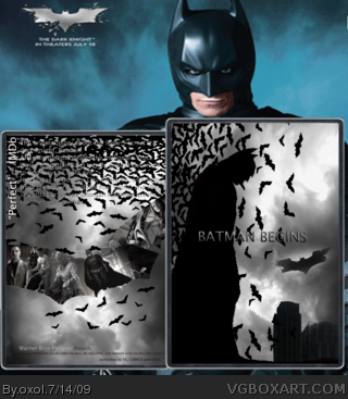
My box for Karmas annual contest, where the boxes should be in just black and white.
Found some flaws but I didnt fix them all becouse I'm not doing this for you, but for me, and Im happy as it is.
credit to Ladykiller for the template.
#3, I just translated it from the swedish cover, didnt think too much about the grammar :(
#2,#3, yeah, I noticed now.it looked fine in PS but now it got alot larger.
I'll see if I can fix that,
oxol, to win this competition you kind of HAVE to do this for us. So we can fav it. So you might win. See where I'm going here? :P But honestly, it's very blurry, the text on the box isn't that good, the logo on the front apoears unprofessional.
And the background says Dark Knight instead of Batman Begins. lol
Anyways, The back is fine, I suppose. The front is nice too, I like the background in it. However, it would be best to blend in Batman more, and.. I don't know, the logo doesn't look right.
#8, Everything matters. The strength of any design is in the details, so hoping that the viewer won't notice small things is kind of like saying, "don't look at my art."
 Batman Begins Box Cover Comments
My box for Karmas annual contest, where the boxes should be in just black and white.
Found some flaws but I didnt fix them all becouse I'm not doing this for you, but for me, and Im happy as it is.
credit to Ladykiller for the template.
[ Reply ]
Not very good in full view, in normal size I can't even read the text.
[ Reply ]
The original story of the legend about the dark knight, batman.
[ Reply ]
Oh man, this looks rough in full view. Sorry!
[ Reply ]
#3, I just translated it from the swedish cover, didnt think too much about the grammar :(
#2,#3, yeah, I noticed now.it looked fine in PS but now it got alot larger.
I'll see if I can fix that,
[ Reply ]
oxol, to win this competition you kind of HAVE to do this for us. So we can fav it. So you might win. See where I'm going here? :P But honestly, it's very blurry, the text on the box isn't that good, the logo on the front apoears unprofessional.
And the background says Dark Knight instead of Batman Begins. lol
[ Reply ]
Haha, yeah you have a Dark Knight background.
Anyways, The back is fine, I suppose. The front is nice too, I like the background in it. However, it would be best to blend in Batman more, and.. I don't know, the logo doesn't look right.
[ Reply ]
#8, Everything matters. The strength of any design is in the details, so hoping that the viewer won't notice small things is kind of like saying, "don't look at my art."
[ Reply ]