Not bad! The front is really good but the back has a lot of potential. Maybe if you added screenshots, less text, and a Yoshi which art style matches the one on the front it would be perfect! 4/5 overall ;)
#2, The front is REALLY GOOD?
I dont know but..i am one of the badest Boxart-Makers on this Site and i made better fronts then this and nobody said rellay good..
But i dont wanna say its bad.
The back is really cool,another Text-Color for ,,Battle as Yoshi...''
will be better.
Screenshots in the DS-Style with two Screens are cool,too...
Back to the front...
Take another Logo,this one is...umph....not so good
ESRB is a little bit sketched up,then use a better background and another yoshi artwork...
So,when you edited all this points,maybe i will fave it :)
cool that you edited the color of the text on the back..
And the DS-Thing is awesome,too :)
But i cant find any Improvement at the front...i dont like the logo...dont know why...But anyway,know you get a 3/5 from me + fav...For one of your first boxarts here it is really cool and i see you have potential :)
 Super Yoshi World Box Cover Comments
Here's where I got the stuff.
Logo: I made it, if you want it, just ask me.
ESRB and Nintendo Logo: VGBA Database.
Yoshi pics and backgrounds: Google.
[ Reply ]
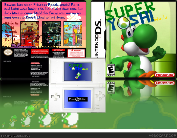
Not bad! The front is really good but the back has a lot of potential. Maybe if you added screenshots, less text, and a Yoshi which art style matches the one on the front it would be perfect! 4/5 overall ;)
[ Reply ]
Okay, I added screenshots (found on Google) and cut down the text, like it now?
[ Reply ]
#2, The front is REALLY GOOD?
I dont know but..i am one of the badest Boxart-Makers on this Site and i made better fronts then this and nobody said rellay good..
But i dont wanna say its bad.
The back is really cool,another Text-Color for ,,Battle as Yoshi...''
will be better.
Screenshots in the DS-Style with two Screens are cool,too...
Back to the front...
Take another Logo,this one is...umph....not so good
ESRB is a little bit sketched up,then use a better background and another yoshi artwork...
So,when you edited all this points,maybe i will fave it :)
2.5/5
[ Reply ]
Edited at 1 decade ago
[ Reply ]
The only reason you make better fronts than me is that you've been on this site longer than me.
[ Reply ]
Okay, updated it.
[ Reply ]
To tell you the truth, i kinda liked the first logo better. This logo's font doesn't have the "Yoshi" style. It doesn't go with the box
[ Reply ]
#8, I liked the first one better too, but I was taking #4's advice.
[ Reply ]
I like the first one better, too. Use the original logo and I'll fav!
[ Reply ]
Um, okay.
[ Reply ]
I updated it, YOYO, you better fave. ^^
[ Reply ]
I faved. :D
[ Reply ]
Worth a fav now :)
[ Reply ]
Thanks for the favs guys.^^
[ Reply ]
bump, lol.
Edited at 1 decade ago
[ Reply ]
I added a DS with screenshots to the presentation, hope you like it.
[ Reply ]
Very cool.
[ Reply ]
#18, thanks.
[ Reply ]
cool that you edited the color of the text on the back..
And the DS-Thing is awesome,too :)
But i cant find any Improvement at the front...i dont like the logo...dont know why...But anyway,know you get a 3/5 from me + fav...For one of your first boxarts here it is really cool and i see you have potential :)
[ Reply ]
#20, thanks for the fav.
[ Reply ]
awsome
[ Reply ]