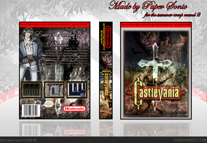
I agree with #6, Richter's from a completely different generation. Simon should be the main focus here. Also, just some minor design flaws on the back (whip going into the screenshot, the NES seal getting cut off, no Konami dev logo...). The front though does look rather pleasing. I like the direction where all this is going, but it still looks like a WIP to me.
Agree with #6,#7. It looks a little rough with some mistakes, but it looks really nice overall and with some corrections/additions it has the potential to be an excellent boxart.
Not bad, but Kojimas work (back) does not fit the artwork on the front (and on the back is Richter, not SImon ;)). The golden parts of the "Seal of Quality" are transparent and that`s one of those no-go`s if you ask me. Some pics look a bit rough (agreed), but the mood of the package is good.
 Castlevania Box Cover Comments
Heyy new box, and my entry for Stevens, Summer Comp! sorry for the low quality it was to big for a Png so i had to save it as a JPL
credit to Runawayrad, for the temp and Da for the art
link
link
[ Reply ]
Thanks for all the comments guys ¬_¬
[ Reply ]
Yesh!
Great one, my favourite from you.
[ Reply ]
EPIC!
Nice one!
Fav + Author Fav XD
[ Reply ]
Thanks for all the favs and comments!
[ Reply ]
Richter Belmont is on a cover for the original Castlevania...
Try to find a good shot of Simon Belmont.
Other than that, this is pretty good.
[ Reply ]
I agree with #6, Richter's from a completely different generation. Simon should be the main focus here. Also, just some minor design flaws on the back (whip going into the screenshot, the NES seal getting cut off, no Konami dev logo...). The front though does look rather pleasing. I like the direction where all this is going, but it still looks like a WIP to me.
[ Reply ]
Agree with #6,#7. It looks a little rough with some mistakes, but it looks really nice overall and with some corrections/additions it has the potential to be an excellent boxart.
[ Reply ]
Very cool!
[ Reply ]
i like it...but you should update it with a picture of Simon from like CV: Chronicles
[ Reply ]
Not bad, but Kojimas work (back) does not fit the artwork on the front (and on the back is Richter, not SImon ;)). The golden parts of the "Seal of Quality" are transparent and that`s one of those no-go`s if you ask me. Some pics look a bit rough (agreed), but the mood of the package is good.
Edited at 1 decade ago
[ Reply ]
Ok working on the update now Thanks guys!
[ Reply ]
SO much better than the real one!
Why would you want to update this? Its perfect as is!
5/5
[ Reply ]
#13, Read comments 6-8 and 10-11. It's good, but needs some changes.
[ Reply ]
SIIICK.. back needs work..
[ Reply ]
Nice.
[ Reply ]
#14, you're right, there are some technical errors, (CV2 images on first game, Richter on back) but there's really no a problems with how it looks.
[ Reply ]