[ Box updated on June 20th, 2009 ] [ original ]
 Resident Evil: The Darkside Chronicles Box Cover Comments
Comment on Thumbs's Resident Evil: The Darkside Chronicles Box Art / Cover.
[ Box updated on June 20th, 2009 ] [ original ]
Comment on Thumbs's Resident Evil: The Darkside Chronicles Box Art / Cover.
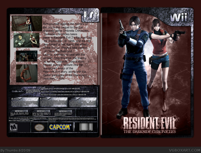
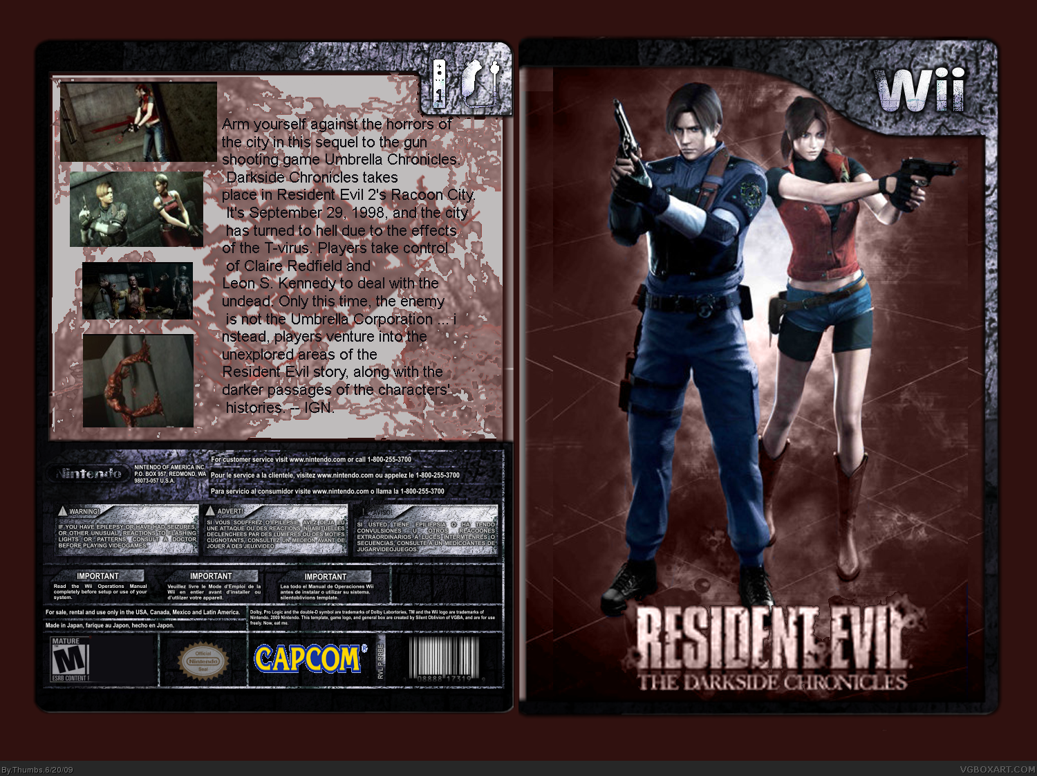
Resident Evil; The Darkside Chronicles box, everyone has been making them lately using the same picture for the front. I decided to use a different one, and then shade the title red, instead of the typical blue. All pictures and back description came from IGN.com, Template came from the Resources tab on this site. It's my first box, so don't be mean.
Edited at 1 decade ago
[ Reply ]
I kinda like it, but the back isn't really that stylish.
[ Reply ]
#2, To get into specifics, the font on the back isn't bold enough and the screenshots haven't been edited enough so that they look like they belong with the background. Perhaps you should add boarders to them. I can't say I understand what the background is suppose to be, maybe just something abstract. It's not badly made yet it needs refining.
Edited at 1 decade ago
[ Reply ]
Don't forget to give credit to S_O for the template.
[ Reply ]
#3, Thanks, the background on the back is suppose to look like the mutated virus, or even the skin of the infected when it's decaying. I thought it was pretty clever... Guess not...
The font, I didn't want to make to fancy that way you wouldn't be able to read it..
[ Reply ]
#5 There are plenty of fonts that are fancy yet readable, but choose the best one that fits the box, and mkae that your priority when concerning with font. Try your best not to ever use Arial or anything like it unless the box calls for it.
And the screens should be the same size, or at least similar (which means that they are the same proportions, just smaller or bigger than the other if that makes sense). Like, don't make one screen a rectangle and another a square, it doesn't look good.
Also, try to kind of entangle the images and words with each other; don't make half the box text and the other images. Again, it doesn't look good.
Finally, the I see what you were trying to do with the front with the background image, and then that same image but bigger behind it, but it just doesn't look that great and is confusing. If you still want to do that idea, at least change the color of one to ghostly blue (yeah, I just made a color, suck it Crayola!) so that the images contrast each other more.
I know it's a lot, but this has a lot of potential to be good for a first box.
Edited at 1 decade ago
[ Reply ]