The actual game cover looks pretty nice, but the slip cover looks a kind of poorly designed. I don't really like the placement on the female silhouette, and I'm getting a bad vibe from that Bevel on the hand.
The actual back however is greatly organized, it kind of reminds me of a newspaper type effect. The slip cover back is perfect too, while it's not as "newspapery" it still screams, ACTION!
 Metropolis Box Cover Comments
O Hai!
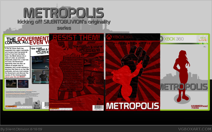
Well, this is my secret project that was dated at the 18th, but I kinda finished early =P
The slipcover is aiming for a propaganda poster, thats why it completely stands out, as a poster like that would.
The main box is very minimilitic, with silhouttes and shizz =P.
Tons of work went into this one, hope you all like it.
And if you haven't noticed, its my first 360 box in eons.
Enjoy.
[ Reply ]
Looks great as always. +fav.
Edited at 1 decade ago
[ Reply ]
Epic!
[ Reply ]
WOOp
[ Reply ]
Meh..My prediction ws close...
[ Reply ]
Very nice job Silent Oblivion, I love the slip cover.
[ Reply ]
oh my sweet jesus! im not worthy *bows down*
[ Reply ]
i like the overall design great job!
Fav
[ Reply ]
The actual game cover looks pretty nice, but the slip cover looks a kind of poorly designed. I don't really like the placement on the female silhouette, and I'm getting a bad vibe from that Bevel on the hand.
The actual back however is greatly organized, it kind of reminds me of a newspaper type effect. The slip cover back is perfect too, while it's not as "newspapery" it still screams, ACTION!
[ Reply ]
good box 4/4
[ Reply ]