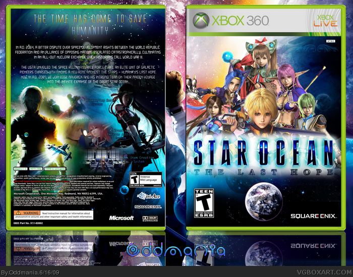
The front has spectacular colors. The back is a bit weird, maybe it's the way your monitor is but I find it easy to notice the space background has been partly cut, it doesn't blend together too well and is a bit of a mishmash.
I kind like what you did with the front, but that back is polluted as heck! The description ins unreadable and as for the front, the STAR OCEAN logo has an intense outerglow, deosn't make it look good
Thanks for your feedback! The only thing that still appeals to me about that box after all this time is the colors on the front. Everything else is full of flaws, it just looks obvious right now. Fortunately, I've learned from my mistakes!
 Star Ocean 4: The Last Hope Box Cover Comments
My new box ! =D
I like the front, but I hate the back :[ I don't know what you think, just tell me ^ ^
[ Reply ]
Epic.
[ Reply ]
#2, Haha thanks !
[ Reply ]
The Back is not bad, it really very pretty and the front you outdone your self there, WELL DONE fav+
Edited at 1 decade ago
[ Reply ]
#4, Thank you ;)
[ Reply ]
looks awesome! are all those characters on the cover separate images
[ Reply ]
Do you care that you don't get noticed? +Fav
[ Reply ]
#6, Thanks ;) Yes, they are. I made the montage myself.
[ Reply ]
amazing box +fav
[ Reply ]
#7, That really doesn't matter, I make covers because I like this.
[ Reply ]
#9, Thanks ^ ^
[ Reply ]
#10, Thats the spirit =]
[ Reply ]
The front has spectacular colors. The back is a bit weird, maybe it's the way your monitor is but I find it easy to notice the space background has been partly cut, it doesn't blend together too well and is a bit of a mishmash.
[ Reply ]
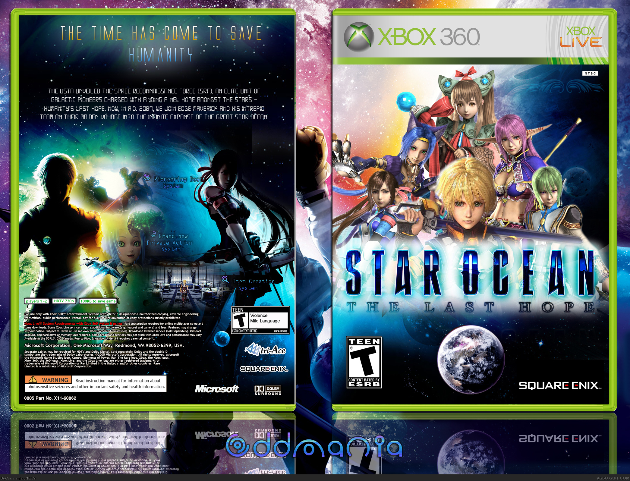
#13, Yeah you're right, I don't really like the back...
I'm gonna try to update it ! Well thanks, for the front, I tried to mix some wallpapers to make a colorful background, behind the characters.
Edited at 1 decade ago
[ Reply ]
Ok that's done, I updated it ^ ^
[ Reply ]
the tagline is a bit small, and the colours on the back still clash a bit, but i actually like the box overall.
+fav
[ Reply ]
#16, Ok thanks, but what do you mean by " clash a bit " ? They're dark, aren't they ?
Edited at 1 decade ago
[ Reply ]
#17, i meant going from a bit light-green to dark-blue is rough on the eyes,but it's not a big deal.
[ Reply ]
Aww ok I see, yeah you're right ;)
[ Reply ]
The front is turly amazing but the back... well, the blending is off and the colors makes it look weird. Glad to see you are trying at least :D
[ Reply ]
#20, Yeah I know, I don't like it either...
[ Reply ]
Your covers are great, but the back, while not bad, could use some work. Maybe doing the back first next time will help. Working may be effective!
Edited at 1 decade ago
[ Reply ]
I kind like what you did with the front, but that back is polluted as heck! The description ins unreadable and as for the front, the STAR OCEAN logo has an intense outerglow, deosn't make it look good
Overrall, it's an "meh" box
[ Reply ]
Thanks for your feedback! The only thing that still appeals to me about that box after all this time is the colors on the front. Everything else is full of flaws, it just looks obvious right now. Fortunately, I've learned from my mistakes!
[ Reply ]