While I like what you did with the screenshots, I'm not feeling the sketched renders. If these were completely original sketches I would'nt have mind the roughness - but since these are traced you could've cleaned them up a bit.
Sort of like your street fighter and Prince of Persia drawings - they seem more complete and clean. You are really good at drawing, so it would've been more interestng to see an original drawing for assassin's creed fom you.
#9, That's a reasonable critique. Admittedly this was a quick box, so I didn't spend nearly as much time drawing as I have with other designs. It was a fun experiment and I appreciate everyone's feedback. I'm sure my next NES box will benefit from what I've learned here.
 Assassin's Creed Box Cover Comments
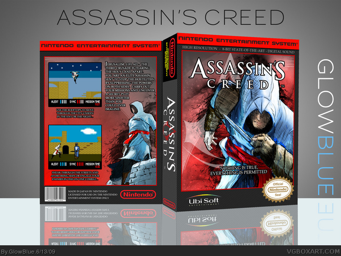
Just a little experiment, hope you like it!
I traced some official artwork and sketched over it to create the larger images. The screenshots I made from scratch in Illustrator and Photoshop.
[ Reply ]
Haha very cool!
[ Reply ]
Great job :)
[ Reply ]
looks awesome! but you should use the old ubisoft logo
Black
link
White
link
would make it look more official ^^. I'm still favin! Those screenshots are THE shit!
[ Reply ]
#4, I really like my little modified Ubisoft logo though :( Grrrrrr. In the interest of authenticity I suppose I should redo it. Update forthcoming...
[ Reply ]
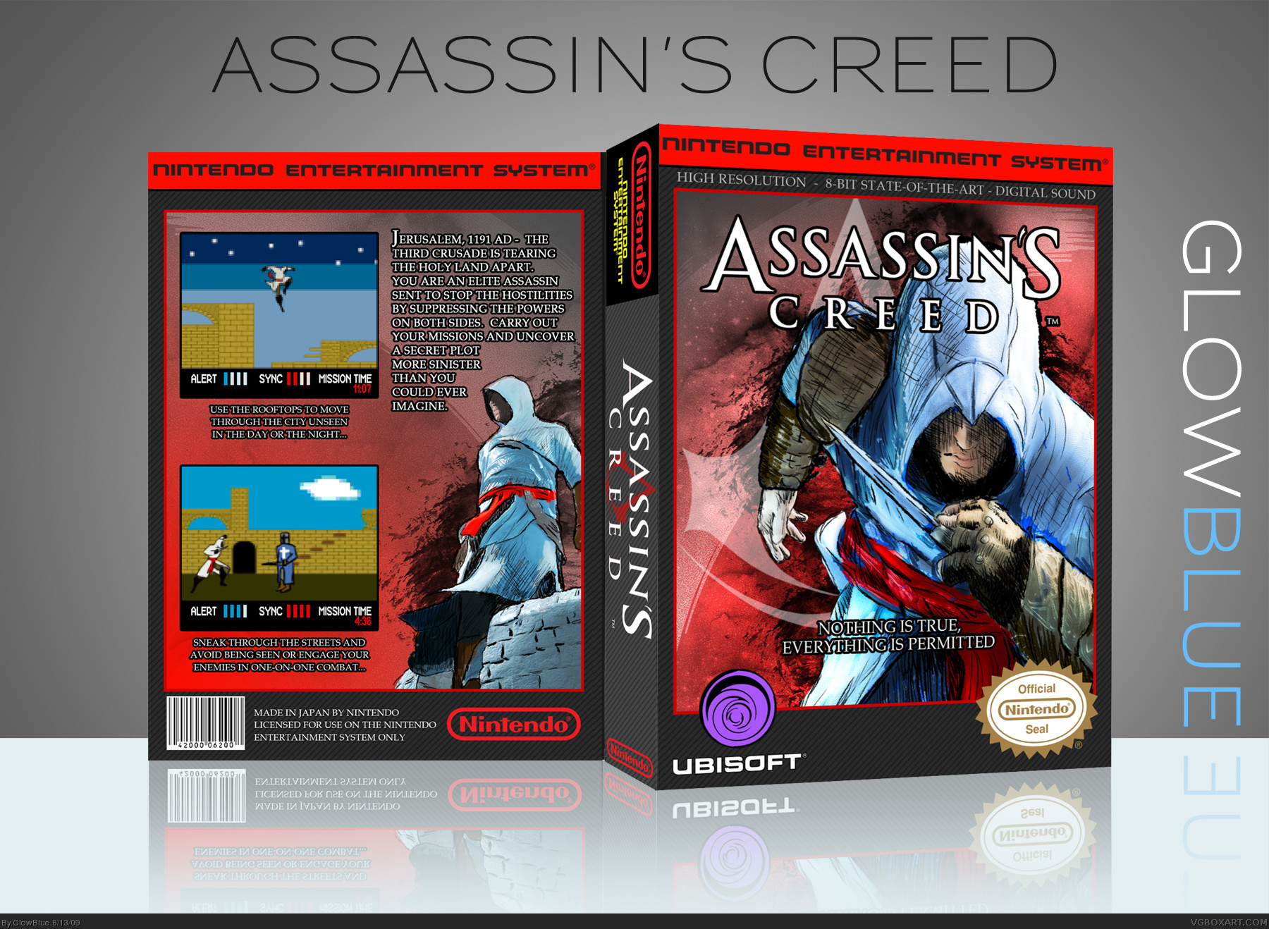
UPDATED: Changed the Ubisoft logo on the front to use the old style. Thanks to Roza for that one.
[ Reply ]
This looks really nice, but it just doesn't seem to have the NES feel to me.
I think that one of the problems is in your screenshots. The sprites are too advanced for 8 bit. You've got to work pixel-by-pixel on such things.
[ Reply ]
Awesome.
Edited at 1 decade ago
[ Reply ]
While I like what you did with the screenshots, I'm not feeling the sketched renders. If these were completely original sketches I would'nt have mind the roughness - but since these are traced you could've cleaned them up a bit.
Sort of like your street fighter and Prince of Persia drawings - they seem more complete and clean. You are really good at drawing, so it would've been more interestng to see an original drawing for assassin's creed fom you.
[ Reply ]
I don't mind the screenshots or the sketchy feel to the drawings. I personally love it.
[ Reply ]
#9, That's a reasonable critique. Admittedly this was a quick box, so I didn't spend nearly as much time drawing as I have with other designs. It was a fun experiment and I appreciate everyone's feedback. I'm sure my next NES box will benefit from what I've learned here.
[ Reply ]
Cool.
[ Reply ]
The Nintendo Seal was the "Nintendo Seal of Quality" back in the NES days.
[ Reply ]
Very cool idea man. I really like how it came out.
[ Reply ]
Really cool! :) I like the screenshots!
[ Reply ]
Thanks for the FAVs and feedback everyone! :)
[ Reply ]
That's amazing :O
[ Reply ]