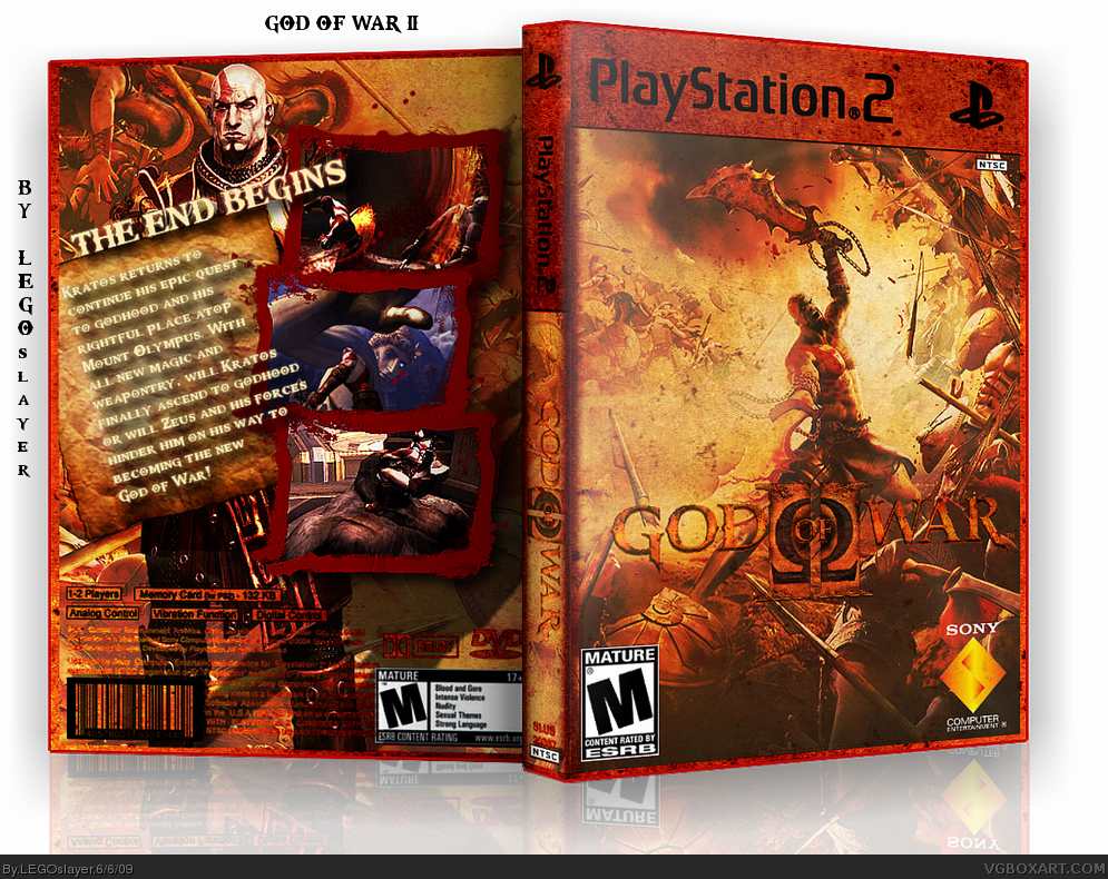
You're reflection doesnt look to good my friend, i suggest that you learn how to skew, we have some tutorials on this site about it. And i also suggest that you try something different with the text, the outer glow and drop shadow are too much. Try removing them both and make the text a grainy orange and tattered up, kinda like the GoW logo. Aside from all that, great work!
The back just ruins a perfect front and temp design. I'd suggest giving it some real image editing, perhaps features across a blade, do something nice with the screenshot borders, instead of the traditional blood borders. Give it some variety.
This is a great box, but I don't think it's done yet.
The front is epic. However the reflection is a little off and the back could use some improvements. For instance, the screenborders don't fit the theme imo and I don't think the text should have a glow.
The text also overlaps the screens and I don't think the tagline fits in.
It has good basic makings but it needs some work. The front however is really epic,loving it.
#12, Have you played God of War II? The tagline is the official, and the bloody screenborders were a great idea. And the overlapping text isn't something that bothers me that much.
Really Good box there, sure stands out. Main distraction for me is that back text.. slight yellow glow and long drop shadow doesn't do it do me. Also, would look better if the title logo stood out more... like more yellow-gold. No comment on reflection ;) Nice one.
#15, No unfortunately I never got to play the 2nd. I've played chains of olympus and the original and if I can I'll try and play it.
Anyway, I meant that it sort of doesn't fit in with the style of the back's art. I was just mentioning about the text which I feel should be more grungey without the glow. And you are completely right,bloody screenborders are a brilliant idea,but they just don't look quite serious enough if you know what I mean.
 God of War II Box Cover Comments
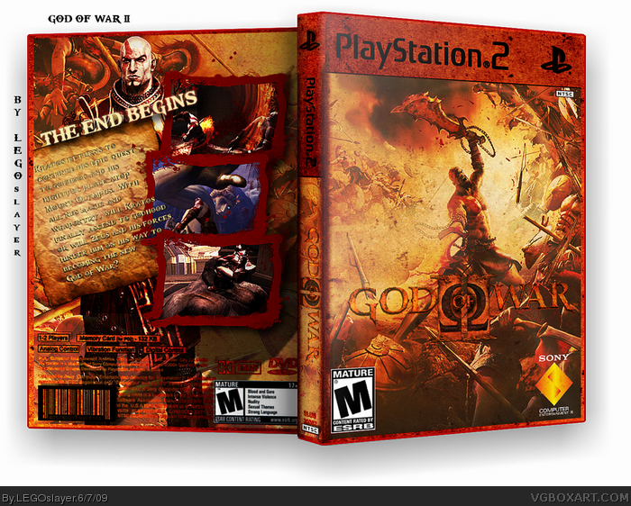
Custom-made temp which I'll release to the forums if anyone wants it. But credit to koopa's database for the base temp.
Credit to gamewallpapers.com for main pic, planetrenders.net for render, and gamespot.com for screens.
credit to querty again for the screen borders, koopa's database for esrb and sony logo, and planetrenders for gamelogo
[ Reply ]
Yes.
[ Reply ]
#2 I agree.
[ Reply ]
#3, I agree also.
This is your Best by far!
[ Reply ]
lovely, even though the reflection is a tad off
[ Reply ]
You're reflection doesnt look to good my friend, i suggest that you learn how to skew, we have some tutorials on this site about it. And i also suggest that you try something different with the text, the outer glow and drop shadow are too much. Try removing them both and make the text a grainy orange and tattered up, kinda like the GoW logo. Aside from all that, great work!
[ Reply ]
The back just ruins a perfect front and temp design. I'd suggest giving it some real image editing, perhaps features across a blade, do something nice with the screenshot borders, instead of the traditional blood borders. Give it some variety.
This is a great box, but I don't think it's done yet.
[ Reply ]
This is nice! I like it!
[ Reply ]
i really like it, great temp too.
[ Reply ]
I agree with Brettska99 about the text on the back. Otherwise, I really like it!
[ Reply ]
I'd like to at least have a look at the template. Don't know if I'd use it, but I'd like it.
[ Reply ]
The front is epic. However the reflection is a little off and the back could use some improvements. For instance, the screenborders don't fit the theme imo and I don't think the text should have a glow.
The text also overlaps the screens and I don't think the tagline fits in.
It has good basic makings but it needs some work. The front however is really epic,loving it.
[ Reply ]
woah
[ Reply ]
sorry dubble post
Edited at 1 decade ago
[ Reply ]
#12, Have you played God of War II? The tagline is the official, and the bloody screenborders were a great idea. And the overlapping text isn't something that bothers me that much.
[ Reply ]
Epic.
[ Reply ]
Really Good box there, sure stands out. Main distraction for me is that back text.. slight yellow glow and long drop shadow doesn't do it do me. Also, would look better if the title logo stood out more... like more yellow-gold. No comment on reflection ;) Nice one.
[ Reply ]
#15, No unfortunately I never got to play the 2nd. I've played chains of olympus and the original and if I can I'll try and play it.
Anyway, I meant that it sort of doesn't fit in with the style of the back's art. I was just mentioning about the text which I feel should be more grungey without the glow. And you are completely right,bloody screenborders are a brilliant idea,but they just don't look quite serious enough if you know what I mean.
[ Reply ]
I'd get rid of the glow on the text, otherwise pretty good.
[ Reply ]
Okay, I edited the text...
[ Reply ]
Now the text isn't as readable. I would suggest darkening the paper.
[ Reply ]
nice one.
[ Reply ]
Front is great (though you could make logo more readable), but on the back it's hard to read the description.
[ Reply ]
Anyway can I ask where you found the artwork for the front?
[ Reply ]
gamewallpapers.com
[ Reply ]
Have I seen you somewhere? You're from Planetrenders, aren't you?
[ Reply ]
Yes I am
[ Reply ]
Nice. I put it in HoF.
[ Reply ]
Congrats! I knew this will get HoF. =)
[ Reply ]
looks awesome, great temp too. Very creative 5/5
[ Reply ]
Welcome to The Hall of Fame!
[ Reply ]
Here have a cookie =)
[ Reply ]
:D
Thanks guys!
Edited at 1 decade ago
[ Reply ]
congrats man!
[ Reply ]
Ha! It's about time!
[ Reply ]
Your first HoF and an awesome one too. Great work.
[ Reply ]
this box is full of win
[ Reply ]
hi
if you could please you give me the image print version because I use your coat for me create a new box PS2
My email address: [email protected]
Thank you very much
[ Reply ]
two worlds: WOW WOW!
[ Reply ]
hello friend nice cover have as you send me this cover?
[email protected]
[ Reply ]