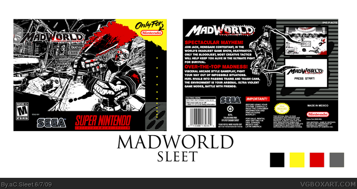
It is A LOT harder to make a box with only 5 colours than I thought it would be.
Credit to Shenske and planetrenders as usual.
This only took about 2 hours which is rushed for me, but my internet is out tomorrow and I leave for school in ten minutes, and I really want to be part of vgba's first competition :)
Updates will be coming on the 8th, better presentation, a bit cleaner etc.
Best viewed NOT in full view.
Hope you like it.
I didn't think people would mind the two Jack's, but I am going to take out the smaller one, and Eggboy'13 i'm leaving the billboard, as they are in the game. Thanks for all the favs and comments guys! and I feel honoured to have fav from you adfd lol :)
It's very well put together. The front is very scenic, and the back is very "Super Nintendo-esque". The color alterations are almost unnoticeable, and pass on very well.
This is a great addition to the competition. Nice work!
#16, nope that's how the esrb goes on SNES boxes lol I'm not sure why the text is backwards :/. Will be fixed in update. thanks for favs and comments guys.
 Madworld Box Cover Comments
It is A LOT harder to make a box with only 5 colours than I thought it would be.
Credit to Shenske and planetrenders as usual.
This only took about 2 hours which is rushed for me, but my internet is out tomorrow and I leave for school in ten minutes, and I really want to be part of vgba's first competition :)
Updates will be coming on the 8th, better presentation, a bit cleaner etc.
Best viewed NOT in full view.
Hope you like it.
Edited at 1 decade ago
[ Reply ]
great.
[ Reply ]
With this 5 colour thing I expected a flood of mad world boxes...
BTW Awesome box!
[ Reply ]
Should have been on the Genesis, IMO, being made by Sega and all...
But it's pretty awesome anyway!
I don'tknow what you mean, it's great in full veiw.
Edited at 1 decade ago
[ Reply ]
Great job. But one thing that really doesn't seem right: there are two Jacks on the front.
[ Reply ]
#5, I was just gonna say that =P Yeah, 2 Jacks.
But the overall box is very nice, great job!
[ Reply ]
I was thinkin the same thing, #3...
Box is great!
Edited at 1 decade ago
[ Reply ]
Very nice. MadWorld on the SNES reminds me of Super Smash TV :)
[ Reply ]
#5, True, plus the one on the billboard, (It's the same as the art on the box!) XD
[ Reply ]
I didn't think people would mind the two Jack's, but I am going to take out the smaller one, and Eggboy'13 i'm leaving the billboard, as they are in the game. Thanks for all the favs and comments guys! and I feel honoured to have fav from you adfd lol :)
[ Reply ]
Holy hell I missed this!?
[ Reply ]
It's very well put together. The front is very scenic, and the back is very "Super Nintendo-esque". The color alterations are almost unnoticeable, and pass on very well.
This is a great addition to the competition. Nice work!
[ Reply ]
very nice. i like it youve improved alot since i last saw your work
+fav
[ Reply ]
Thanks for the critiques and fav's guys.
Nowhere near enough to come close to even the top ten in the comp but still i'm really proud of this one. :)
[ Reply ]
Great Job! Even though I just told you in person haha
[ Reply ]
Great box! I love grunge-style things like this. Shouldn't the ESRB logo be moved down a bit on the front? Sorry if I'm wrong, though.
Oh, and the top screenshot on the back made me laugh and reminds me of Tankmen. Why is the text backwards though?
[ Reply ]
woah cool :)
[ Reply ]
#16, nope that's how the esrb goes on SNES boxes lol I'm not sure why the text is backwards :/. Will be fixed in update. thanks for favs and comments guys.
[ Reply ]