Not supposed? Well... You sure can make something like that, but you could at least try a bit more if you cannot wait till more information and material is available.
#4, Yes your right that was not constructive, Your really cracking down on that aren't you. Any way, Yoyo, as Wasa-bi has said even quickies could use more work. Your problem with the back is that You have some great art but the text goes right over it. That is making it hard to see the art as well as hard to read the text. Try morphing the text around the image, and adding a shadow. For the front I suggest getting rid of what ever is on the logo. And try reworking the image. Good Luck, I can't wait to ee what you can do with this.
 Metroid: Other M Box Cover Comments
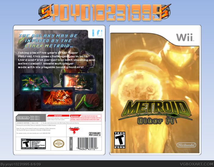
Hey, it's me with my latest box!
I know it's not my best work, but I had to do a box for this big announcement!
Please comment, rate, and enjoy!
Credit to Koopa Dasher for the Wii template.
[ Reply ]
You just had to be the first. Its not too good. Back is really bad.
[ Reply ]
I suggest a better logo.
link
[ Reply ]
#2, That's not constructive.
Yoyo you should think about mentioning this author. link
[ Reply ]
Okay, okay, calm down everyone.
#2, I know I'm not supposed to do this, but, since what you said is true, this is indeed a quickie. Sorry you don't like it.
#3, thanks! I'll update with that logo.
#4, you're right. The author of the back, everyone, is =transfuse of Deviantart.
[ Reply ]
Not supposed? Well... You sure can make something like that, but you could at least try a bit more if you cannot wait till more information and material is available.
[ Reply ]
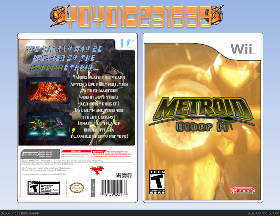
Update!
Better font on the back!
Better Nintendo logo on the front!
New title! However, I think that it doesn't look any better than the first one.
#2, could you tell me what you don't like about the back?
#6, you're not supposed to do "quickies". This is kind of a quickie.
[ Reply ]
#7, you can make even quickies if you try a bit more (and wait till more information and material is available)
[ Reply ]
#8, you're right... but I really wanted to make a box for this. I'll make a better one when more info comes out.
[ Reply ]
#4, Yes your right that was not constructive, Your really cracking down on that aren't you. Any way, Yoyo, as Wasa-bi has said even quickies could use more work. Your problem with the back is that You have some great art but the text goes right over it. That is making it hard to see the art as well as hard to read the text. Try morphing the text around the image, and adding a shadow. For the front I suggest getting rid of what ever is on the logo. And try reworking the image. Good Luck, I can't wait to ee what you can do with this.
[ Reply ]
Why didn't you use the logo I suggested? It is already rendered.
[ Reply ]
#10, I'll update later.
#11, I did and this is how it turned out.
[ Reply ]
Updated with a few minor changes!
[ Reply ]