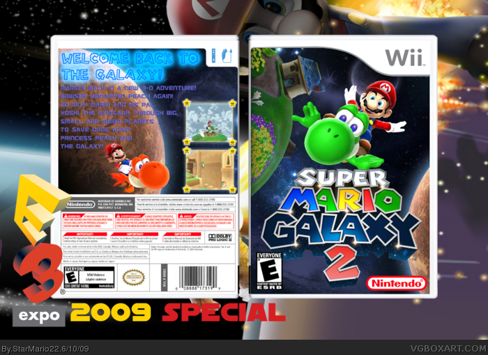
It's too early for this, you're using the same art from the first game, because of this the box doesn't correlate to the game. It means nothing to be first, just make sure that before you create a cover for a game, that there is distinguishable art available for use. It isn't bad, it just doesn't appear to be new, a lot of the old art is being used here.
#3, yeah, but I want to do a box for this so much.
oh and BTW, will you FAV it?
EDIT: #3, there are only 3 or 2 (LOGO) things from the old Game. So you can't say "a lot of the old art is being used here"
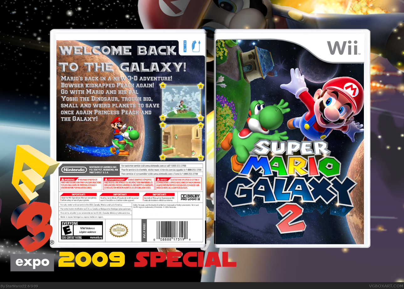
#13, Mario font for the tagline, styled to match the Galaxy feel. Just search for it. Anyway, for the secondary (description) font, something simple, rounded. I'd say Continuum Bold (or just one from the Continuum family).
Totally badass. The front is done very nicely, although it is missing a developer logo and ESRB rating. The back could use a little work, though; the text is hard to read against that planet on the left side.
Did someone noticed that this logo is a little different then the original? Under Galaxy and the 2 are stars and stuff. On the Original, there is it metalic.
:O
 Super Mario Galaxy 2 Box Cover Comments
Not bad, feved, I hate the render on the back though.
[ Reply ]
Woah. Love this. And it will be harder, nintendo said! :D
Credits:
Logo - Tucker1140
Screenborder - the guy who made this.
renders - Planet renders
so yo.
Enjoy!
EDIT: #1, woah fast and thx.
Edited at 1 decade ago
[ Reply ]
It's too early for this, you're using the same art from the first game, because of this the box doesn't correlate to the game. It means nothing to be first, just make sure that before you create a cover for a game, that there is distinguishable art available for use. It isn't bad, it just doesn't appear to be new, a lot of the old art is being used here.
[ Reply ]
#3, yeah, but I want to do a box for this so much.
oh and BTW, will you FAV it?
EDIT: #3, there are only 3 or 2 (LOGO) things from the old Game. So you can't say "a lot of the old art is being used here"
Edited at 1 decade ago
[ Reply ]
#4, What new art is being used besides the main logo and the screenshots?
Edited at 1 decade ago
[ Reply ]
It was inevitable.
[ Reply ]
#5, well I edited the Yoshi in the front and back.
Another Background. But not OFFICIAL art of course.
[ Reply ]
UPDATE: CREDIT FOR NINTY (MY HERO) FOR THE FIRST OFFICIAL ART (RENDER)
OF SUPER MARIO GALAXY 2.
[ Reply ]
It is way too early for boxes of these to be made.
[ Reply ]
WHERE CAN I FIND THIS LOGO?!?
the box is good too, faved.
just change the text on the back.
Edited at 1 decade ago
[ Reply ]
#10, On the request forum ;) I made the theard.
[ Reply ]
will you actualy be able to ride Yoshi in this game?
#13, Sweet! I don't know what font you should use though...search on dafont.
Edited at 1 decade ago
[ Reply ]
#12, YES!!! YEAH! Look in the trailer!
PS: What Font should I use for the Back?
[ Reply ]
#13, Mario font for the tagline, styled to match the Galaxy feel. Just search for it. Anyway, for the secondary (description) font, something simple, rounded. I'd say Continuum Bold (or just one from the Continuum family).
[ Reply ]
UPDATE: New Fonts, just like Tleeart said.
[ Reply ]
-Comment deleted by user-
Edited at 1 decade ago
[ Reply ]
Has anyone else noticed the lack of rating and dev logos on the front?
[ Reply ]
Totally badass. The front is done very nicely, although it is missing a developer logo and ESRB rating. The back could use a little work, though; the text is hard to read against that planet on the left side.
Overall, good job. IT really gives the SMG feel
[ Reply ]
#17, I actually didn't notice that.
[ Reply ]
What the fudge, this is real?! You have done an awesome job!
[ Reply ]
Did someone noticed that this logo is a little different then the original? Under Galaxy and the 2 are stars and stuff. On the Original, there is it metalic.
:O
[ Reply ]
#2, Where am I?
[ Reply ]
#2, are those screenborders from a mario party galaxy box? 'cuz i remember making those borders:P
[ Reply ]
#21, that was the original logo. It was changed before the official release.
[ Reply ]
It's not bad, but you should really just follow what others have been saying. Add an ESRB and dev logo, and clean up the back a bit.
[ Reply ]
UPDATE:
Esrb and dev logo are now on it and I changed the Back a little!
[ Reply ]
Awsomeness. Fav.
[ Reply ]
Your best :)
[ Reply ]
Your best :)
[ Reply ]
#28, Yes, I know
#29, Yes, I know
XD
[ Reply ]
Awsome! The back could be better, but love the front!
[ Reply ]
Where did you get those picture there amazing
[ Reply ]
Nice! 4.5/5 +fav
[ Reply ]
someone used this in nintendo clips link
[ Reply ]
A noob stole the front of your box.
www.vgboxart.com/view/40158/super.mario-no.time.to.waste/?replies=2
[ Reply ]