Please do not comment saying that the boxart is no good because the front or any of the other images are used everywere. This is just practice for me as I want to start using Photoshop again. Constructive criticism is more than welcome.
Not bad, it just looks too similar to Hellknight's honeycomb one for me, and it's a bit too small to give any proper criticism.
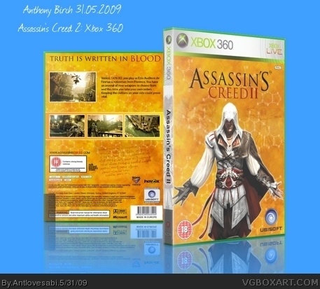
Nonetheless, I'll try: You should have done something different with the front and back, the same parchment/dna thing looks too bland. Ezio also looks like he's just been slapped on the front, try and put something around him, like some lighting effects, blooming, other pictures (like of 15th Century Italy or some Da Vinci drawings). Good job for a first though.
Just noticed you've uploaded a bigger version, can't view it in full though. Still same advice, but good job on your first box.

 Assassin's Creed II Box Cover Comments
Please do not comment saying that the boxart is no good because the front or any of the other images are used everywere. This is just practice for me as I want to start using Photoshop again. Constructive criticism is more than welcome.
[ Reply ]
It's lookin pretty good! But it is a bit too small! I cant really see it wee, even in full! Upload a bigger version...
[ Reply ]
Not bad, it just looks too similar to Hellknight's honeycomb one for me, and it's a bit too small to give any proper criticism.
Nonetheless, I'll try: You should have done something different with the front and back, the same parchment/dna thing looks too bland. Ezio also looks like he's just been slapped on the front, try and put something around him, like some lighting effects, blooming, other pictures (like of 15th Century Italy or some Da Vinci drawings). Good job for a first though.
Just noticed you've uploaded a bigger version, can't view it in full though. Still same advice, but good job on your first box.
Edited at 1 decade ago
[ Reply ]
Okay ... added a new bigger version :)
EDIT: if you have a closer look now i have drawing in the background aswell to help it not look to bland.
Edited at 1 decade ago
[ Reply ]
#4, Ah right, just noticed. They're still a bit faint though, and don't really stand out.
[ Reply ]
Thank you for the feedback anyway i will have a go and reblending them into the background and changing the transparency.
Edited at 1 decade ago
[ Reply ]
Sorry about double post cannot see where i press to delete :)
Edited at 1 decade ago
[ Reply ]