Maybe you could move the first line of the tagline down. I personally hate it when logos, or taglines are right at the top edge of the box.
4.9/5.
FAV.
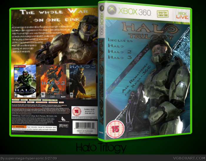
Looks great! but on the back, you have one PC box art and one NSTC box art, see if you can find all pal versions! and because Halo 2 was rated 16+ by PEGI the BBFC wouldnt be able to rate it 15 lol. Other than that it looks awesome!
Obviously you would have received more positive posts if you work on it. The text is too near to Master Chief and overall the text doesn't have enough depth, perhaps try experimenting with layers on text more. The Halo images could do with frames.
 Halo Trilogy Box Cover Comments
Cred to ADFD and to PR.
Also IGN.com.
[ Reply ]
I've seen MUCH better from you, it's a bit of a down, but hey... everyone has that sometimes :)
[ Reply ]
Maybe you could move the first line of the tagline down. I personally hate it when logos, or taglines are right at the top edge of the box.
4.9/5.
FAV.
[ Reply ]
#3, Thanks ;)
[ Reply ]
Looks great! but on the back, you have one PC box art and one NSTC box art, see if you can find all pal versions! and because Halo 2 was rated 16+ by PEGI the BBFC wouldnt be able to rate it 15 lol. Other than that it looks awesome!
[ Reply ]
I couldn't find a pal version of halo 3 boxart.
Edited at 1 decade ago
[ Reply ]
Maybe this will help!
link
[ Reply ]
Obviously you would have received more positive posts if you work on it. The text is too near to Master Chief and overall the text doesn't have enough depth, perhaps try experimenting with layers on text more. The Halo images could do with frames.
[ Reply ]
Nice idea, good have been executed a little better.
Fave non the less
[ Reply ]