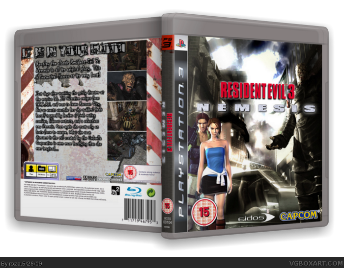
Hey guys! Resident Evil 3 on the PS3! I made this back when I made RE4 on PS3 and utterly forgot about it! So here it is! Credit to Sens for the template and SMHS for the 3D! Enjoy!
#2 wont be able now, this is a really old box, I only have the flattened image now :( besides if I used UC art it wouldnt fit in with the 'oiginal glory' to be fair, but thanks for the suggestions, ill use them if I make RE2 on PS3 ^^
Okay, so you do have some good stuff going on, but some things could use some help.
First off, that tagline is nearly unreadable. I had to stare at it for a few seconds to figure it out. Also, the description's font isn't feeling right for me.
Also, Carlos and Jill don't feel like they fit on the front. The lighting is seriously off. If you can find the art from The Umbrella Chronicles of Jill and Carlos (I know they got the Jill render on Planet Renders) it would look more accurate.
This one is just an opinion, but I think it would look cool if you used the newer Resident Evil logo font for the logo.
#2, i do agree with this comment, this cover got potential but readability and colors matches or textures doesn't fit together.
colors or texture should be same "brightness and contrast"
i like the idea but it misses something
#5-7 thanks! I appreciate the comments and critiques
#5-6, if the file is still on my school comp, and i have some spare time, ill see what I can do ^^
 Resident Evil 3 Nemesis Box Cover Comments
Hey guys! Resident Evil 3 on the PS3! I made this back when I made RE4 on PS3 and utterly forgot about it! So here it is! Credit to Sens for the template and SMHS for the 3D! Enjoy!
#2 wont be able now, this is a really old box, I only have the flattened image now :( besides if I used UC art it wouldnt fit in with the 'oiginal glory' to be fair, but thanks for the suggestions, ill use them if I make RE2 on PS3 ^^
Edited at 1 decade ago
[ Reply ]
Okay, so you do have some good stuff going on, but some things could use some help.
First off, that tagline is nearly unreadable. I had to stare at it for a few seconds to figure it out. Also, the description's font isn't feeling right for me.
Also, Carlos and Jill don't feel like they fit on the front. The lighting is seriously off. If you can find the art from The Umbrella Chronicles of Jill and Carlos (I know they got the Jill render on Planet Renders) it would look more accurate.
This one is just an opinion, but I think it would look cool if you used the newer Resident Evil logo font for the logo.
Edited at 1 decade ago
[ Reply ]
You should make a disc for it.
FAV!
[ Reply ]
#3 thanks man! I'll have to add a disc if I do RE2 lol
[ Reply ]
Oh wow, wow, that is, sexy.
[ Reply ]
#2, i do agree with this comment, this cover got potential but readability and colors matches or textures doesn't fit together.
colors or texture should be same "brightness and contrast"
i like the idea but it misses something
[ Reply ]
I do agree with sk.ar that it's missing something, but I still really like it, especially the front. Fav
[ Reply ]
#5-7 thanks! I appreciate the comments and critiques
#5-6, if the file is still on my school comp, and i have some spare time, ill see what I can do ^^
Edited at 1 decade ago
[ Reply ]
Bit of a late reply but i like it ... looks good the way it's been blended
[ Reply ]
Wow nice ! Great job I really like this one ^ ^
[ Reply ]
great! Jill it's so sexy!
[ Reply ]