It is finally here! The conclusion to my RE trillogy on GBC, only just noticed it was on my computer, i completely forgot to upload it when i made it lol! so enjoy!
Siiiiick! Thew only thing i would say is make that RE: Nemesis logo on the front a bit bigger (the RE part of course!), otherwise, niiiiiice! Thanks for the reminder!
#15 I wont be able now, I made this back when I had my Fireworks trial and for somereason Paint.Net opens it as a flat layer, and that is how I got the logo (Before I rendered it that is lol) thanks anyway man :)
Not too fond of the front. The titles clash a bit too much with the background. Nemesis should stand out to work with the titles well, much like how Jill stands on the cartridge.
The title on the bottom center seems completely unnecessary, I can see what the game is just by looking on the font cover.
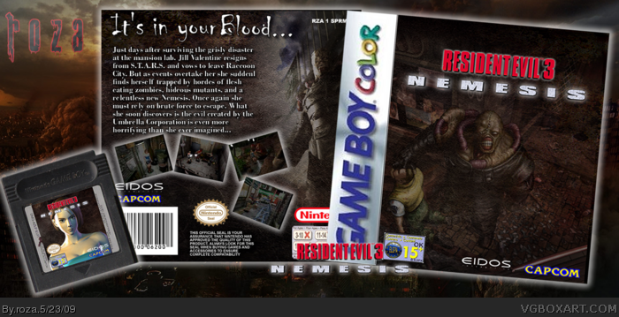
 Resident Evil 3: Nemesis Box Cover Comments
It is finally here! The conclusion to my RE trillogy on GBC, only just noticed it was on my computer, i completely forgot to upload it when i made it lol! so enjoy!
Cresit to CengizMan for the cartridge temp!
Edited at 1 decade ago
[ Reply ]
I like it. It looks subtle, not what you see from most Resi boxes on the site. Well done! +fav... yay! I fav'd first!
Edited at 1 decade ago
[ Reply ]
I am going to come out and say it. This is an excellent box, with no major flaws (if Any).+Fave.
[ Reply ]
#2+3 thanks guys!
[ Reply ]
awesom
[ Reply ]
Nice!
[ Reply ]
the box looks great, nice job.
[ Reply ]
Good job roza!
[ Reply ]
It looks freaking awesome!! Will you do resi 4 and 5 maybe ;)?
[ Reply ]
Right on point man. I've really come to like your subtle retro designs.
[ Reply ]
#9 thanks! =D might see if i can pull of RE4 on DS but i doubt ill do 5 ^^
#10 thanks man :)
Edited at 1 decade ago
[ Reply ]
its very dark, but i can see the effort, +fav
[ Reply ]
Good Job! +fav
[ Reply ]
Tasty.
[ Reply ]
Siiiiick! Thew only thing i would say is make that RE: Nemesis logo on the front a bit bigger (the RE part of course!), otherwise, niiiiiice! Thanks for the reminder!
[ Reply ]
#12-25 thanks ^^
#15 I wont be able now, I made this back when I had my Fireworks trial and for somereason Paint.Net opens it as a flat layer, and that is how I got the logo (Before I rendered it that is lol) thanks anyway man :)
[ Reply ]
Not too fond of the front. The titles clash a bit too much with the background. Nemesis should stand out to work with the titles well, much like how Jill stands on the cartridge.
The title on the bottom center seems completely unnecessary, I can see what the game is just by looking on the font cover.
The back cover looks great as well the cartridge.
Edited at 1 decade ago
[ Reply ]